10 Design Rules That Aren't Really True, According To Designers
Let's face it: When it comes to home design, some rules are meant to be broken. While some decorating guidelines should be followed closely, others truly aren't worth paying any attention to. To prove our point, we asked a few of our interior designer friends what commonly accepted design truths should actually be ignored, and here's what they had to say.
1. Rule: Bedroom rugs should run the length of the room.
1. Rule: Bedroom rugs should run the length of the room.
If you think bedroom rugs should always run the shape or length of the room, Caitlin Murray of Black Lacquer Design says you're mistaken. "Often, the point of an area rug is to add emphasis, so under a bed, for example, the rug should be placed perpendicularly and should be evenly visible on all sides of the bed," she explains.
2. Rule: Low contrast rooms are more relaxing.
2. Rule: Low contrast rooms are more relaxing.
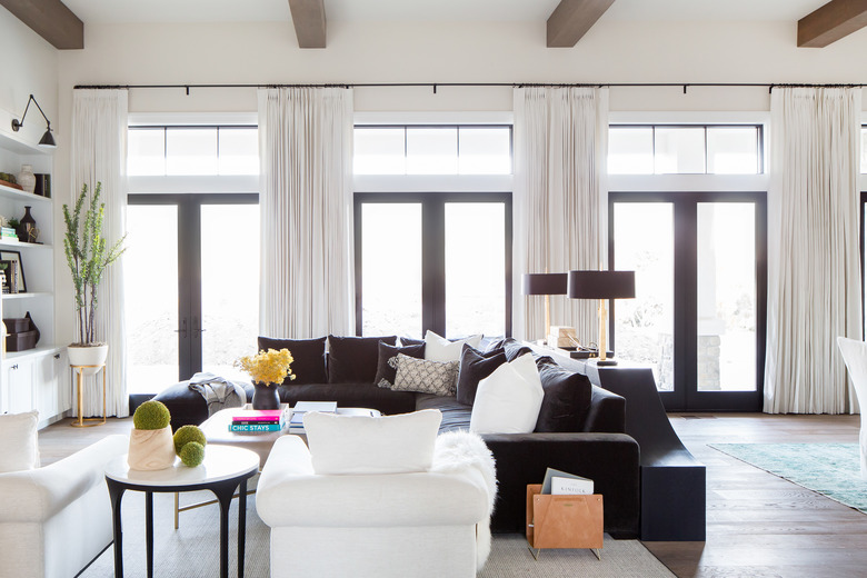
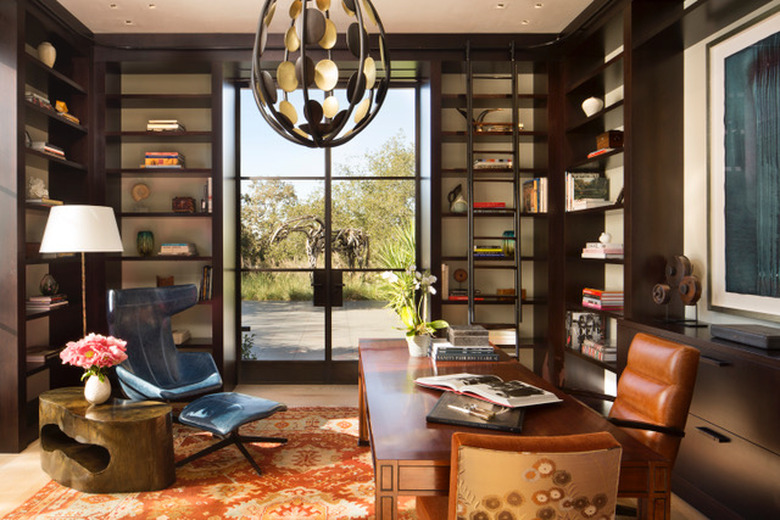
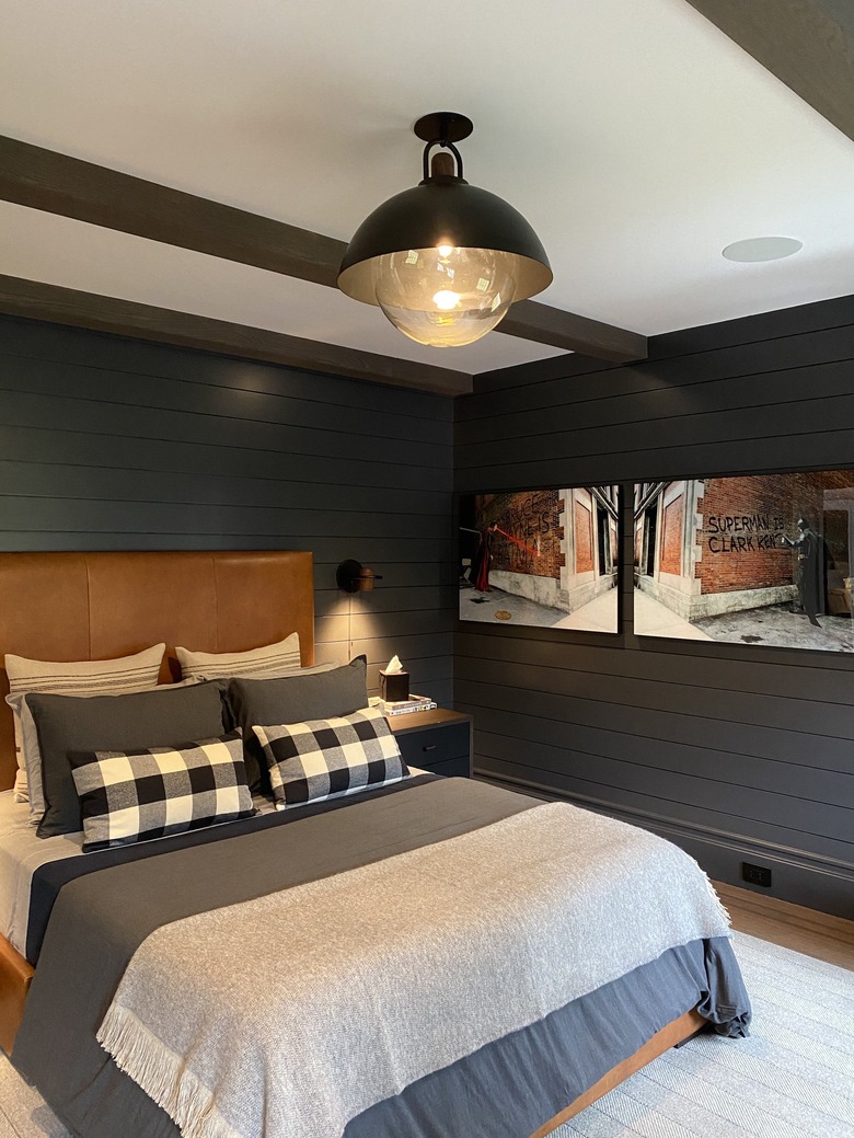
According to Lori Paranjape of Mrs. Paranjape Design + Interiors, the belief that neutral rooms are more welcoming than ones with contrasting colors is false. "When used well, the black (or dark) elements define a space and give the lighter colors and textures a chance to get even dreamier," she says. "The eye craves a little contrast to create some definition."
3. Rule: Don’t mix too many patterns in the same space.
3. Rule: Don't mix too many patterns in the same space.
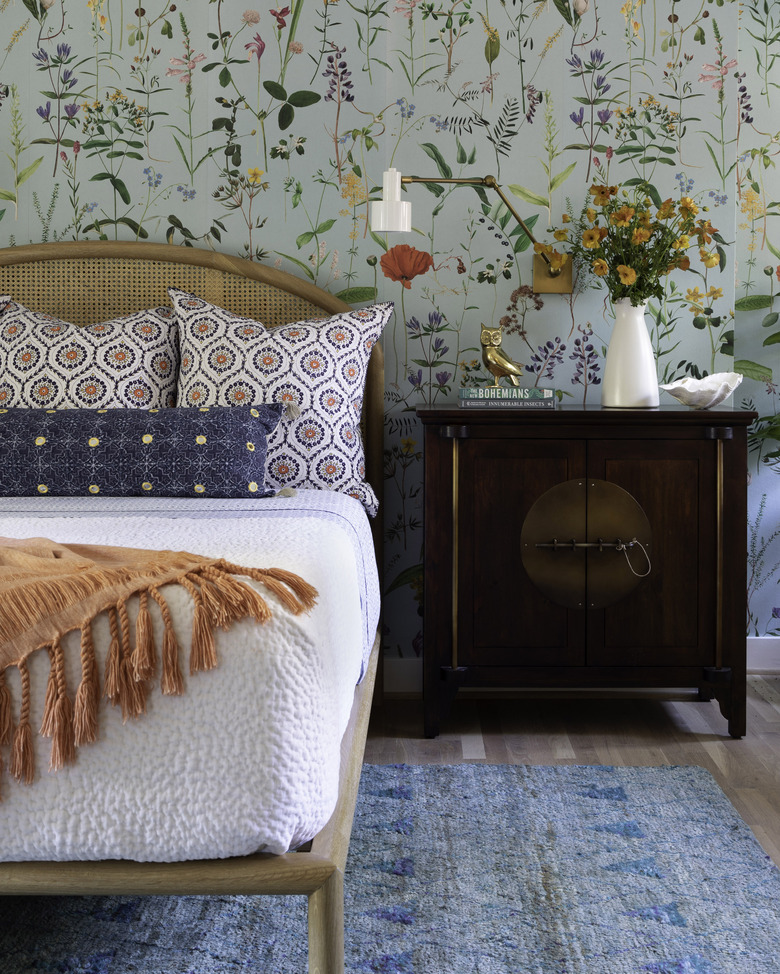
Contrary to popular belief, Emily Spanos of Emily June Designs says patterns can be mixed and matched in the same room. "Make sure you're mixing patterns that are different enough to stand out when lined up next to one another," she explains. "A mix of patterns that feel too familiar can be distracting and can easily overpower a space. Also, don't forget to play with scale! Combine large-scale prints with smaller, more intricate ones for a playful vibe that doesn't overwhelm."
4. Rule: Don’t mix different design styles in the same room.
4. Rule: Don't mix different design styles
in the same room.
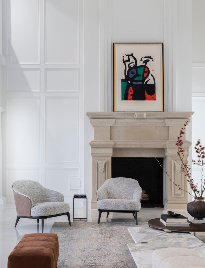
Kendall Wilkinson says to ignore the mandate that you shouldn't mix various design styles in the same room. "I believe that all good things go together, and when you combine elements from multiple styles, like midcentury with an antique desk, the result is a beautiful tension," she says.
5. Rule: Light colored fabrics are not family-friendly.
5. Rule: Light colored
fabrics are not family-friendly.
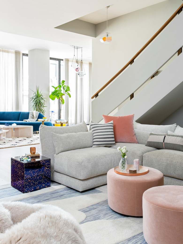
Scared to buy a cream-colored sofa because you've got kids at home? Anna Kroesser of Kroesser + Strat Design says don't be. "Performance fabrics have come so far," she explains. "They're soft and comfortable, come in great textures like tweed, basketweave, or boucle and wear like iron. Most of these fabrics bead the liquid, so clean up is pretty easy. Just look for performance fabric pieces and get a sample of the fabric to test out at home."
6. Rule: You can’t mix the old with the new.
6. Rule: You can't mix the old with the new.
While sticking to a particular style period may sound like a safe way to design a space, Nina Magon of Contour Interior Design says that in reality, it can cause your space to look dull and cold. "Mixing vintage, antique, and modern pieces in a room can give your home character, as well as create depth and interest within your space," she explains.
7. Rule: Bachelor pads must be neutral or dark.
7. Rule: Bachelor pads must be neutral or dark.
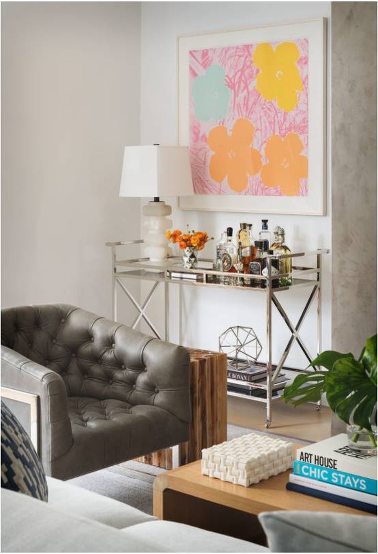
According to Julie Kleiner of Massucco Warner, the belief that all bachelor pads should have either a dark or neutral color palette is flat-out wrong. "This bachelor client's living room was lacking interest and when we proposed a pink, floral, Andy Warhol print, he said yes without pausing a beat, and has never been happier," she explains. "Decorate with things that speak to you from the heart and you'll never be disappointed."
8. Rule: Dark colors make a room look smaller.
8. Rule: Dark colors make a room look smaller.
Becky Shea says the idea that dark colors will make a room appear smaller is simply not true. "It's about how you pair that dark tone with everything else, and creating a balance," she explains. "I love painting rooms with really dark tones, including base, case, and windows in the same finish to give everything a monochromatic format and not highlight aspects that don't need highlighting."
9. Rule: Don’t mix metals in the same room.
9. Rule: Don't mix metals in the same room.
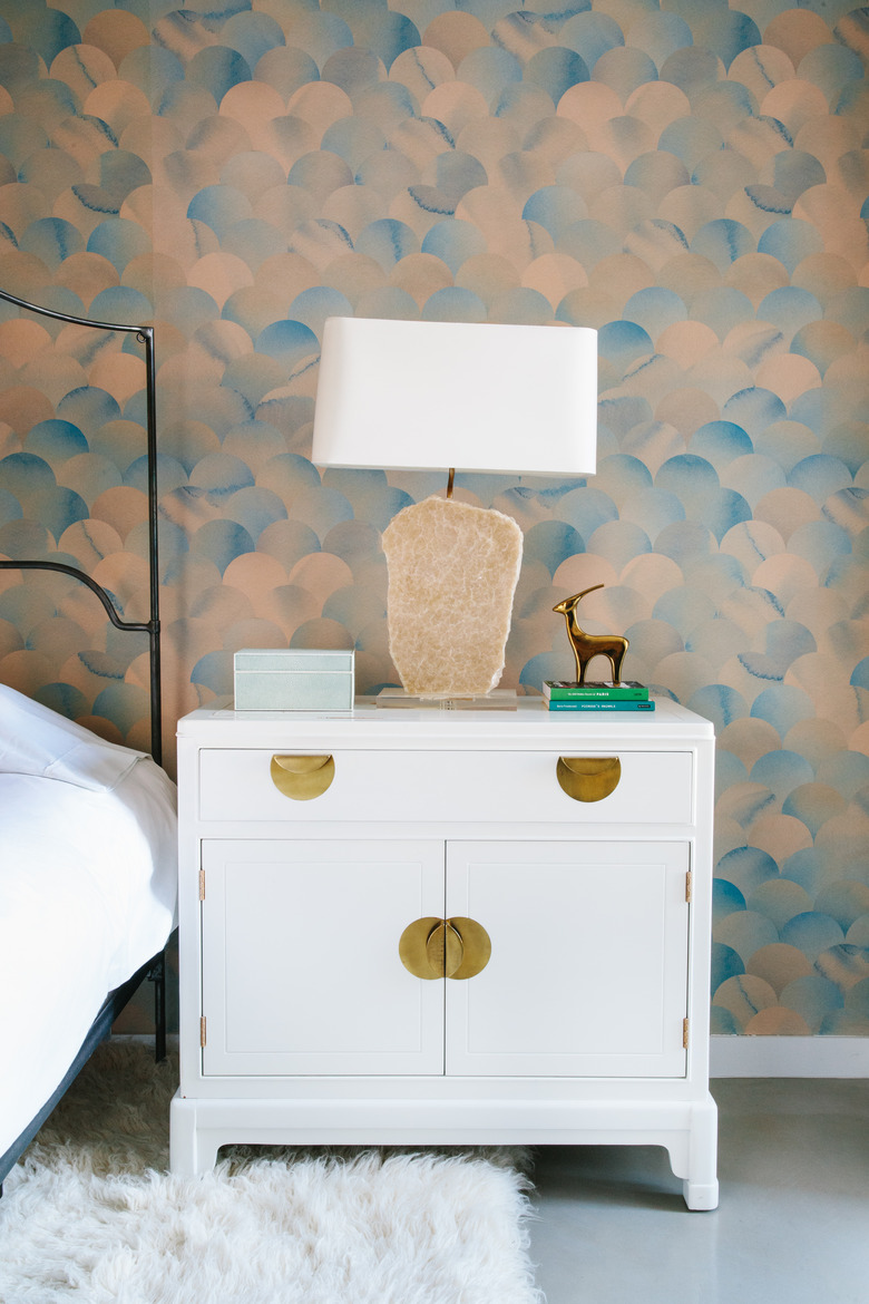
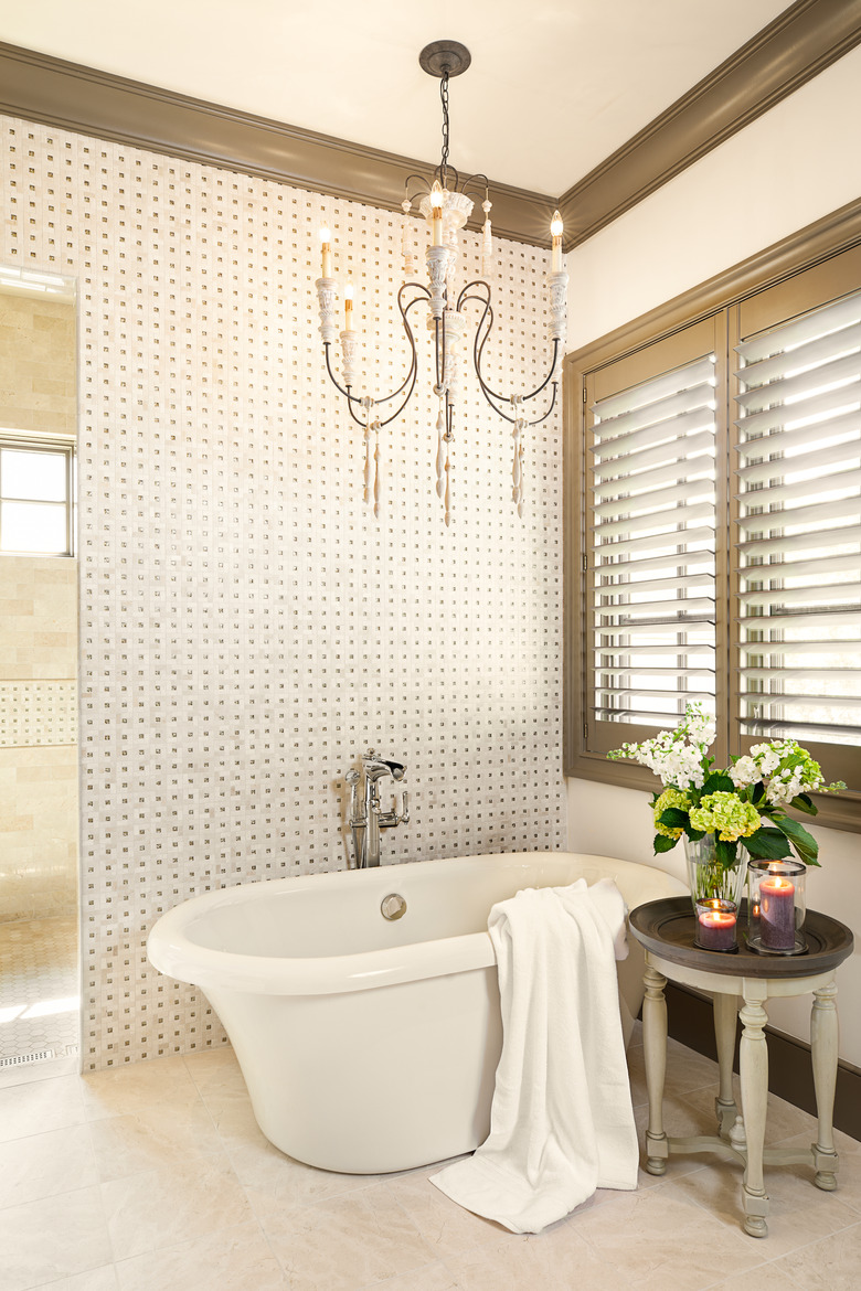
If you feel that mixing different metal finishes in the same room is a design faux pas, then Amanda Lantz urges you to reconsider. "I love mixing metals on door hardware, cabinet hardware, furniture, tile, plumbing, lighting, and so on," she says. "It feels more authentic and collected, and adds depth to the design."
10. Rule: Hang drapes just above the windows.
10. Rule: Hang drapes just above the
windows.
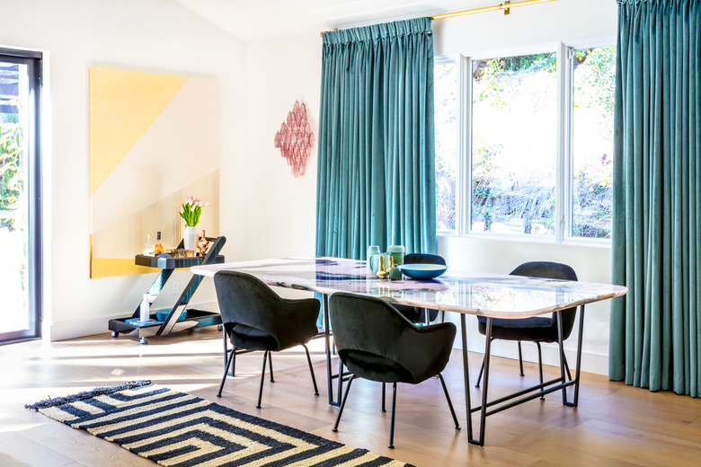
If you're following the rule that you should hang your curtain hardware just a few inches above your windows, Murray says you're doing it wrong. "We often see people mounting drapery just above windows, since that's all it technically needs to cover," she says. "However, the ideal way to hang curtains is as high on the wall as possible — it brings the eye up and makes ceilings seem taller!"
