6 Secondary Color Ideas That Will Take Your Palette To The Next Level
The pros make it look easy, but selecting an interior color scheme is one of the more common decorating conundrums. Maybe you've experienced this: You fall in love with a specific paint swatch at the store only to discover the shade looks entirely different once it's on your walls and in different lighting. Not to mention the challenge of actually pairing it with other colors. Even if you don't have a background in color theory, with a few basic principles under your belt, you'll be able to better navigate the wonderful world of color and feel confident when it comes to pairing hues.
A great way to start is by studying the color wheel — a circular visual representation of how colors naturally blend, contrast, and combine. While most people are familiar with primary colors, the spectrum can be broken down even further. For example, secondary colors are those that are created when primary colors are mixed together; yellow and red make orange, yellow and blue make green, and blue and red make purple. Employing these hues in your decor will help create a layered and visually compelling story.
Curious about how to use secondary colors in your home? Read on to learn more.
1. Orange and Purple
1. Orange and Purple
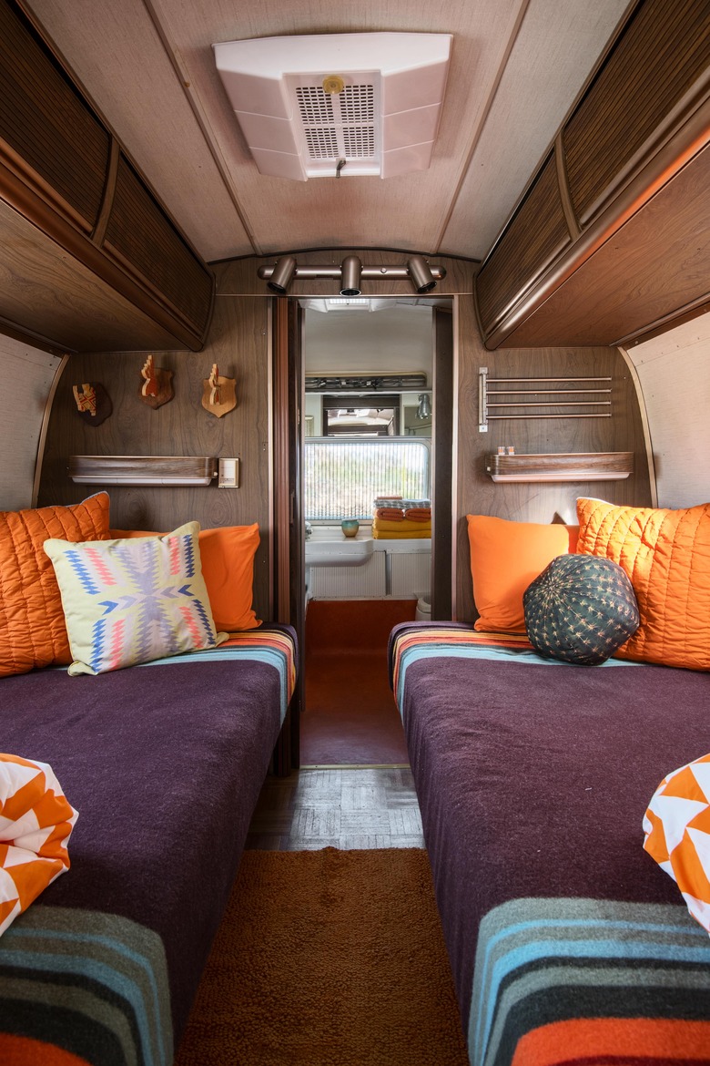
It might come as a surprise that purple and orange work well together, but this secondary color combo is rich and eye-catching, plus it adds considerable depth. A regal plum functions surprisingly as a neutral, allowing orange pillows and accessories to pop in this handsome Airstream. Wood paneling adds texture and further underscores the masculine vibe.
2. Purple, Orange, and Green
2. Purple, Orange, and Green
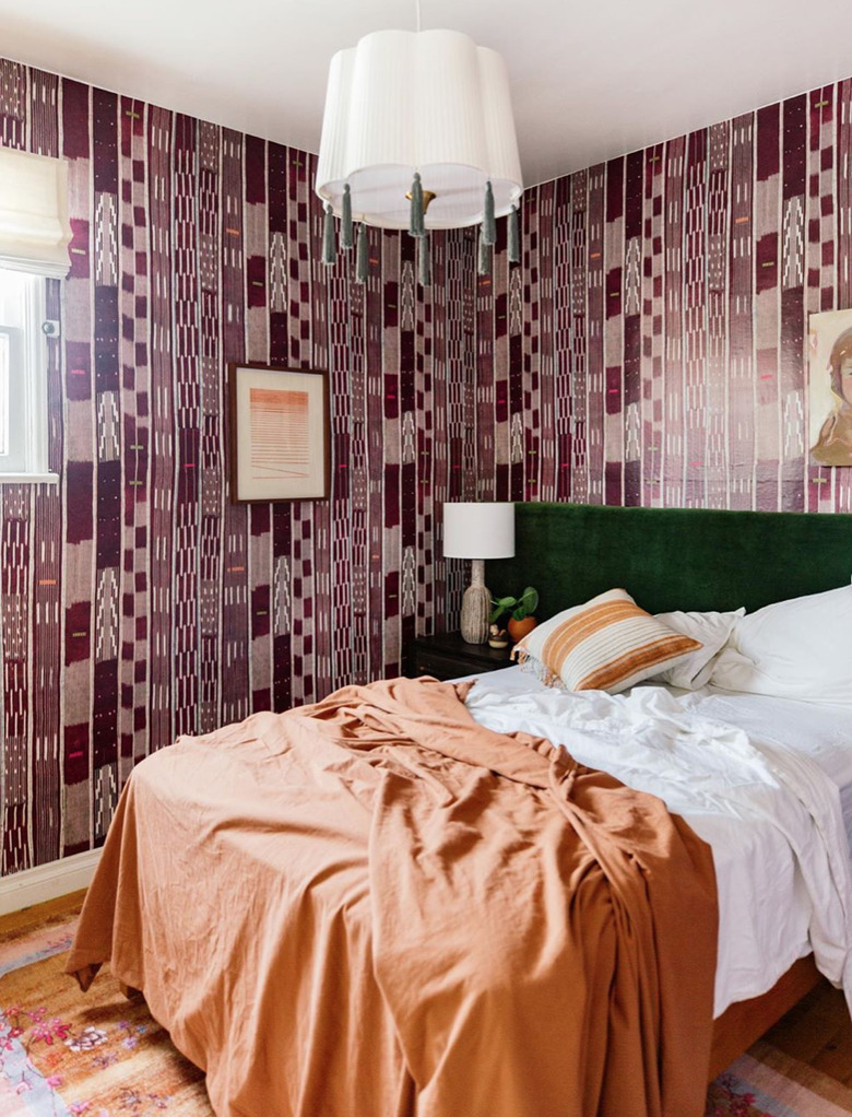
Combine all three secondary colors for an unexpectedly elevated look loaded with fall vibes. This bedroom by color master Dabito features a tone on tone purple wallpaper, emerald green headboard, and muted orange bedspread, while crisp white accents — sheets, ceiling, and pendant light — break up the design and keep it from being visually overwhelming.
3. Orange and Green
3. Orange and Green
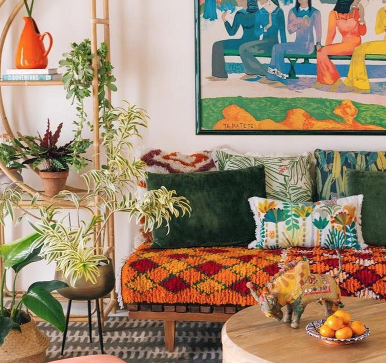
Avoid cliche Halloween vibes when combining secondary colors by pairing saturated orange with mossy green, as Justina Blakeney does in this casual and eclectic living room. She injects plenty of other hues, prints, and textures for an energetic space that's full of life.
4. Orange and Yellow
4. Orange and Yellow
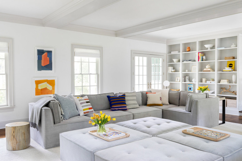
If you're averse to color, you can use it sparingly and in measured amounts to add a bit of personality to neutral spaces. Chango & Co. punctuated a soothing monochromatic living room with subtle doses of secondary colored accents including orange artwork and orange, yellow, and green flower arrangements.
5. Purple and Yellow
5. Purple and Yellow
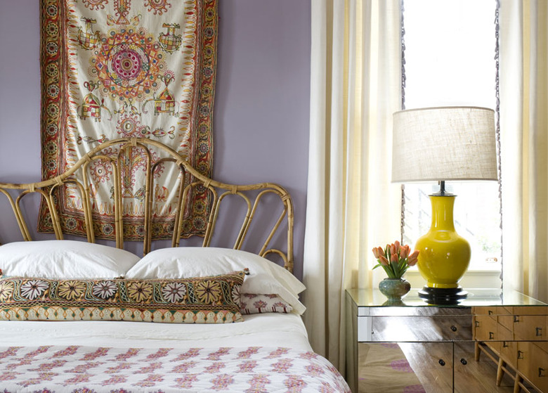
According to color theory, calming "cool" colors — blues, greens, and purples — should be used in rooms (such as bedrooms) where relaxation is a priority. Angie Hranowsky gave this refuge the cool color treatment by coating the walls a pale periwinkle, which tempers a bold canary yellow lamp. A rattan bed, patterned textiles, and a mirrored end table lend both boho and sophisticated touches.
6. Orange and Teal
6. Orange and Teal
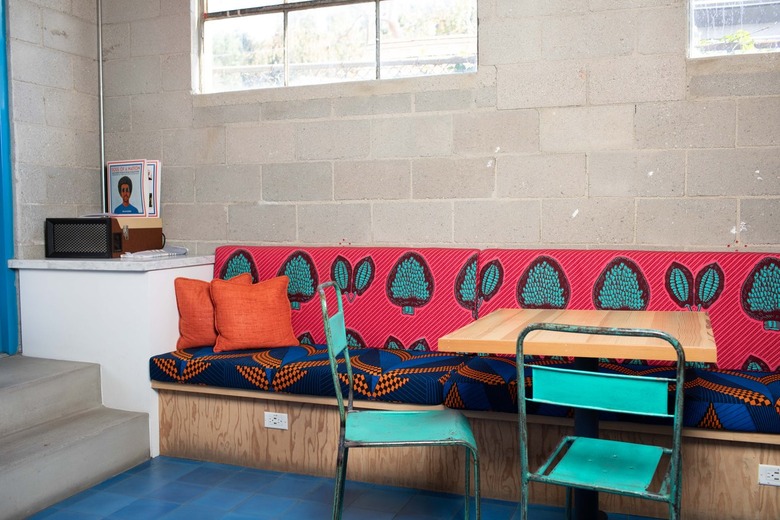
A little bit blue, a little bit green, teal manages to impart both a free-spirited and sophisticated vibe — depending on the tone selected — and is embraced for its versatility. It works well with all of the secondary colors and is particularly playful when paired with pops of orange, as seen on this vibrant patterned banquette.
