There's More To The Color Wheel Than What Meets The Eye
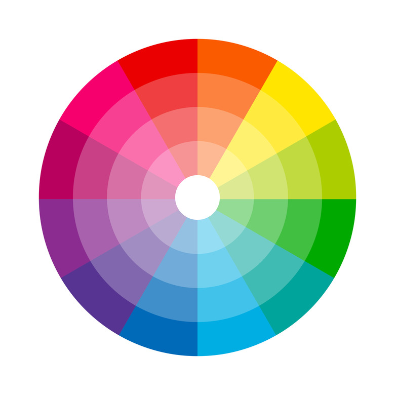
You've definitely heard of the color wheel (think back to elementary art class) and have probably seen the gradient circle where tones are arranged in sequence according to ROYGBIV. But what is it exactly? Turns out, a whole lot more than just a rainbow pizza pie. It's essentially a cheat sheet that illustrates how various shades work together, and the framework for color theory — a guiding set of principles that designers and artists look to when selecting a color palette.
The science behind the color wheel can be traced back to Sir Isaac Newton, who first discovered the spectrum using white light reflected off of a prism. Years later, after it was tweaked and developed, it's become a mainstay of the arts and a valuable tool at that. To better understand the inner workings of the color wheel and all that it has to offer, it's worth digging a little deeper into the components that shape it. Let's dive in.
Primary Colors
Primary Colors
Red, blue, and yellow are the three true primary colors and the basis for the shades that comprise the wheel. Together, in light form, they produce white and even though you can mix and match them to create other hues (think green or violet), no other colors can combine to make these shades.
Secondary Colors
Secondary Colors
Secondary colors are products of two primary colors. Red and yellow make orange, blue and yellow make green, and red and blue make violet.
Tertiary Colors
Tertiary Colors
Now, picture a color wheel that's split into six equal parts comprised of primary hues and their respective secondary ones — tertiary colors are a result of the fusion of two of these neighboring tints. So, for example, a primary yellow and a secondary orange make yellow-orange, a primary red and secondary orange make red-orange, and a primary blue and secondary violet make blue-violet. There are a total of six tertiary colors, which along with the above, include: yellow-green (or chartreuse), blue-green (or teal), and red-violet (or magenta).
Color Schemes
Color Schemes
The color wheel is divided by warm and cool tones — a term used to classify the level of saturation, or lack thereof, for a particular hue. Red, orange, and yellow are all classified as "warm" while blue, green, and dark purple fall under the "cool" umbrella. When it comes to the tertiaries, some, like yellow-green may err towards the warmer spectrum but it all depends on the undertones of the hue.
Once you have the basics down, you can begin to think about color schemes, which essentially group tones based on compatibility. Now, that can come in the form of complementary colors and even a monochrome palette comprised of tonal variations. All it takes to figure it out is to peek at the color wheel.
Complementary Colors
Complementary Colors
Complementary colors are those that are located immediately across from one another on the color wheel, regardless if you're working with a secondary or tertiary circle. Take, for instance, yellow and purple, red and green, or blue and orange — these high-contrast pairings, which are essentially polar opposites, still manage to work in tandem with an aesthetically-pleasing effect.
Analogous Colors
Analogous Colors
Analogous colors, on the other hand, are those that are located next to one another on a 12-part color wheel. Typically represented by three hues, examples of these include red, red-orange, and orange or blue-green, green, and yellow-green. When going for a monochromatic finish, working within an analogous palette will be the key to inviting interest.
Triadic Colors
Triadic Colors
Triadic colors are evenly spaced out within the color wheel. Red, blue, and yellow will always comprise a triadic scheme, regardless of how many elements the circle has. If you're working with a 12-part wheel and are looking for a triadic grouping centered around blue-green, its counterparts will be red-violet and yellow-orange. The easiest way to source these is to pick out one hue and count four steps to the right and then four steps to the left — the shade you land on will inform the rest of your palette. In short, the colors should each form a triangle.
Now that you have a solid understanding of the inner workings of the color wheel, you can take on just about any design project and select a palette in a snap.
