Before And After: The Kitchen In This Spanish Revival Home Gets An Earthy Update
The most exciting part of any renovation project is standing back and admiring the big reveal, because, honestly, who doesn't love a good before and after? But for Hunker creative director Paul Anderson, the most impactful change to come out of his kitchen renovation wasn't new appliances or the color of the walls — it was a feeling.
"We only remodeled the kitchen, but the vibe of our whole house has changed," Anderson says. "The contractor said, 'This feels like a different house,' but we didn't move any walls or do anything drastic."
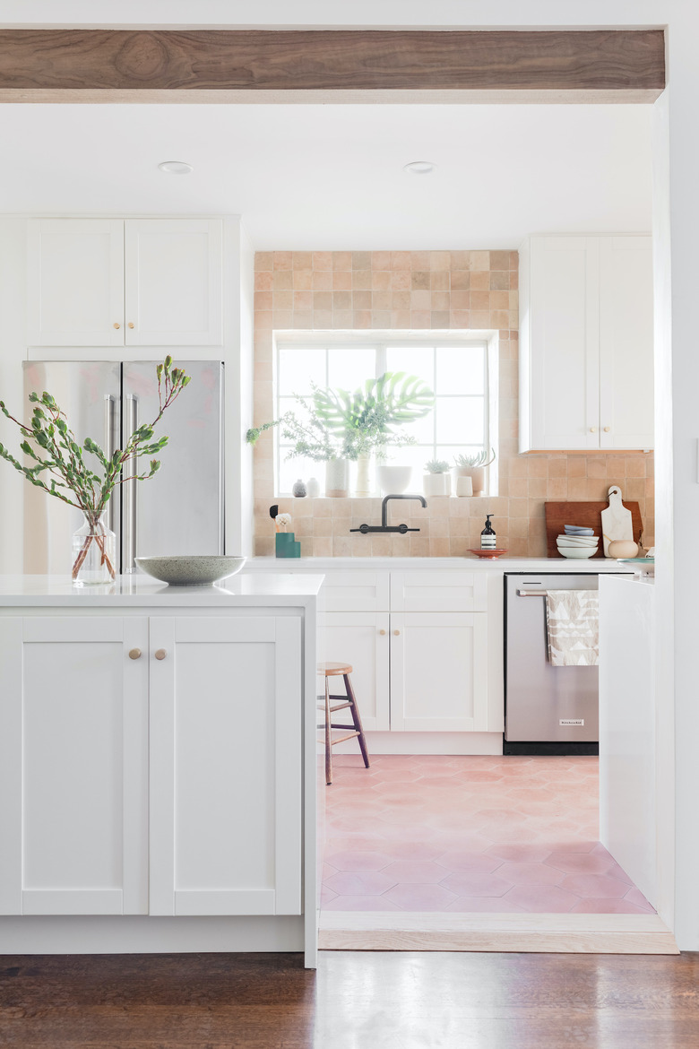
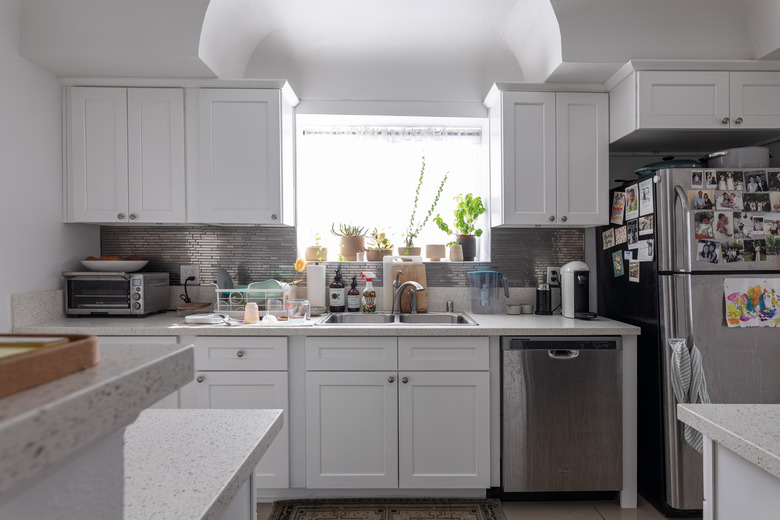
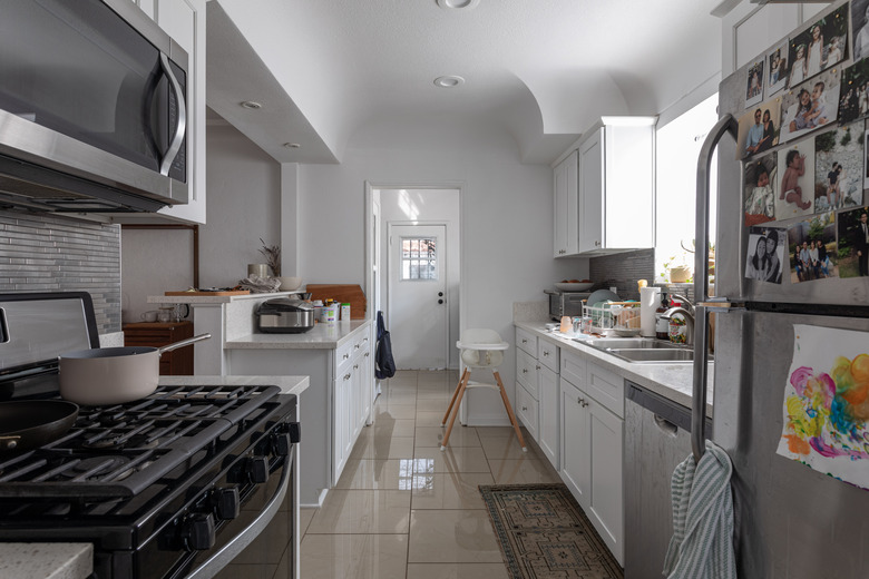
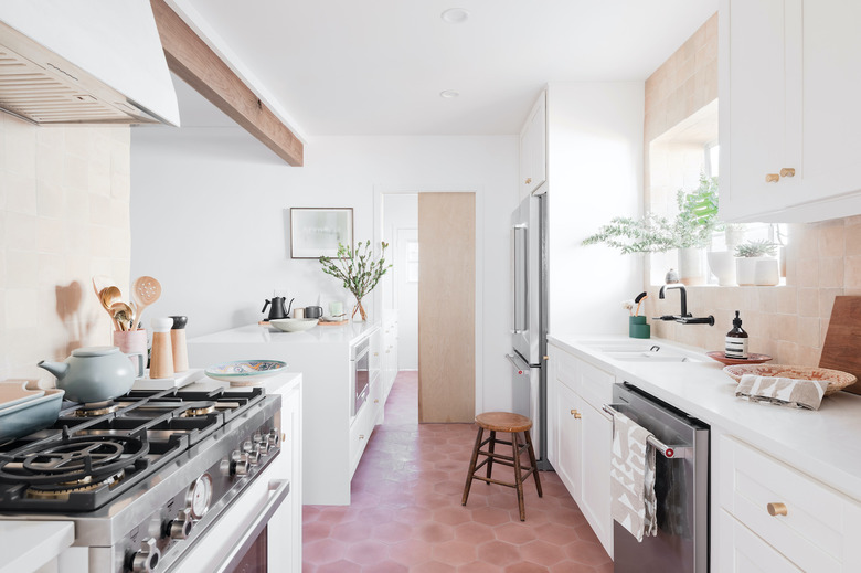
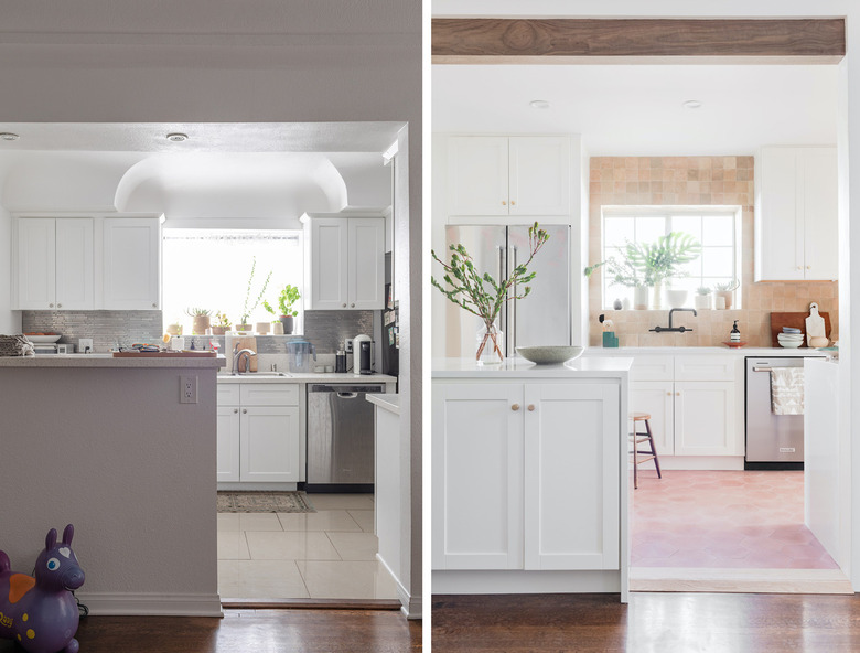
The key changes he did make? Removing the cove ceiling in his 83-year-old Spanish Revival home's galley-style kitchen, installing custom-fitted cabinets from Cabinets To Go to utilize the newly created storage space, and rearranging the appliances to create a more functional, streamlined flow.
"Opening the ceiling and stripping away the clutter revealed what is original to the house, which is what really works with the house," Anderson says. "There was all this really great detail that wasn't front and center because of all this weird clutter. Through this process it's revealed a lot."
The house had undergone a quick-flip renovation before Anderson purchased it, so he admitted to mentally remodeling the kitchen since he first laid eyes on the house in December 2017. Three years (and one next-level mood board) later, his kitchen has finally been transformed from a sterile space into a room heaping with character.
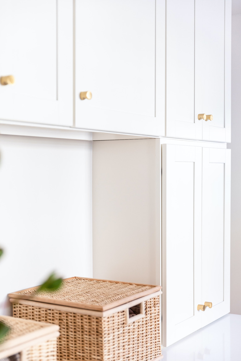
First on his list was removing the cove ceiling to allow for more storage (and to put an end to conversations with his wife about how there was no space to put anything). Once that was gone, he fitted the space for new cabinets, and went with the Malibu White shaker cabinets from Cabinets To Go.
"My favorite thing with the cabinets is that everything is super tight," Anderson says. "There won't be any gaps. Everything feels super custom. There's a level of customization to it that I didn't think was possible." His new cabinetry also includes a hidden charging station inside a drawer, plus a drawer to keep extra appliances out of sight but easily accessible.
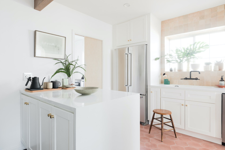
By redistributing the larger appliances through the kitchen (rather than having them lumped together on one end like they were in the original layout) the space became more functional and livable for Anderson and his family.
"The ability to cook and prep will be way easier and not feel as claustrophobic," Anderson says. "Now we can cook and prep on one side of the kitchen, and feed my daughter on the other, so we'll be able to manage dinner time a lot easier and not be running into each other."
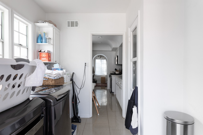
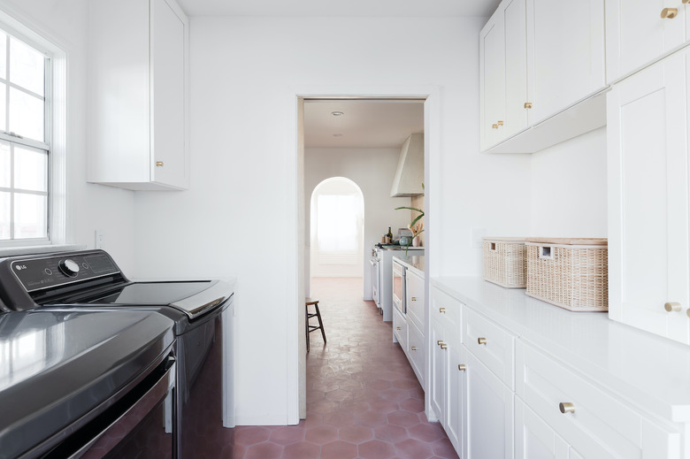
"In the laundry room, we demo-ed a whole pantry and put all cabinets there," Anderson says. "The cabinets were built to align so it feels like a seamless countertop from the laundry room to the kitchen when the pocket door is open, which makes it feel a lot bigger and really custom."
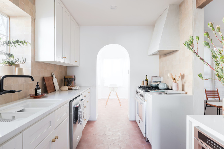
By pushing the cabinets up to be flush with the ceiling, the angular cabinetry is able to complement the other arch details in the space, rather than compete with them. Anderson was able to land on the layout and style he wanted by working with the Cabinets To Go team to see real-life samples of all the options he was considering before committing.
Perhaps the pièce de résistance of the entire kitchen is the arched entryway, which was given more room to shine by reorganizing some of the appliances around it.
"You couldn't see that architectural detail before because of the bulbous refrigerator and other appliances," Anderson says. "After we peeled back all the clutter around it, the entryway now feels like a really big moment."
