The Secrets Behind The Design Of 'The Flight Attendant'
We may receive a commission on purchases made from links.
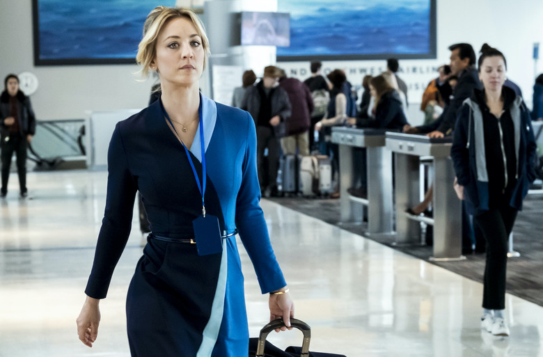
HBO Max's new miniseries The Flight Attendant is pretty stunning from multiple perspectives. First, you've got the intriguing story: Cassie Bowden (as played by Kaley Cuoco) is a boozy flight attendant who wakes up in a swank Thai hotel suite next to her one-night-stand — who is dead. What follows is her quest to clear her name and find the killer as she gets further wrapped up in in a dangerous international scheme. But what makes this show truly magical are the sets, created by production designer Sara K White. From sleek Bangkok hotel rooms to NYC studio apartments to chic lofts, White managed to craft spaces that are not only full of mystery, but totally enviable.
We chatted with White about her vision for the show and the meaning behind some of these incredible spaces and objects.
HUNKER: Let's talk first about Alex's hotel room, as that space is so significant to the entire show. Not only is it where he was murdered, it also then morphs into Cassandra's dream space/alternate reality. First question: Is this opulent suite based on (or inspired by) any real hotel?
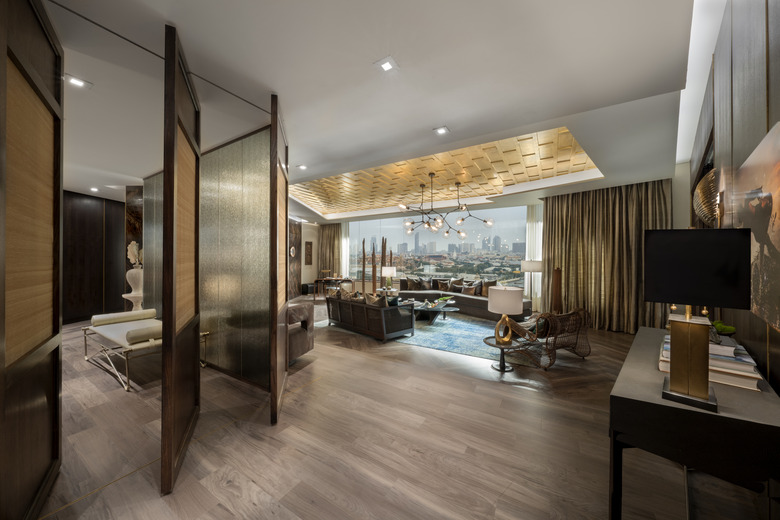
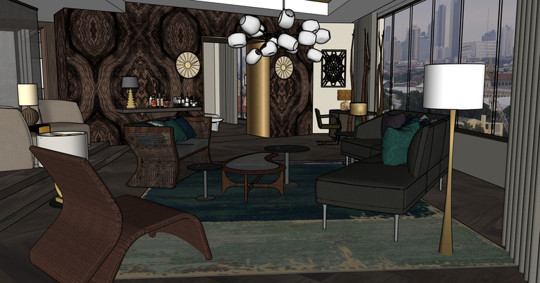
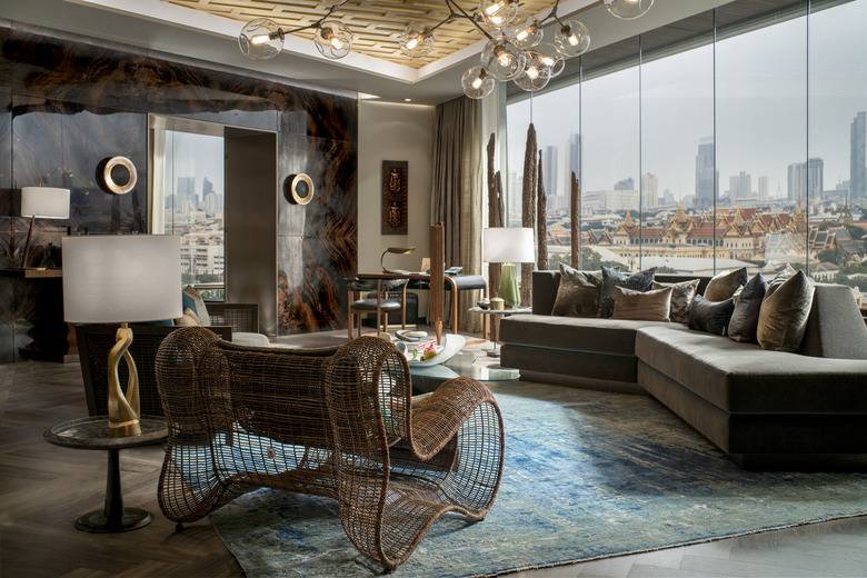
SARA K. WHITE: I drew from a variety of design-forward high-end hotels, but ultimately the needs of the story drove the design. The plan for the suite was created to highlight the disorientation Cassie experiences after the traumatic events of the night and, later, of her childhood. To achieve that, I made a basic massing study [ed. note: a massing study is a 3D rendering process] and "shattered" it in a way that worked with broken symmetries throughout the space. Reflection, refraction, and obfuscation also allowed climactic moments of discovery for Cassie, and in camera for the audience, as the mystery progresses.
SKW, CONT'D: To keep the decor rooted in a sense of place, I leaned into references from Thailand, where the first scenes are set. We pulled from traditional architecture in creating the fa pakon-style gilded ceiling, the moving screens with their lotus motifs, and in the rich chocolate marble that I seemed to see everywhere when we were scouting. Crafting these elements from scratch was a real challenge, but my art director, Christine Foley, and her team did an amazing job. My set decorator, Jessica Petruccelli, and I worked hard to include furnishings and materials sourced from the region, including raw silks and all of the art pieces in the space.
HUNKER: That room also seems to slightly change and morph when Cassandra is pulled back in. What are the visual cues you used to bring the audience deeper into her un-reality?
SKW: By designing occasions for surprising shots into the floor plan from the beginning, all of our talented directors and DPs were able to find unique angles for telling the story. The moving screens and panels let us tweak and adjust the suite to each frame, alternately showing and hiding things as we went. The mirrors and reflections in the suite could also shock you with a view into a room you didn't expect to see.
The design was really exploited by our writers, who at times wrote with an eye to those opportunities. Because we were also in Cassie's subconscious — moments like the floral funeral, the twisting hallway maze, the gliding dance in the air, and the tension- and vodka-filled confrontation — we were able to redress and transform the set to respond to her emotions in the moment. I often feel like the art department works in the audience's subconscious, so doing that in an overt way was a thrill!
HUNKER: The show is based on a book of the same name — did the book provide any direction in terms of how spaces looked?
SKW: A number of the actual settings of the book ended up changed in the scripts for the show. For example, the book actually places the mystery in Dubai, but we were unable to shoot there. Keeping in mind each space's tone from the book was helpful. When we were forced to pivot, director Susanna Fogel and I selected a city that juxtaposed our New York and Rome locations and offered an aesthetic and cultural environment that would feel fresh to our audience. While that was in keeping with the book, our show's creator, Steve Yockey, amplified and imagined characters and moments that allowed the story to become visually engaging in a way that exploited the talents of our collaborators.
HUNKER: The most interesting space, to me, is Annie's apartment. A shower in the living room is just so New York! Where did that idea come from? And can you talk a bit about the pieces and decor in her home (brands, sources, etc.). I feel like I'm picking up on some distinctly Scandinavian sources?
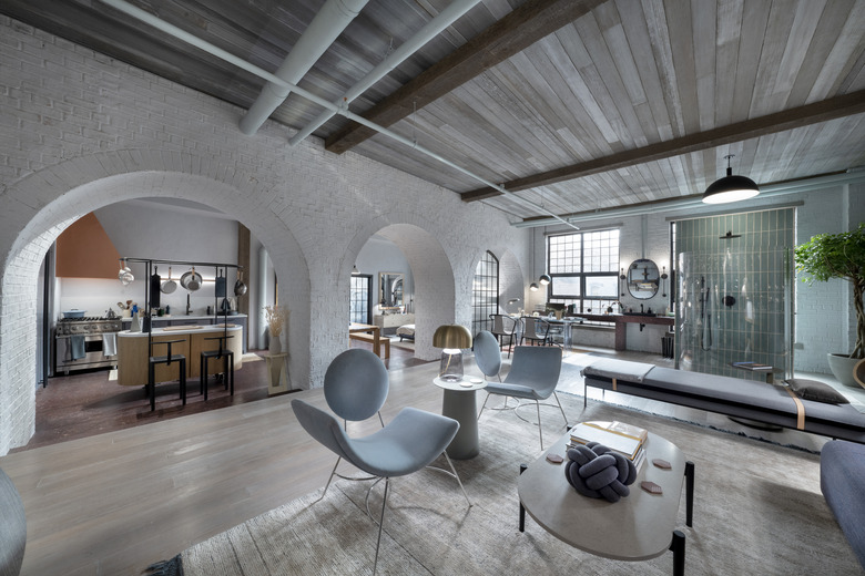
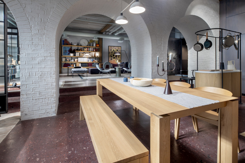
SKW: The shower itself was written into the script and it informed us so much. We were dealing with a very bold woman! She's a lawyer who plays with truth and can use human nature to her advantage by, say, surprising you with a risqué shower where you'd least expect it. I used that element to push the boundaries between public and private, creating a rather wall-less space with bold arches that don't define rooms in a standard way. I was always looking for a way to take the typical and tweak it.
We took the mauve terrazzo floor and pulled it up into the entry niche's wall and along the windows as a console behind the desk and by the bathroom. The kitchen nearly hides at a time when exposed shelving is very on-trend. They are individually subtle moves but they kept the look fresh.
SKW, CONT'D: To keep the energy up, we brought in retro and modern pieces and created some custom elements for the loft. We sourced modern Danish pieces from Muuto, Menu Design, and Ferm Living. We brought in vintage lucite pieces from Chairish and sourced from Adaptations, a local [Brooklyn] shop. It was great fun to design the built-in elements and Annie's kitchen island. And we were lucky to include really exciting lighting, playing with three pendants from Hollis and Morris to create the artwork surround, as well as pieces from Entler Studio, OVUUD, and Trella Studio.
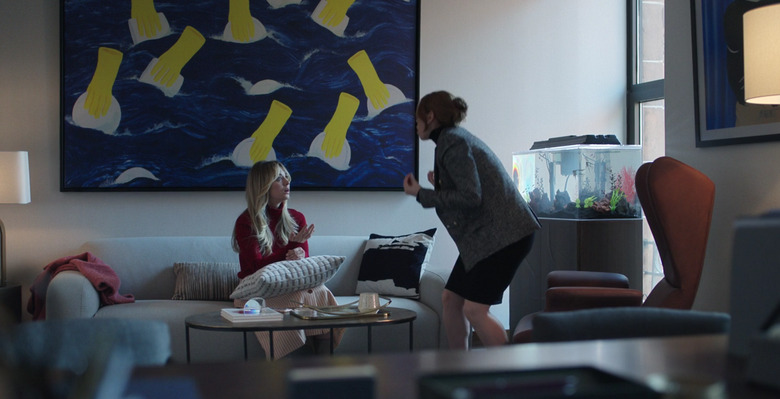
HUNKER: You made some very interesting choices in terms of artwork. Can you talk a bit about the pieces you chose and who the artists are? I was especially intrigued by the piece in Annie's office — I believe it was yellow rubber dishwashing gloves emerging from a sea?
SKW: Oh, I love that one! It's "Endless Chores (Life at Age 6)" by Crys Yin. Steve Yockey told me early on that he wanted to feature living female artists and we were so thrilled to collaborate with both Crys Yin and Jane Dell, who supplied a majority of pieces for Annie's office and the loft.
Their pieces walk an interesting line — they're bright, compelling, sometimes unnerving, and supported the themes we'd established for Annie. The references to hands in a few pieces from Crys Yin spoke to me about the managing of truth. The mixed media collage pieces from Jane Dell were often inspired by memory, which comes through in spades. I felt like I was in a dreamscape trying to discern something just out of comprehension, which dovetails nicely with Annie and Cassie's journeys.
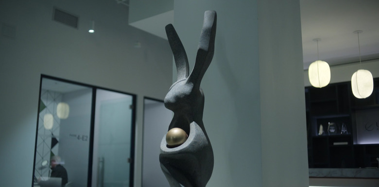
HUNKER: And, of course, there's that rabbit sculpture at Alex's workplace, which plays a big role in one episode. How did you go about concepting that?
SKW: The comedic moment when Cassie and Sabrina talk about the sculpture had to land, so Steve Yockey and I worked closely to hit that mark. I have a real love and respect for corporate art and architecture. The needs are so at odds — you're making statements while saying nothing. For our rabbit, I wanted to make something that was strong and solid while being patently ridiculous. That gave us the solid base, the long upright ears and the absurdity of the ball cradled in the paws. Using a granite-look scenic treatment on our carefully carved foam and rubber frame was the perfect final touch.
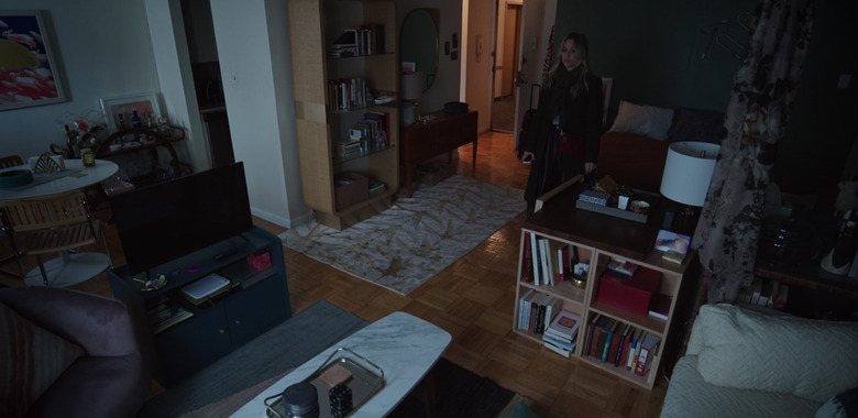
HUNKER: Cassandra's home is also interesting. It wasn't until, I think, the third episode, that I realized she lived in a studio apartment. Can you talk a bit about the layout in her home and her decor style?
SKW: Absolutely. Even though we're not in her apartment much, it was an important exercise to discover her character through that space. We chose a location with a sort of racetrack layout, the galley kitchen has egress[es] at both [ends] so she's never boxed in. Cassie is constantly in motion; that motion makes her feel safe.
For decor, her space reflects both her joie de vivre and her detachment from the world around her. It's both fun and fresh and incomplete, with the art she'll hang "someday" still leaning against her dresser. Not decorated in the professional sense, Cassie knows how to pull it together to make a good impression. That part of her character becomes amplified later as she deals with being a functional alcoholic. We sourced from vendors we thought Cassie would know about, [like] Chairish and AptDeco, as well as thrifts and little [NYC] vintage shops like Dobbin Street and Furnish Green, places where Cassie might cut a deal if she gives a wink and a winning smile.
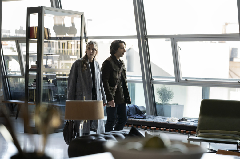
HUNKER: We finally see Alex's apartment in Episode 5. It matched up pretty perfectly in my head with who he is. It's a "bachelor pad," but it's not douchey. What type of vibe were you going for? What brands did you pull from?
SKW: We wanted to give it a sleek, upper-class sophistication that leans into older money. It gave the impression that he grew [up] putting on a public face in a way that connects his plight to Cassie's. We used antiques and modern pieces to give his taste range. Sourcing came from Arteriors, 1stdibs, Designlush, Suite NY, John Koch Antiques, Blu Dot, and Newell Props. But under the glossy exterior hides some unnerving realities — Cassie doesn't know him, he could be anyone. It was important for us to use beautiful artwork that makes us a bit uncomfortable and we found that with Corwin Prescott's evocative photography.
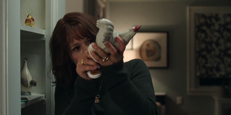
HUNKER: Finally, where did you source Megan's ceramic chickens?
SKW: Those chickens were hard to find! We had really specific needs for that prop and we were lucky to find the perfect hollow, chubby little guy who could fit an entire secret life. Our props team did a deep dive and scouring all of the decor shops in NYC, starting high-end and landing somewhere between Bed Bath & Beyond to the little mom and pop housewares stores on the corner. Sometimes finding the right things for your characters require you to really get your hands dirty in the search, but that's part of the joy of filmmaking!
