A Sleek Paris Apartment Inspired By The Memphis Group
When they started renovating a Haussmann-style apartment located in the 18th arrondissement of Paris, architects Hélène Pinaud and Julien Schwartzmann of Heju Studio took inspiration from their clients — a pair of graphic designers with a one-year-old. "We wanted to treat the apartment in a non-classic way and we thought of this apartment as a graphic designer would: with different compositions of flat tints of colors and patterns," says Pinaud.
They began by modernizing the layout, then diving into adding color and pattern. The challenge was making sure the colors coordinated from room to room to create a cohesive look. "For instance, the pink color we used on the living room ceiling is the same that we used for the cabinets in the kitchen and in the bathroom," says Schwartzmann.
The duo was also influenced by India Mahdavi and the Memphis Group, incorporating wallpaper and bold tile to add pattern and more color. The home's period details were mostly preserved, but the architects gave them a contemporary update: Classic moldings in the living room now frame deep purple walls and an ornate ceiling is painted a soft pink.
The completed home reflects the charming neighborhood and the clients' personal style. Says Schwartzmann, "The apartment has a classic style but is now more open and modern."
1. Entry
Cole & Son's lively Miami wallpaper was installed in the entry. Open shelves provide spots for displays or to drop keys and other essentials.
2. Living Room
The original herringbone floors and moldings give the living room a feeling of grandeur. Colorful elements — like the vintage side table, Made sofa, and modern Vanity Boum lighting — make it feel youthful and fun.
3. Living Room
The doors between the living room and dining room — now the kitchen and dining area — were removed to allow the home to feel more open.
4. Kitchen
The apartment's original marble fireplace is a focal point in the kitchen and dining area, thanks to the sleek and simple cabinetry. "It was crucial to hide every electrical appliance — the dishwasher too — in this configuration," says Schwartzmann. "You can see the kitchen from the couch, so it had to be very clean."
5. Kitchen
"We wanted to create a two-colored kitchen," says Pinaud. "We tried different colors that contrast with the light pink. We love to create a contrast between a pastel color and a bolder or darker one. We liked this green because it matches the pink and the terracotta from the terrazzo." IKEA ceiling lights hang above a Parrot Table by India Mahdavi from Petite Friture. The black stools are by Tolix.
6. Bedroom
Yellow ombre wallpaper by Bien Fait, a side table by Petite Friture, and a polka dot duvet cover by La Cerise sur le Gateau set the tone in the bedroom. The architects installed a wall of pale green cabinets to boost the amount of storage.
7. Bedroom
The team carved out a small office area in the bedroom. "Our client works from home so we had to imagine a cool space for her desk," says Schwartzmann. "Their bedroom is large (for a Parisian apartment) so it was the right spot for it. The interior window defines the desk area. "
8. Bathroom
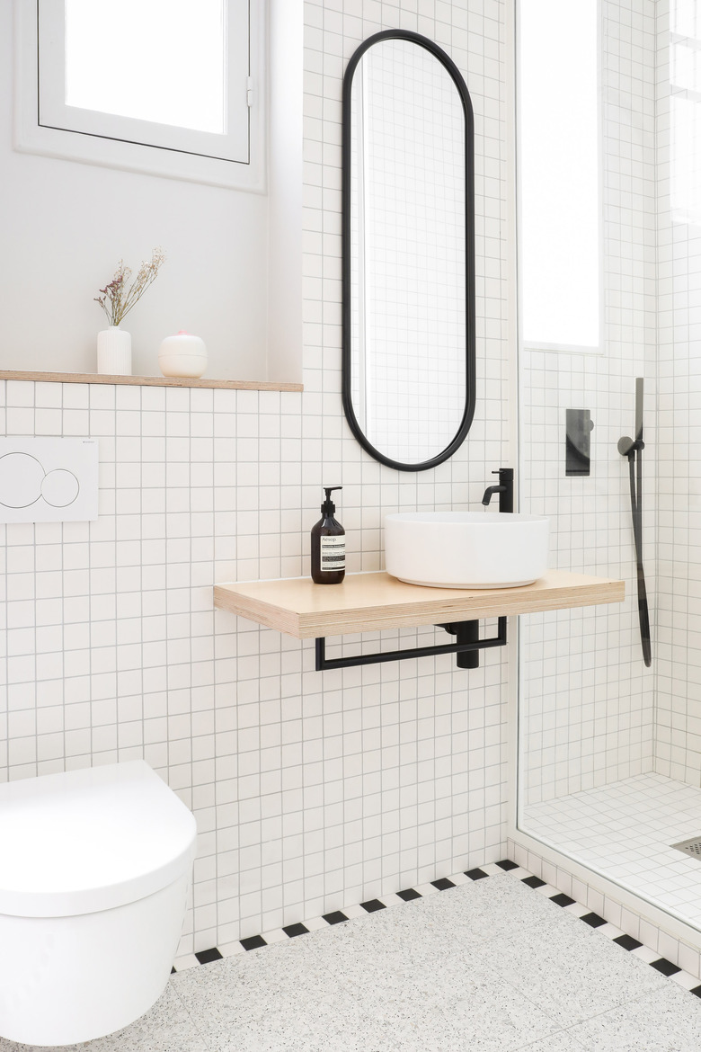
The apartment's bathroom was inspired by the Memphis Design Group. A black and white tile border defines the space and frames terrazzo tiles, which are a nod to the kitchen's countertops. The toilet and sink are suspended to help make the space feel bigger.
9. Nursery
The original kitchen was transformed into a nursery. Pinaud and Schwartzmann didn't want to add new wood floors that wouldn't match the existing ones, so they installed mustard-colored carpet that has a vintage look. The Maison Deux watermelon rocker and Djeco mobile add whimsy to the space.


