These Hues Will Be Popular This Spring 2021, According To The Experts
Spring is just around the corner, which means it's time to start thinking about how you can refresh your home with new decor! To help get your creative juices flowing, we chatted with color experts and designers to find out what shades will be big this season.
From bold hues to more classic choices, here's what they predict will be in our homes in 2021.
1. Quiet Comfort Colors
1. Quiet Comfort Colors
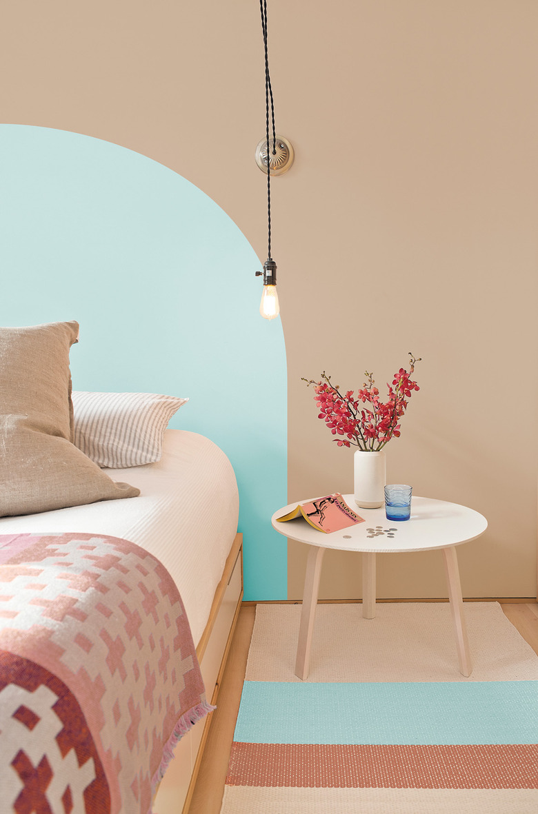
"When the world experiences events that cause unrest, anxiety and grief, we tend to naturally gravitate toward compassionate colors that allow us to create a comforting personal retreat from the world," Amy Donato, PPG's senior color marketing manager, tells Hunker. "We'll see these comfort colors take center stage this spring, as they offer a certain sense of familiarity and normalcy."
PPG's 2021 Palette of the Year embodies this trend perfectly. It comprises three quiet, earth-inspired hues: the warm neutral Transcend, the gingery Big Cypress, and the fresh Misty Aqua. "Used according to the 60-30-10 design rule — 60% of a room should be the dominant color, 30% as the secondary color and 10% as the accent — Transcend, Big Cypress, and Misty Aqua pair well with greenery, blonde or natural brown-toned woods, as well as layers of texture in the form," says Donato.
2. Earthy Cheer
2. Earthy Cheer
Now that we're one year into lockdown and there's hope on the horizon as vaccines are being administered globally, there's room for some optimism in our homes.
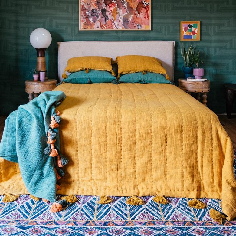
"We've found ourselves inside for quite a while, so a great way to reset your space and set the mood for spring is by surrounding yourself with cheerful colors," Jungalow founder Justina Blakeney tells Hunker. "I love to pull color inspiration for Mama Nature to invite the outdoors in ... a sunny shade of turmeric yellow, mellow sage or minty greens, and rich clay and terra-cotta tones are some of my go-to hues."
If you're not entirely ready to overhaul your home in this palette, consider using some bright colors as an accent. "Shake up your space and sprinkle in some springy colors by adding bold-hued planters, popping some fresh art in your frames, switching up your bedding for a lightweight quilt, and even swapping out throw pillows," says Blakeney. "Fill your rooms with fresh, foraged florals for a quick and easy seasonal swap."
3. Bold Statements
3. Bold Statements
There's actually quite a bit of precedent for bringing bold colors inside when it comes to spending time at home. "Looking back at a few golden eras of home entertaining, such as the Victorian era or the mid-20th century, people decorated their homes with bold and intense color palettes," wrote Modsy vice president of style Alessandra Wood in a blog post. "Perhaps as we lead lives that are more centered at home, we too are turning to more bold statements via color."
Such vivid hues are likely to conjure a sense of escapism. "The moody palettes might also remind people of their favorite restaurants or hotels, creating a subconscious, mental escape from one's own home," wrote Wood.
4. Blue, Blue, Blue
4. Blue, Blue, Blue
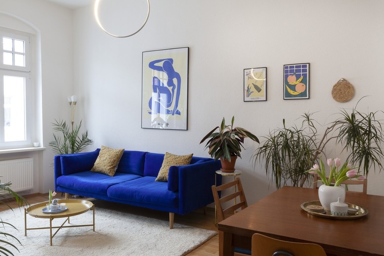
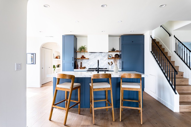
Blue is an extremely versatile color, fitting into all three of the aforementioned categories — it's no wonder Modsy creative stylist Karina Lameraner reports that it's the most requested color by clients year after year.
"Light Blue is a beautiful example of a blue tone that hits a neutral color palette with silvery undertones," she tells Hunker. "For those looking to go a bit bolder, Stone Blue is a stylist favorite for its rich, timeless quality. And finally, Scotch Blue is the perfect bold statement-maker to transform any accent wall into a fun and thoughtful focal point."


