25 U-Shaped Kitchen Ideas You Don't Want To Miss
Your dream kitchen might be huge with seemingly limitless space, but in reality, not many of us have that luxury. For your culinary remodel, you'll need to look at your current floor plan and decide what kitchen design makes the most sense for the space you're working with. There is the classic L-shaped kitchen layout that is built into a corner, with two walls coming together at a perpendicular angle like the letter "L". But many homeowners prefer a U-shaped kitchen, known for maximizing the kitchen triangle thanks to a three wall-setup lined with cabinets and appliances.
U-shaped cook spaces have plenty of pros. For one, it's great for workflow since you can glide effortlessly from your food prep area to your sink to your appliances with ease. You'll have tons of counter space, and storage will be easy-peasy with all those cabinets. Basically, it's a genius solution for small space-dwellers.
As with most things in life, U-shaped kitchens also have their fair share of cons. Since it's technically a galley kitchen, it can feel a bit claustrophobic at times. It oftentimes requires an open concept floor plan, so if that's something you don't have, a U-shaped kitchen may not work well in your space. And if your heart is set on a kitchen island, you'll need to move on — there won't be room for one here.
So, if you've been weighing the benefits of an L-shape and U-shape layout, scroll on for 25 inspiring ideas that will help you make an informed decision.
1. Turn the backsplash into the main attraction.
1. Turn the backsplash into the main attraction.
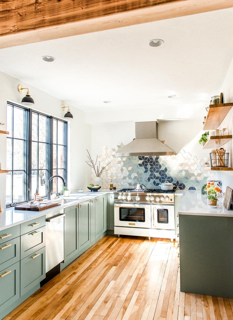
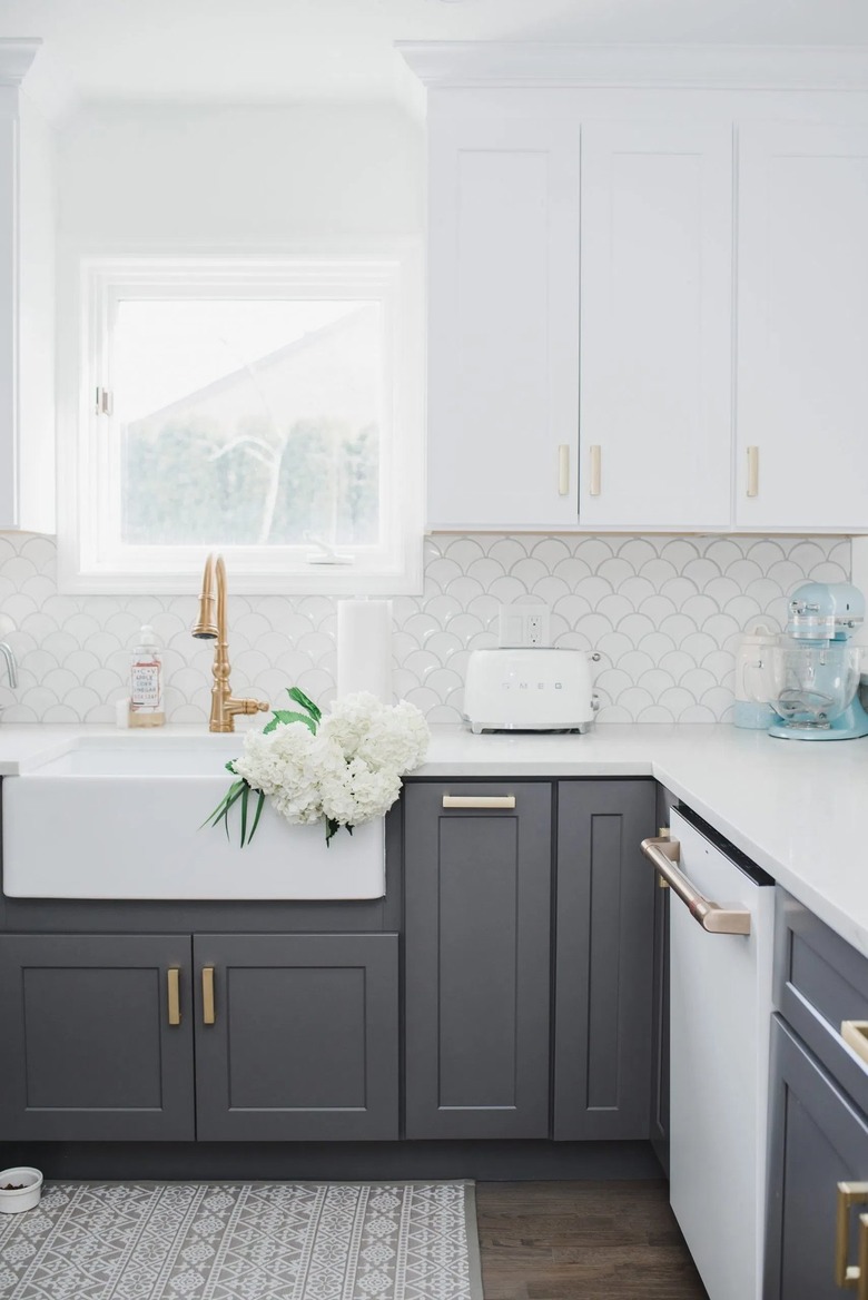
The nice thing about a U-shape kitchen design is that your eyes will automatically be drawn to the back wall. This means that you can add an oh-so-creative touch, like a contemporary tile backsplash. It's something that's seen in this inviting cook space belonging to Amanda of Heartbeet Kitchen. The white vintage-inspired stove serves as contrast alongside cabinets flaunting a pastel shade of blue-green.
2. Choose two different cabinet colors.
2. Choose two different cabinet colors.
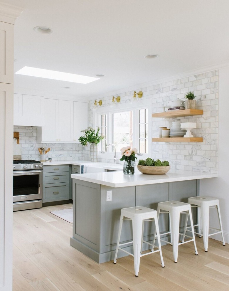
To create additional visual interest in your U-shaped kitchen, consider two different hues for your upper and lower cabinets. That's the approach Shea of Studio McGee took with the cabinetry in this culinary design, resulting in a two-toned combo of white and sage that looks perfectly airy. The stainless steel oven is a modern touch in an otherwise traditional kitchen.
3. Get creative with kitchen storage.
3. Get creative with kitchen storage.
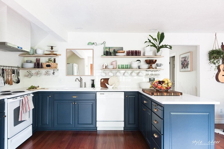
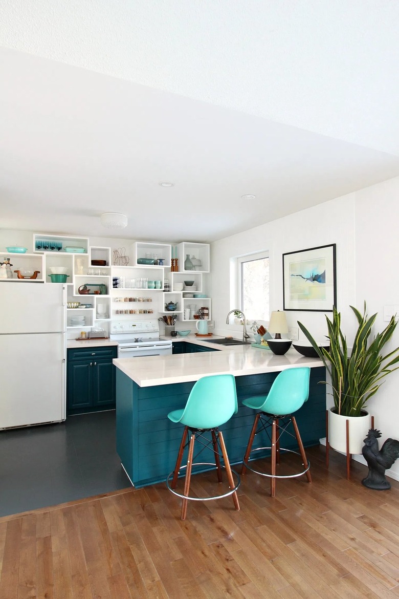
While a U-shaped kitchen design already offers lots of storage and counter space, if you need more, the layout also allows room for open shelving to give you even more storage space. In this renovation mastered by Angie of Style + Cheer, all the bases are covered when it comes to storage needs. A white dishwasher and stove reinforce the white walls and countertops to balance the dramatic blue cabinetry.
4. Make it simple.
4. Make it simple.
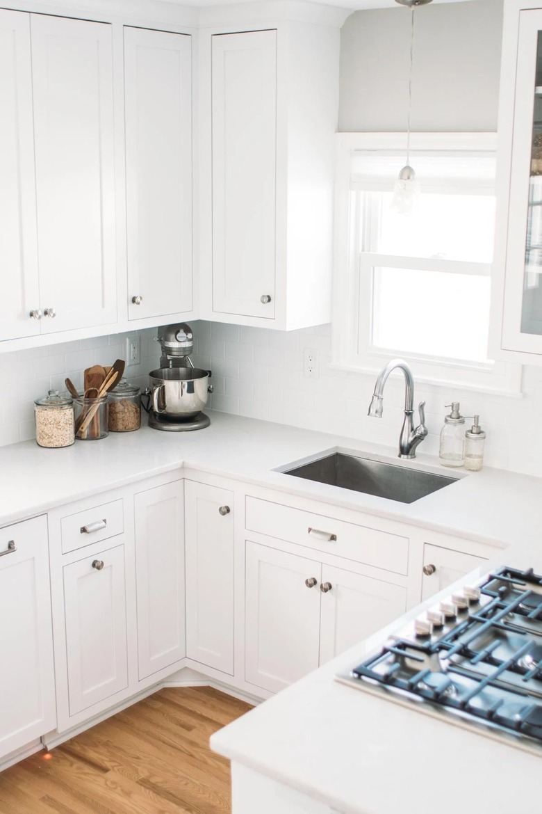
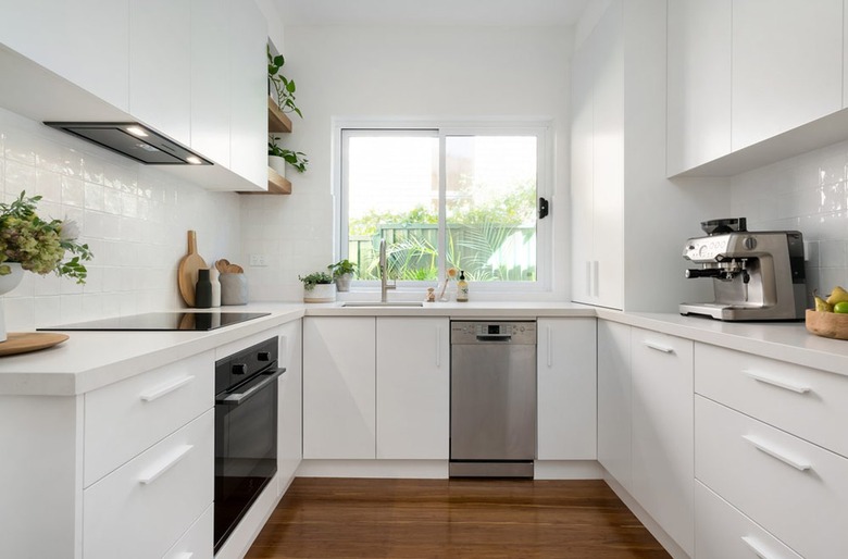
Small kitchens can also get in on the fun of a U-shaped layout. Since space is limited, keep things functional and only showcase the necessities. Go with white or another neutral color for your palette, and display minimal decor — you might be surprised to discover that your cook space appears larger than it actually is. In this all-white setup belonging to Lindsay of A Pinch of Yum, a stainless steel undermount sink and gas stovetop represent the ease and simplicity of a well-planned design.
5. Go with an eye-catching countertop.
5. Go with an eye-catching countertop.
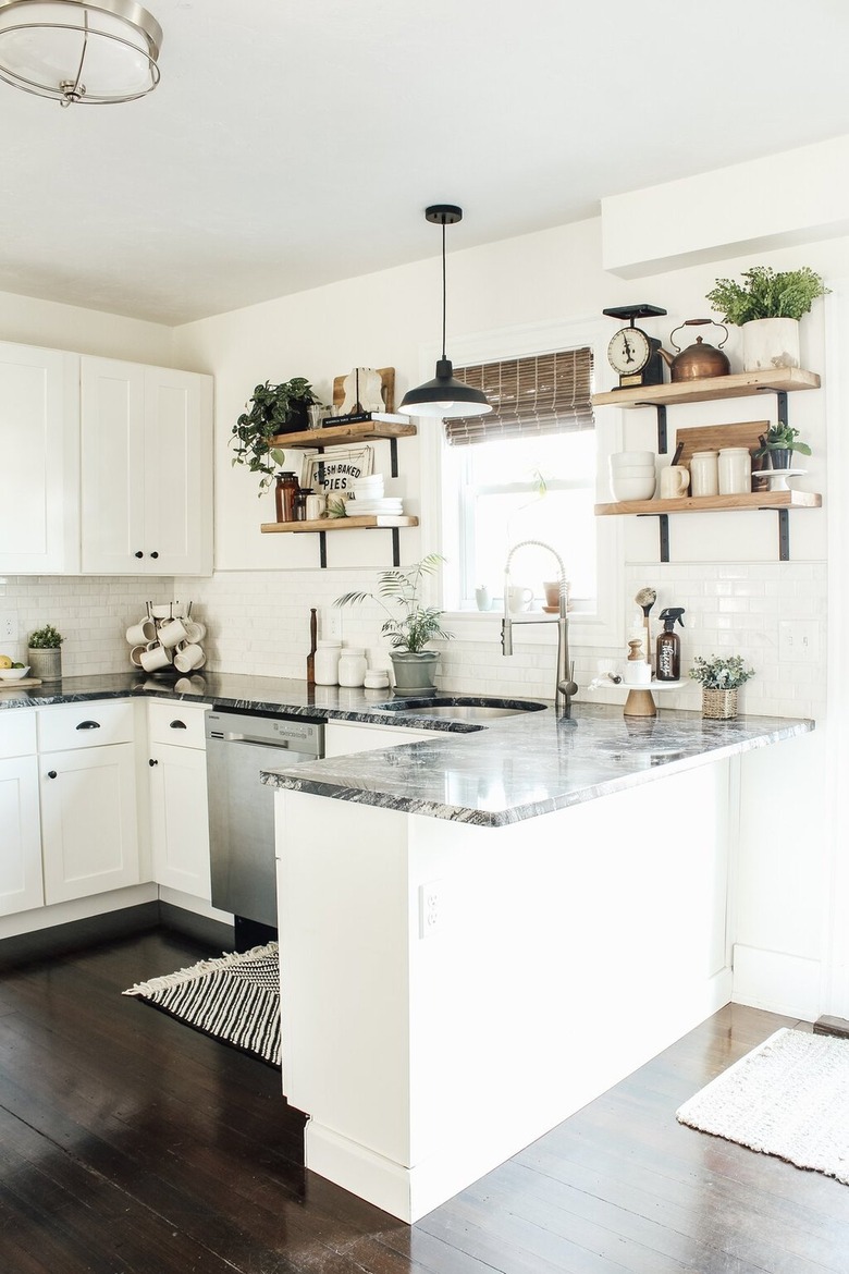
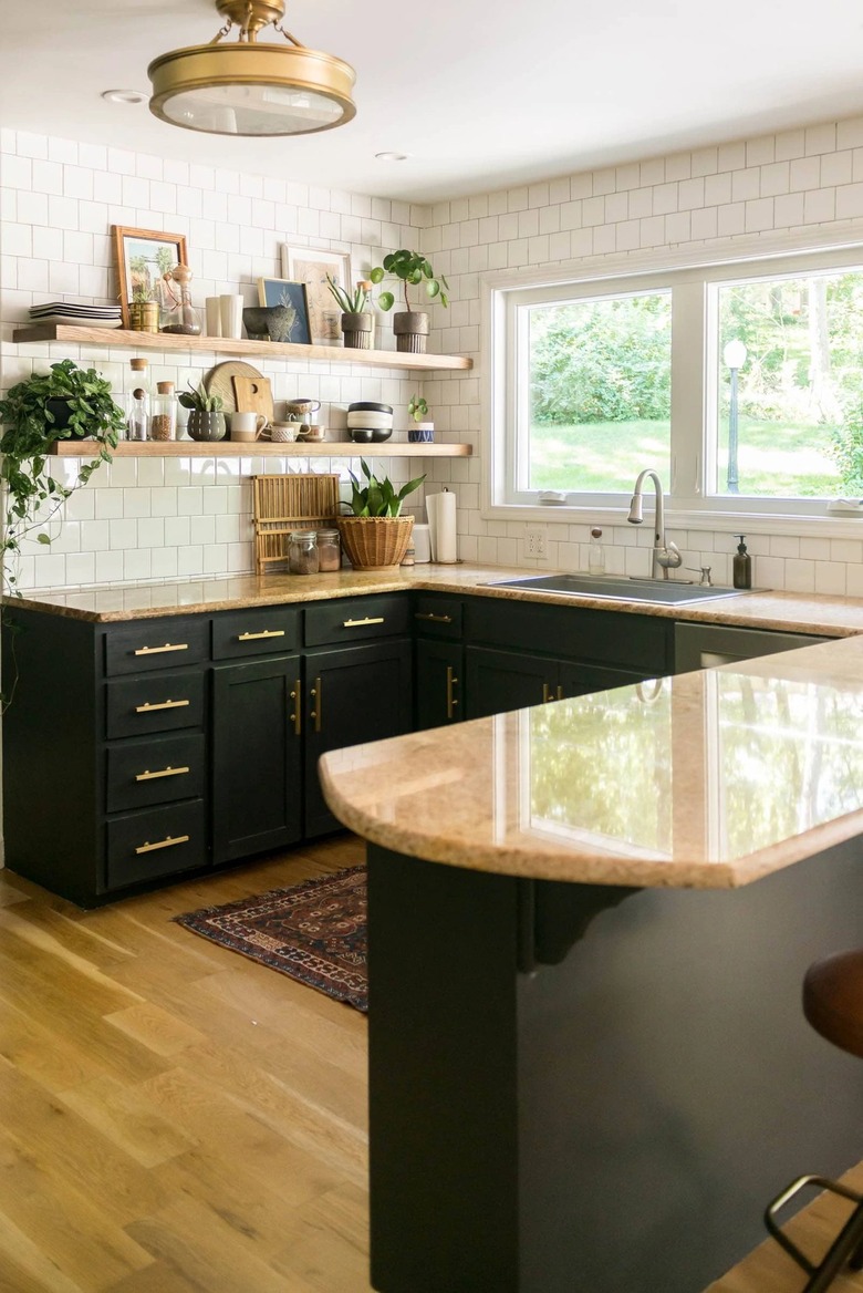
Since a U-shaped design allows for copious countertop space, you should consider this your opportunity to showcase a unique material. Go with something striking like black granite, which looks amazing when paired with stylish open shelving, as witnessed in this kitchen by Michaela Diane Designs. The stainless steel dishwasher and sink complement the dark countertops and black accents throughout.
6. Get matchy-matchy.
6. Get matchy-matchy.
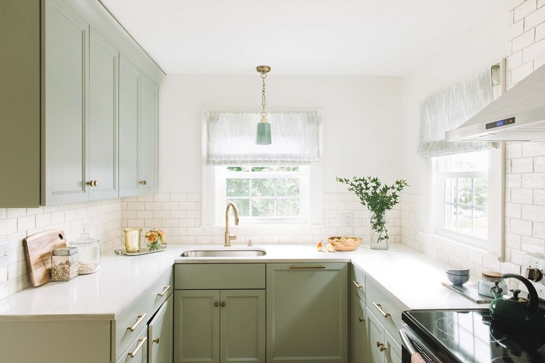
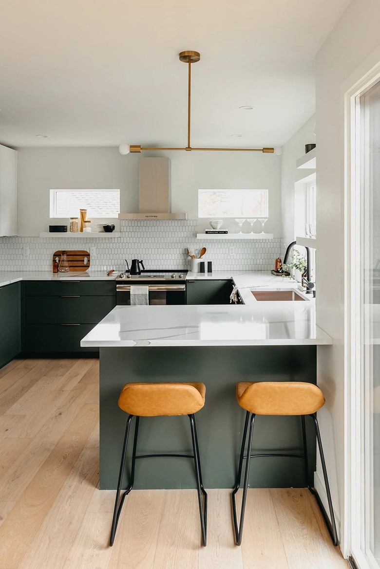
If you're working with a small space, you won't want to overwhelm your U-shaped kitchen design with a lot of fussy colors and decor. Instead, go for a totally cohesive look for your culinary makeover. For instance, in this design by Jennifer Justice Interiors, green is the dominant color that pulls everything together, from the cabinets to the pendant light. Lustrous brass details add warmth and a hint of glam.
7. Be clever with decor choices.
7. Be clever with decor choices.
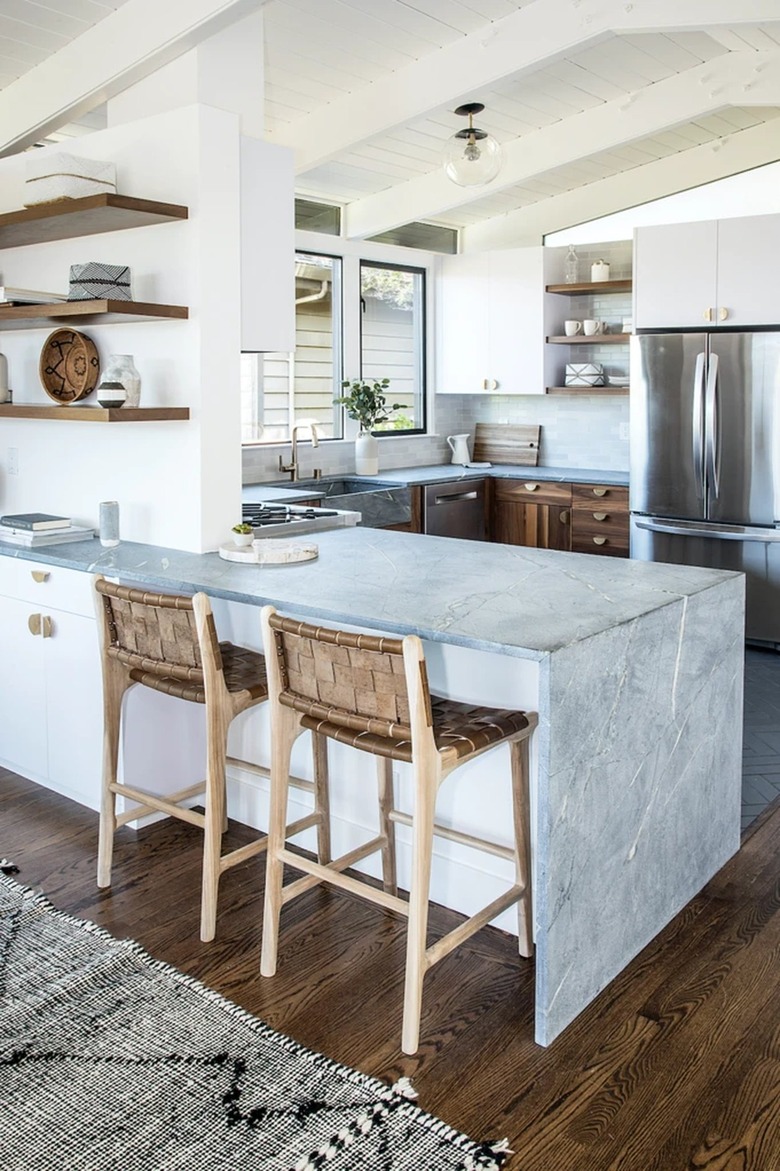
Just because you're working with a small space that doesn't mean you can't be creative. In this kitchen showcased by Saffron + Poe, the small U-shaped design spotlights artful elements that don't take up a lot of room, like modern drawer pulls, a midcentury-inspired ceiling light, and a waterfall breakfast bar. And there's even enough room for a stainless steel refrigerator, too.
8. Consider the workflow of your kitchen.
8. Consider the workflow of your kitchen.
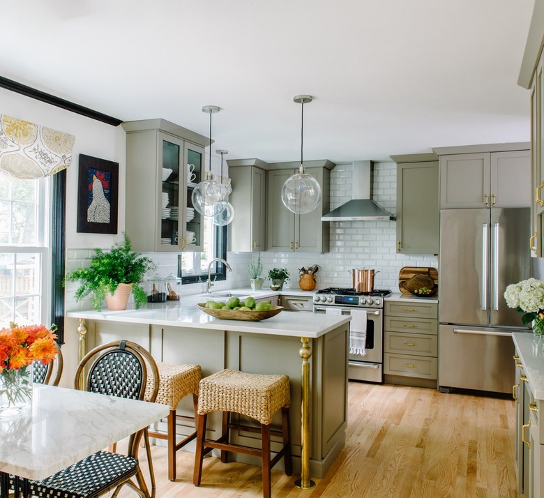
Before you start your renovation, think about how you will be using the space — consider the kitchen triangle. That will determine how your space should be laid out. This culinary design by Alison Giese Interiors is loaded with functionality and style, to boot. A stainless steel stove and matching hood take center stage among a sea of sage green cabinetry.
9. Warm things up with wood.
9. Warm things up with wood.
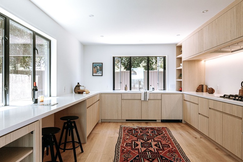
Top-to-bottom wood finishes, from the floor to the cabinets, are stylish and timeless in any kitchen, whether it's U-shaped or not. But it does happen to look particularly chic in this Scandinavian-inspired design. Subtle decorative accents add visual interest and a dash of contrast.
10. Weave in midcentury touches.
10. Weave in midcentury touches.
If you're short on space, that doesn't mean you have to skimp on style. Follow the lead of this kitchen by Tanya from Dans le Lakehouse, and showcase all of those mid-mod details you love with the help of a splashy color palette, retro counter stools, and unique shelving.
11. Consider a vaulted ceiling.
11. Consider a vaulted ceiling.
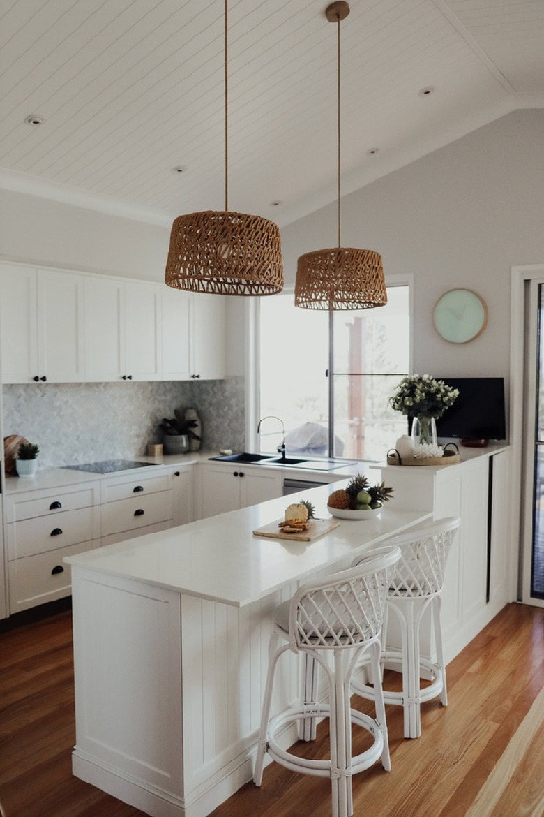
Perhaps you don't want a huge U-shaped kitchen, but you also don't want to feel claustrophobic. This is where vaulted ceilings (and some extra room in the budget) can prove helpful, as seen in this space crafted by Karen of A House Full of Sunshine. A smooth induction range blends in effortlessly with the other streamlined visuals.
12. Amp up the drama with black cabinets.
12. Amp up the drama with black cabinets.
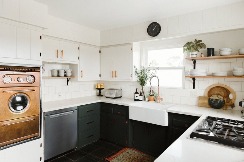
It used to be said that black hues make a space feel more closed-in, but that's just not true. Black paint can actually work beautifully in small spaces, like a U-shaped kitchen, adding a welcome dose of drama and anchoring the overall look. Let Ashley of Bigger Than the Three of Us show you how it's done.
13. Make it light and bright.
13. Make it light and bright.
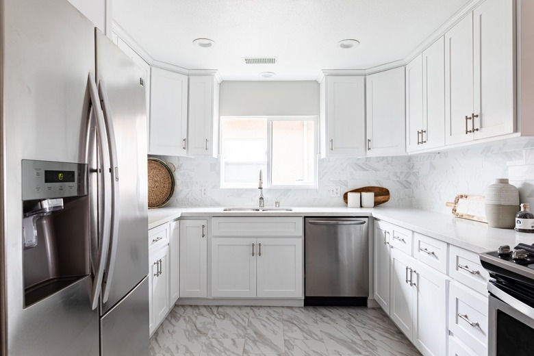
If your U-shaped kitchen feels closed-in, the quickest way to make it feel airier is to bring in as much natural light as you can and go light with your finishes as well. Think: white cabinets and a white marble backsplash — two details displayed beautifully in this cook space. Stainless steel appliances complete the look and mesh well with the white palette.
14. Ponder flat panel cabinets.
14. Ponder flat panel cabinets.
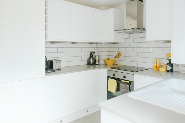
Another way to open up a U-shaped kitchen design is to choose flat panel cabinets. Adam of Rock My Style went without panels and hardware, resulting in a clean and minimalist look that's free of distraction. A sleek stove and range hood fit in seamlessly with the streamlined cook space.
15. Punctuate the layout with stylish stools.
15. Punctuate the layout with stylish stools.
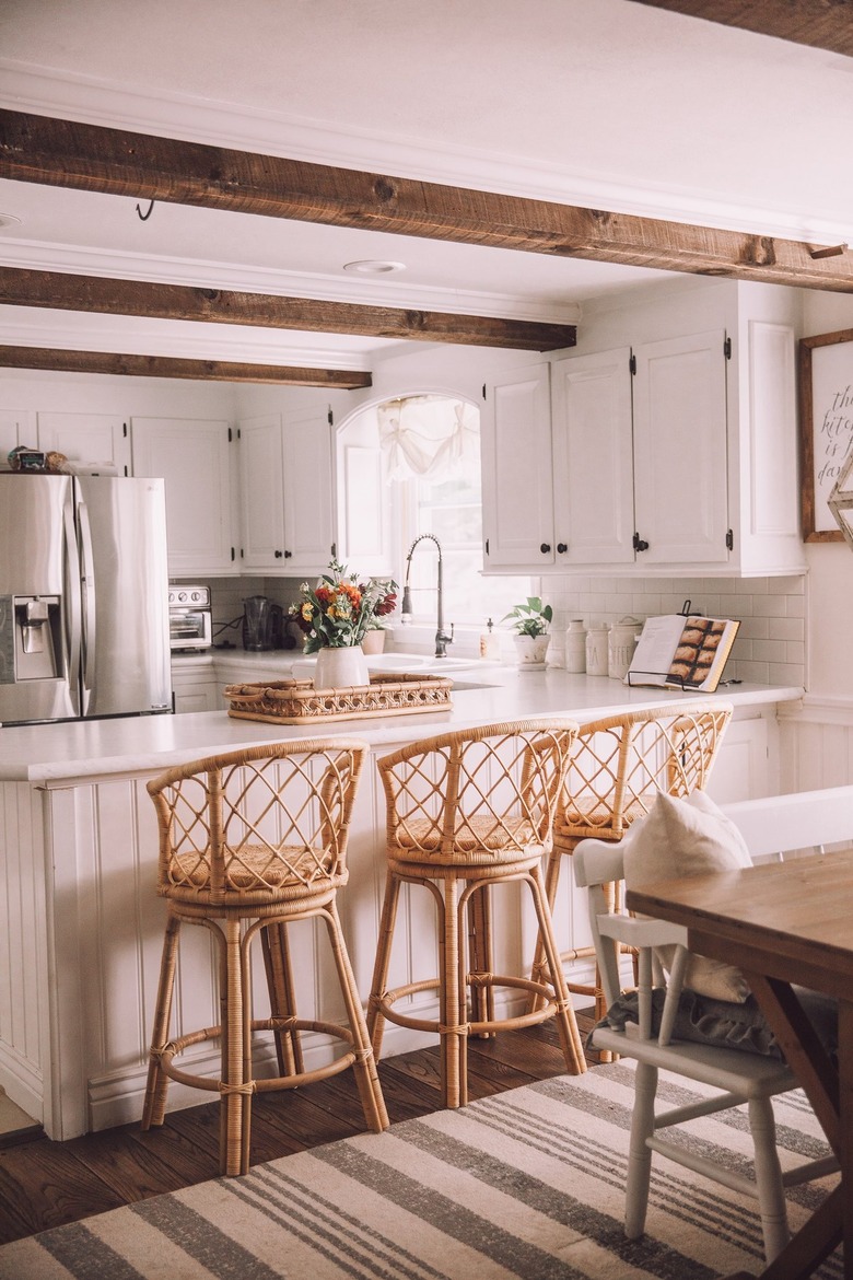
We have to say, this Lynzy and Co. U-shaped kitchen really came together quite nicely. The rustic ceiling beams and trio of gorgeous rattan bar stools complement the wood flooring and incorporate dreamy texture. Additionally, the use of these natural materials adds just enough warmth to balance the mostly white space. And bonus: Bar stools are a great way to add decor to the outward-facing side of your kitchen.
16. Pull your kitchen away from the walls.
16. Pull your kitchen away from the walls.
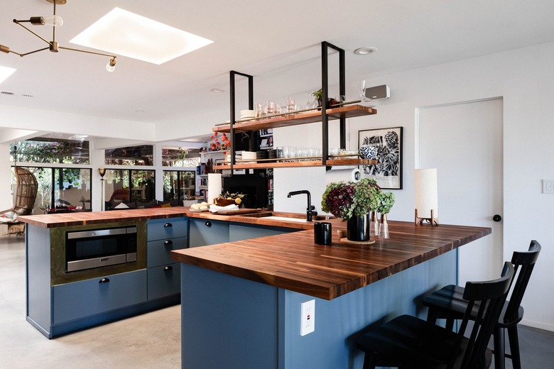
If you have more room than you know what to do with and you're all about the flow in your home, consider placing your U-shaped kitchen right in the center of the room. It'll allow people to pass on both sides while keeping the space open. A built-in microwave and artful shelving hung from the ceiling are just a couple of the handy, yet stylish, touches seen in this luxe design.
17. Save space with slim-profile appliances and cabinets.
17. Save space with slim-profile appliances and cabinets.
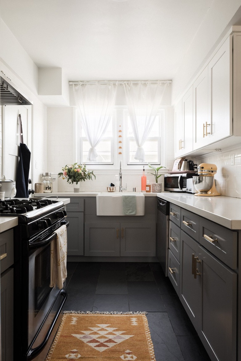
In a teeny-tiny U-shaped kitchen, it's a wise idea to go with slim-profile appliances and cabinetry. Sizing down is an excellent way to maximize your space, as proven by this kitchen from Galit and Leah of Just In Place.
18. Display a striking chandelier.
18. Display a striking chandelier.
To give your U-shaped kitchen a decorative focal point, think about hanging an eye-catching chandelier. The contemporary ceiling fixture in this Copeland + Co. setup looks absolutely stunning. And don't be afraid to mix metal finishes — like the brass chandelier and stainless steel oven and range hood seen here — for a high-style look that doesn't feel matchy-matchy.
19. Think onwards and upwards.
19. Think onwards and upwards.
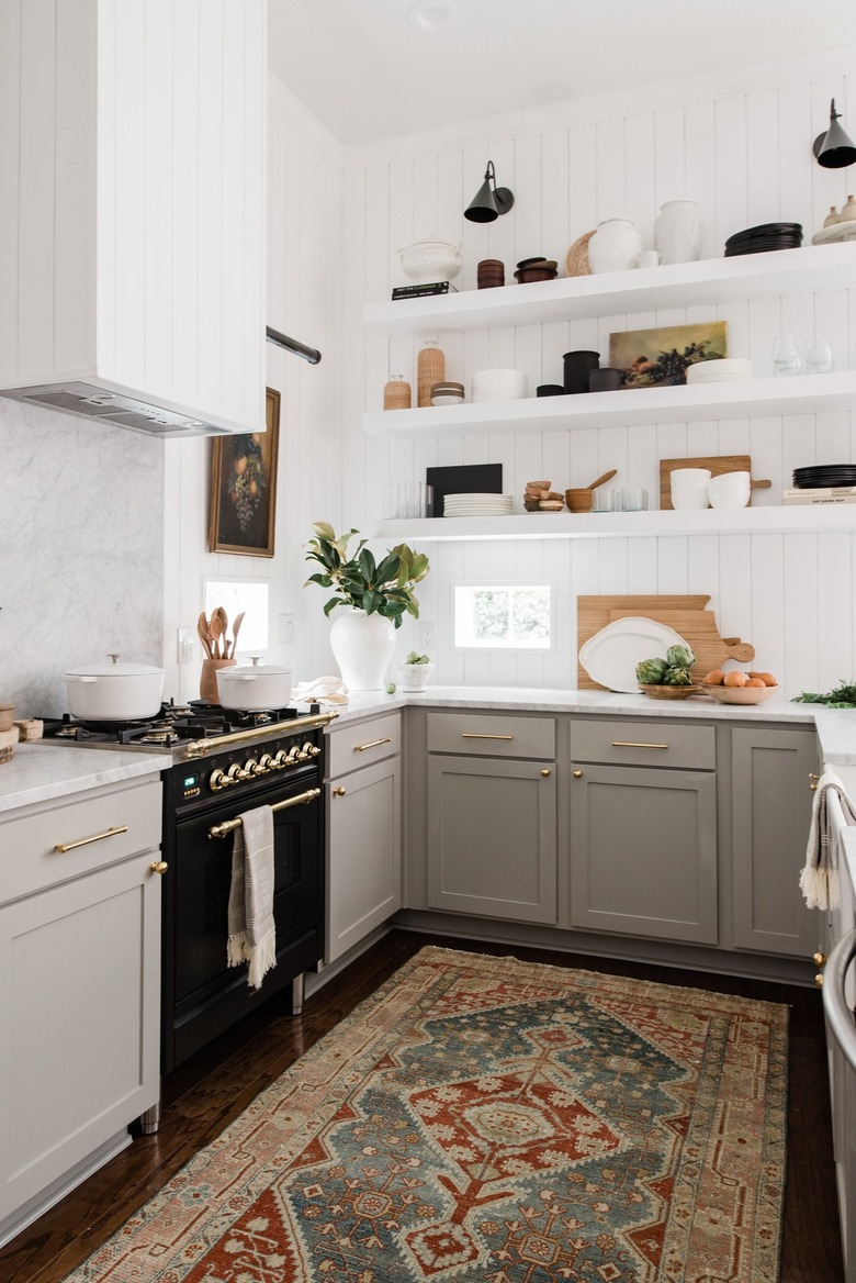
While a U-shaped kitchen design might not have tons of floor space, you probably have some wall space to spare. Here, you'll want to go vertical with shelving and decor à la this stunning space by Anastasia of The Identité Collective. In black and brass, a vintage-style oven seems like the perfect choice to complete this vintage-inspired setup.
20. Opt for classic white tile.
20. Opt for classic white tile.
When in doubt, white tile for a backsplash is always a good choice. It looks streamlined and clean, and it essentially goes with any decor style, as proven by this country kitchen.
21. Center the layout around a window.
21. Center the layout around a window.
If you are able to rearrange your kitchen layout, line up the bottom of the "U" in your U-shaped kitchen with a window. It'll bring in all that lovely natural light, something that makes this culinary space belonging to Helen of Style Inherited look even brighter.
22. Liven up the flooring.
22. Liven up the flooring.
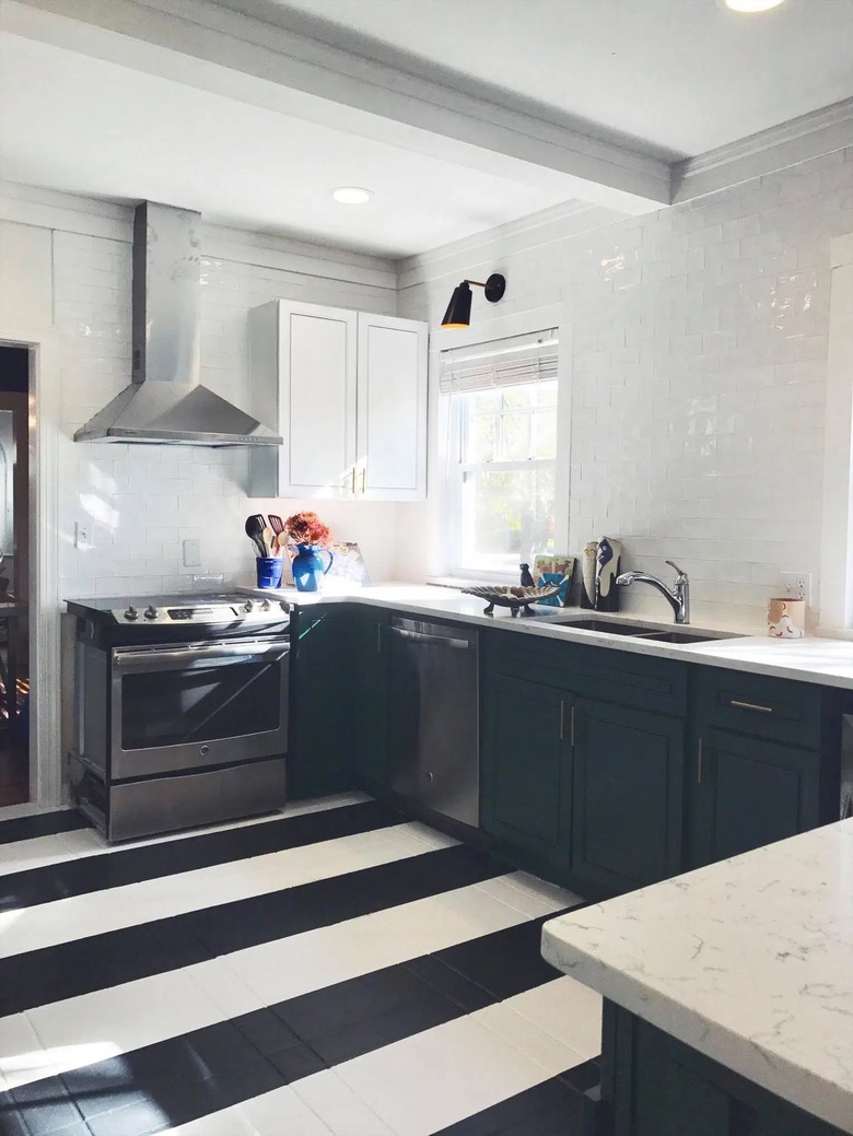
Perhaps your U-shaped kitchen is feeling, well, a bit flat. To spice up the visual appeal, ponder painting the floor in black-and-white stripes, which is what Virginia of That's a Good Find did in her cook space. Or, if painting the floor is not your cup of tea, go with tile flooring in a graphic pattern.
23. Don’t be afraid of color.
23. Don't be afraid of color.
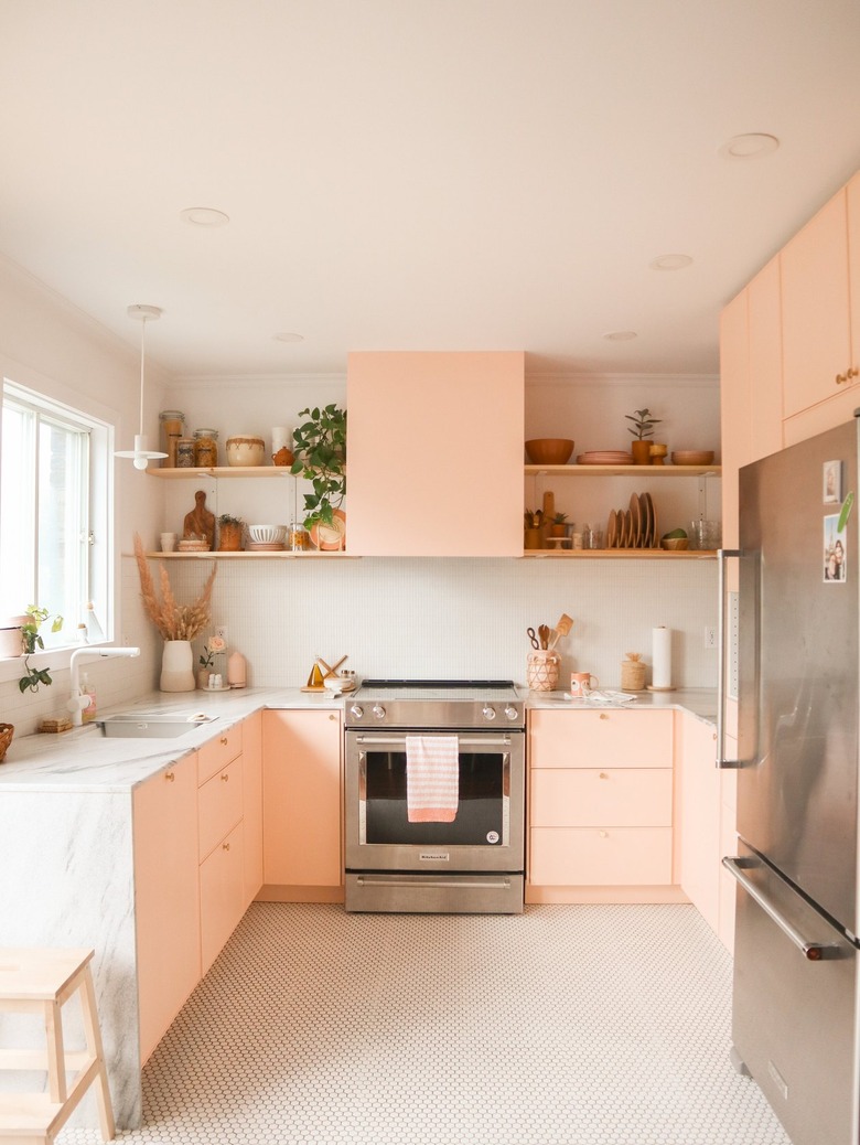
Van and Félix of Fleur Maison went with what might be considered "too much" color for their U-shaped kitchen, but the end result is a pleasant pink wonderland. Follow their lead and balance the vibrant hue with neutral finishes like marble countertops, white walls, and wood shelving.
24. Place a dining space alongside the kitchen.
24. Place a dining space alongside the kitchen.
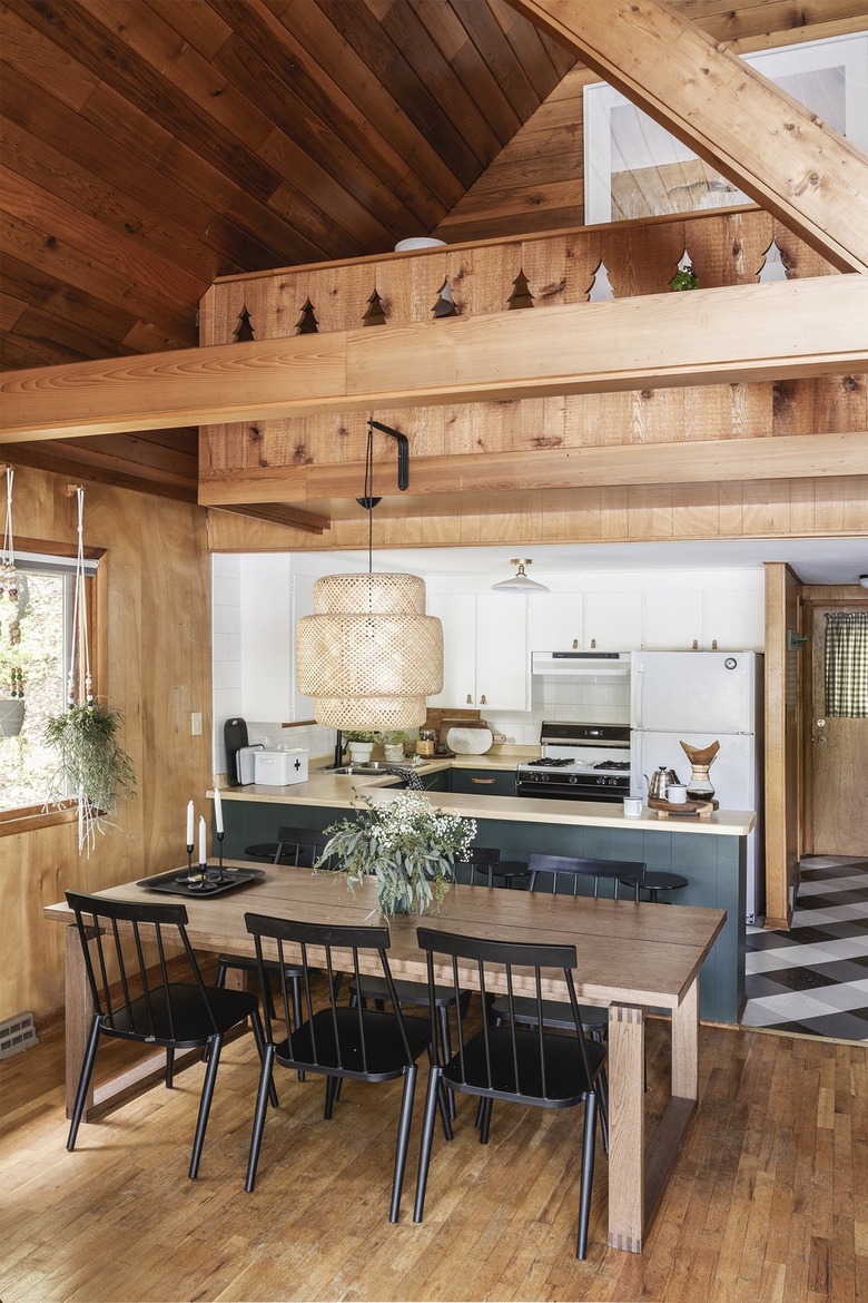
To keep things cohesive-looking with your U-shaped kitchen, place a dining area right next to it, like Alison of Deuce Cities Henhouse did in this cabin. It'll make serving meals that much easier and it looks pretty good, too.
25. Hang multiple pendant lights.
25. Hang multiple pendant lights.
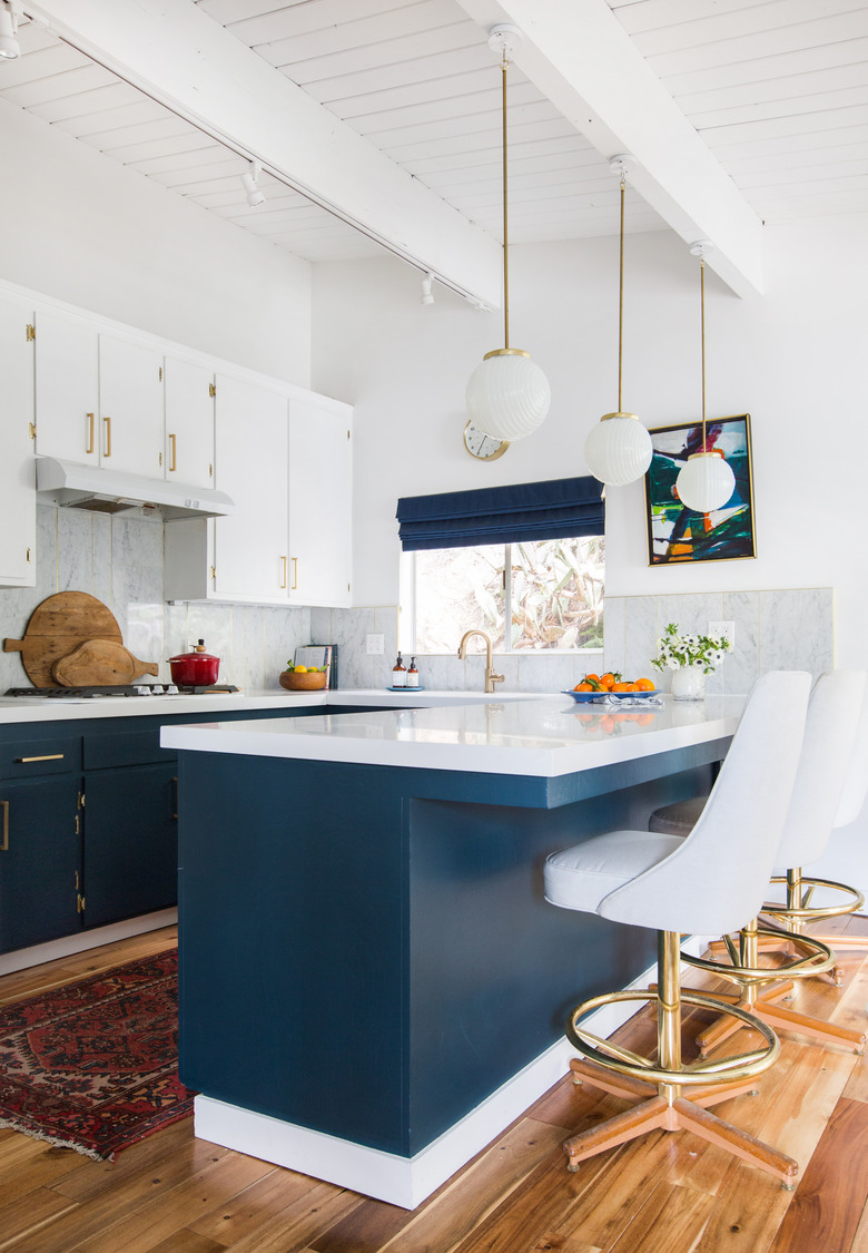
A U-shaped kitchen tends to have a rather sizeable peninsula, which is great if you want a big kitchen bar, and you can make sure it's fully illuminated with the help of multiple pendant lights. Emily Henderson hung three midcentury-inspired fixtures in this cook space, which provides more than enough light.
In Conclusion
In Conclusion
U-shaped kitchens can be an ideal choice for small spaces but do require some planning and thought before executing the idea. It's also helpful to consider the fact that there are key differences between small, medium, and large layouts.
For instance, a small U-shaped kitchen will require you to be more thoughtful with the size of your appliances and cabinetry layout — but this is really no different than any other small kitchen. A medium cook space will afford a bit more wiggle room for larger appliances, extra cabinets, and if you desire, a sizeable peninsula to use as a breakfast bar. However, you'll still only be able to fit a couple of counter stools. With a large U-shaped kitchen, the sky's the limit. But even with all that room, keep in mind that an island will still likely not be possible.
Here are some top takeaways to remember about U-shaped kitchens:
- U-shaped kitchens are just the thing for small
spaces, but do require careful planning. - They offer tons of counter space and you can
efficiently go from one workspace to another. - They're not the best choice if you desire a
kitchen island. - A U-shape is generally not ideal if you have a
large family who likes to gather in the kitchen. - A small or medium U-shaped
kitchen is really best suited to small households.
