This London Apartment Uses Mirrors And Pops Of Color In Energetic Ways
Who: Studio Ben Allen
Where: East London
Style: Experimental and eclectic
For architect Ben Allen, renovating the two-story maisonette he shares with his wife was a chance to create a design laboratory that could be a testing ground for ideas. Set in a Brutalist high-rise designed by architect Denys Lasdun in the 1950s, the flat had last been renovated in the 1990s in a minimalist, open layout — and it was ready for an update. Allen wanted to return the space to its original floor plan.
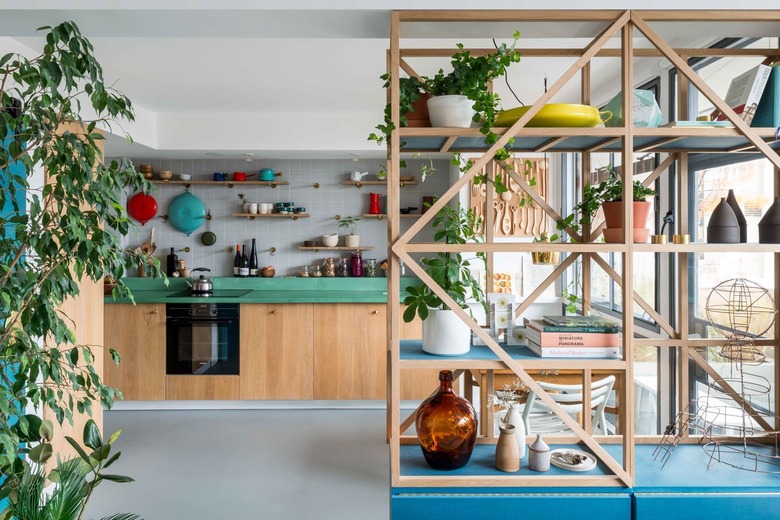
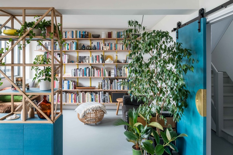
"The bathroom layout is the same (albeit looking very different) and the galley kitchen matches the original layout," says Allen. "In the case of the living room, which was divided from the kitchen in the original flats, we created a more permeable division of the spaces with a trellis shelving unit that acts as shelves, a storage cupboard, a place for houseplants, and a screen."
Along with the new footprint, increased storage, improved thermal performance, and an updated bathroom were on the list of must-haves. While the apartment was an opportunity for experimentation, Allen also had to balance play with livability.
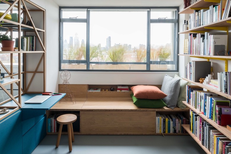
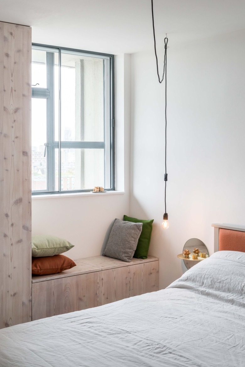
"As with much of our work the more radical ideas come together with practical considerations over the course of the project," he says. "For example, the window seats in the living room and bedroom were storage solutions."
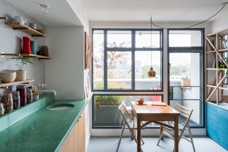
Allen infused the space with earthy, primary colors and natural materials to complement the large windows and abundant natural light. The rubber floors and gray tiles provide a neutral foundation for colorful accents.The kitchen counters are green-pigmented concrete and the shelving unit has a bright blue base.
Having himself as a client meant that the architect could take his time and set his own deadlines.
"We did the work in a number of phases so it look longer than most of our projects (my wife was amazingly patient) and as the budget was limited we lived in the flat while the work was being carried out. I would never recommend this to our clients!" he says. "In the end it benefited the project, as we had more time to ponder decisions and get used to living with completed parts while considering the next step."
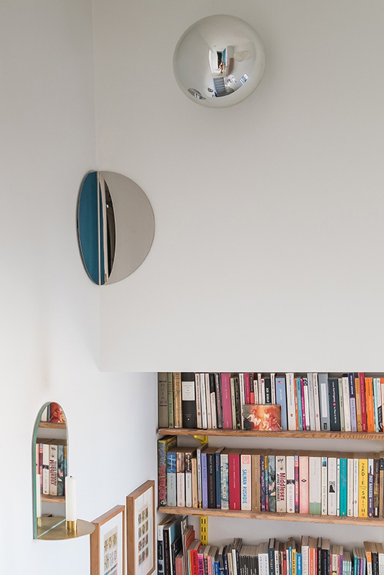
Allen and his team took inspiration from the Sir John Soane's Museum in London as well as the architect's art collection, gifted to him when he worked with the artist Olafur Eliasson. Both influences led them to incorporate mirrors into the design — in the form of nightstands, a vanity, and an installation in the corners of the stairwell.
"The idea of the corner mirrors was to dematerialize some of the solidity of the concrete walls in a playful way," says Allen.
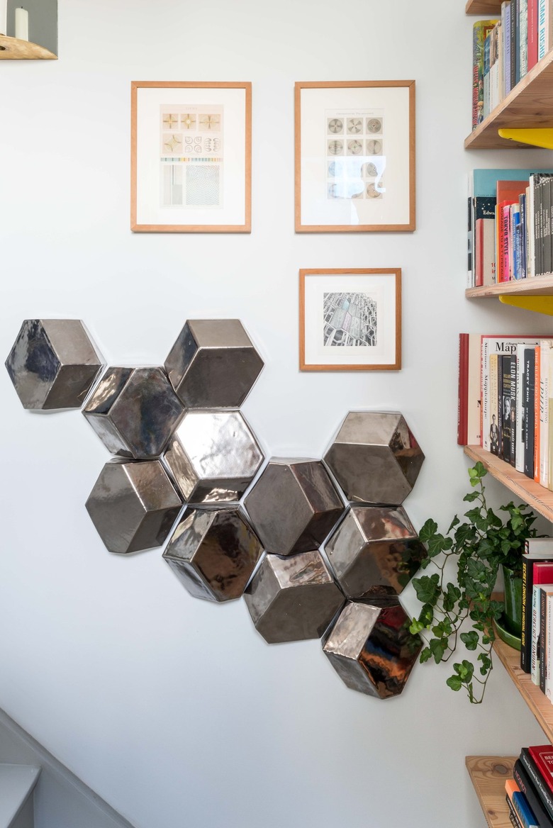
Ceramic tile samples were transformed into an artful installation in the hallway.
The primary bedroom has a built-in storage bench and bespoke brass and mirror nightstands. The custom headboard and cushions are covered in Kvadrat fabrics.
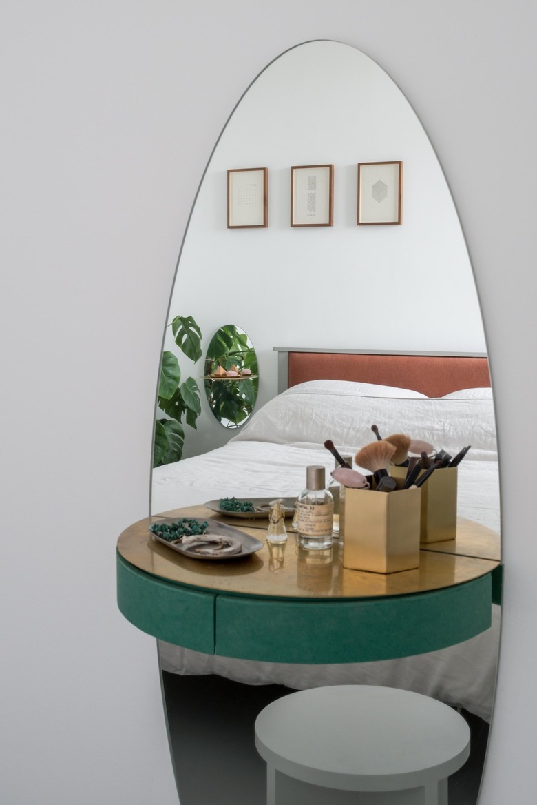
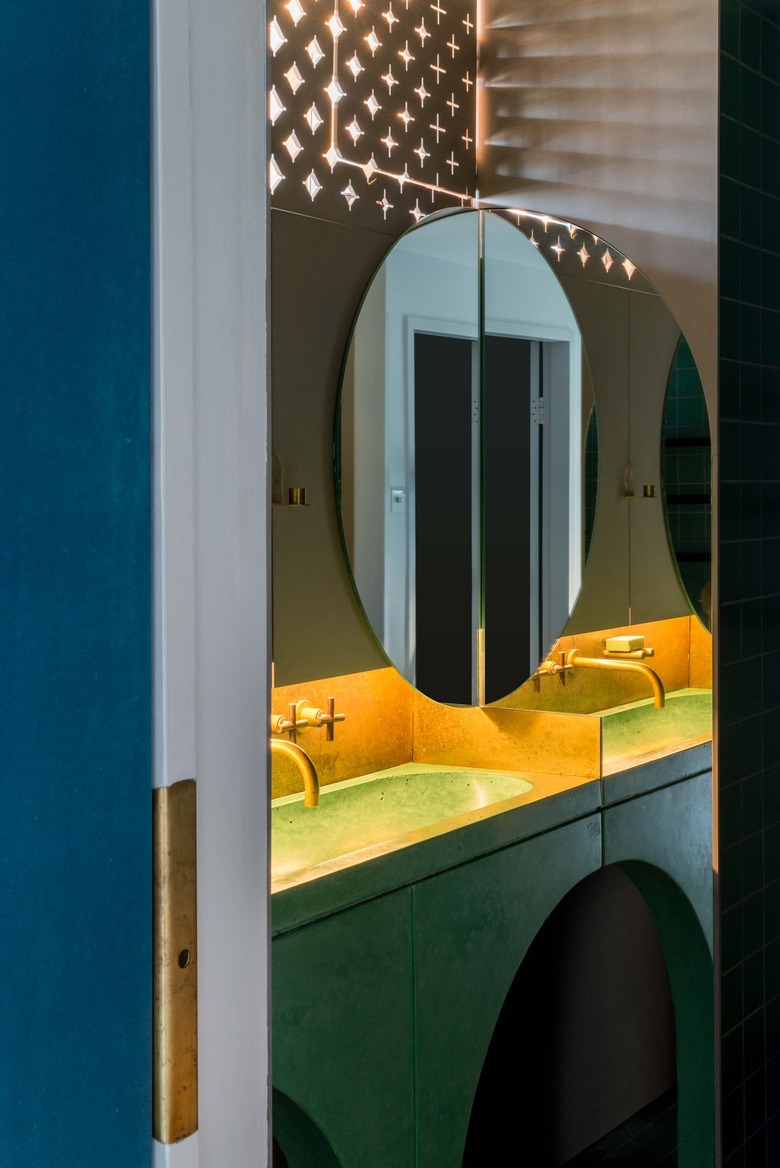
The firm designed a custom vanity with an elliptical mirror, brass shelf, and green fiberboard drawer.
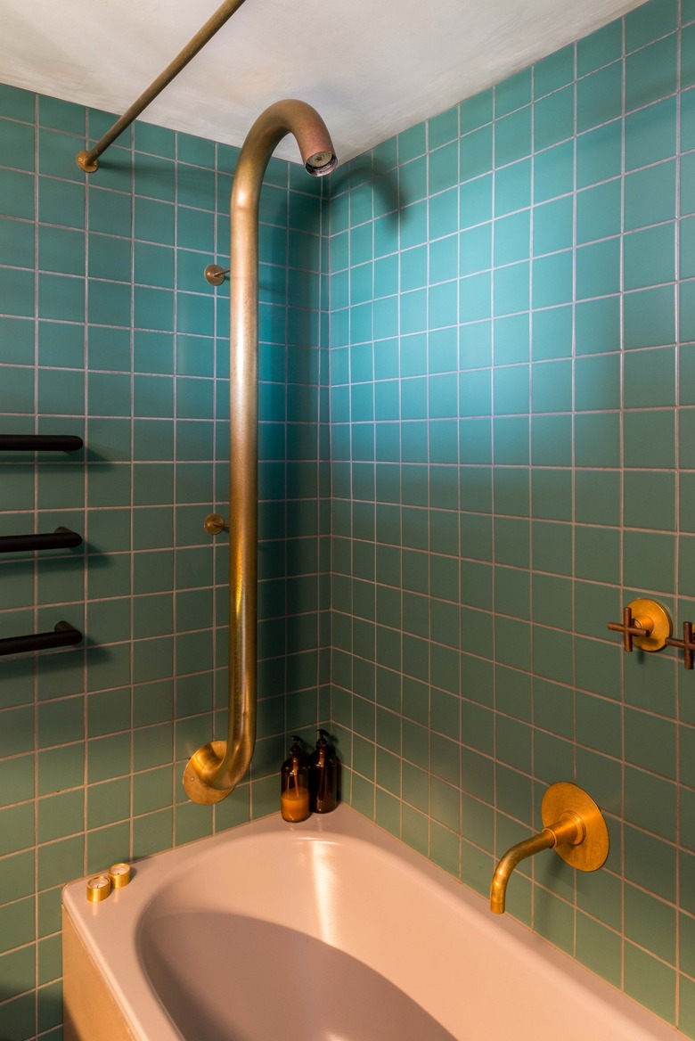
The primary bathroom was lined with green Villeroy & Boch tiles and outfitted with a custom brass shower. The Dornbracht taps and faucet were stripped back to their copper bases.
"We wanted materials that would get better with age," Allen says.
The architect designed the bathroom to be darker to contrast with the brightness throughout the rest of the home. Light peeks through CNC-cut fiberboard; the green concrete sink was paired with a brass backsplash.
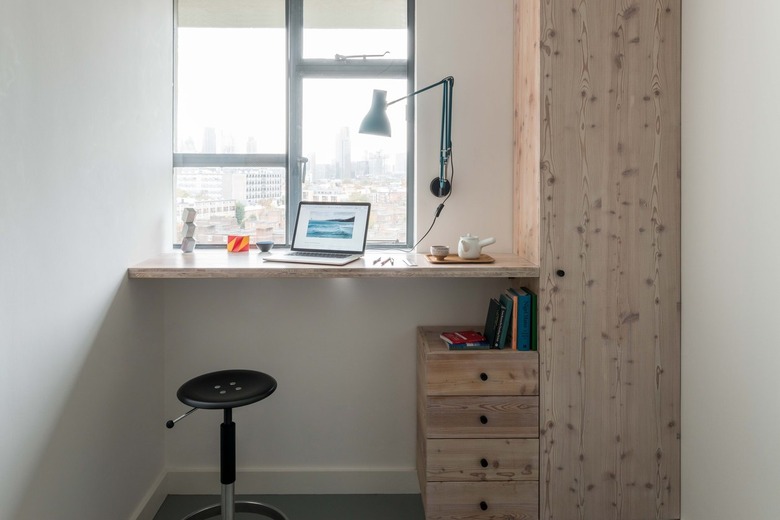
The second bedroom has a built-in standing desk. Warm woods, including oak and larch, were additional materials that Allen incorporated throughout the project.
