Farrow & Ball Lovers, This London Home Is For You
When renovating a Victorian terraced property in the Stoke Newington area of London, architecture and design firm Studio Merlin made storage the top priority. "The overarching goal was to create a 'home for everything,' which led to the creation of a 'spectrum of storage compression' concept," says Josh Piddock, founder of Studio Merlin.
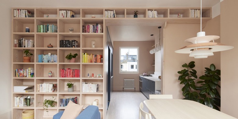
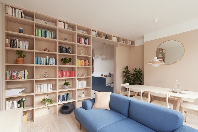
The firm devised spots for infrequently used items, keeping them out of sight, as well as display areas, such as the floor-to-ceiling Douglas fir bookcase that lines a wall in the living area. Focusing on a variety of storage solutions, notes Piddock, "allowed us to house each object in line with its value and access requirements on a daily basis, reducing clutter and better composing each space."
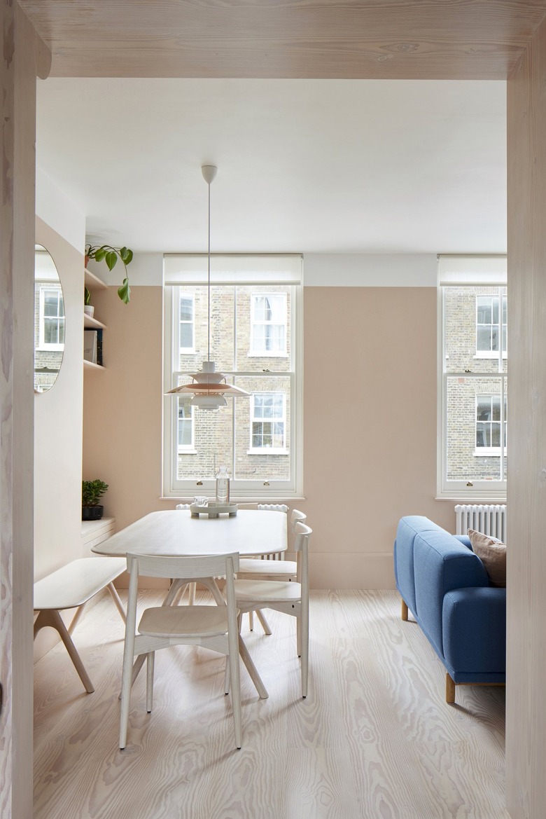
Piddock and his team reconfigured the first floor from two rooms with two doorways into an L-shaped living, dining, and kitchen area. They also "replaced all windows to focus views out to the surrounding Victorian terraced buildings, which now feel like a part of the flat decorations," he says.
The clients wanted a minimalist design but didn't want the home to feel austere. So Piddock worked to create a warm, colorful, simplified space. "We call the color palette 'Pastel Franco' in the kitchen/living space due to its nod to the French flag," he says. The dining area was outfitted with a table, chairs, and bench by Ercol, as well as a Louis Poulsen P5 pendant light.
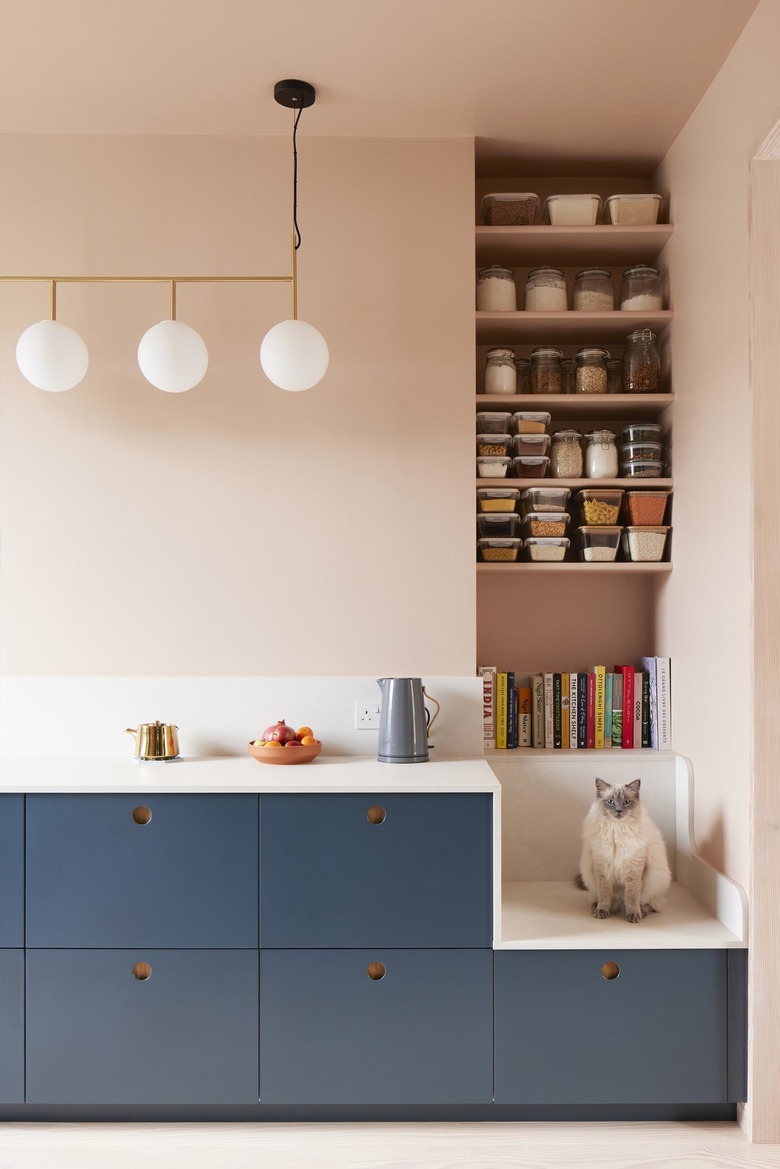
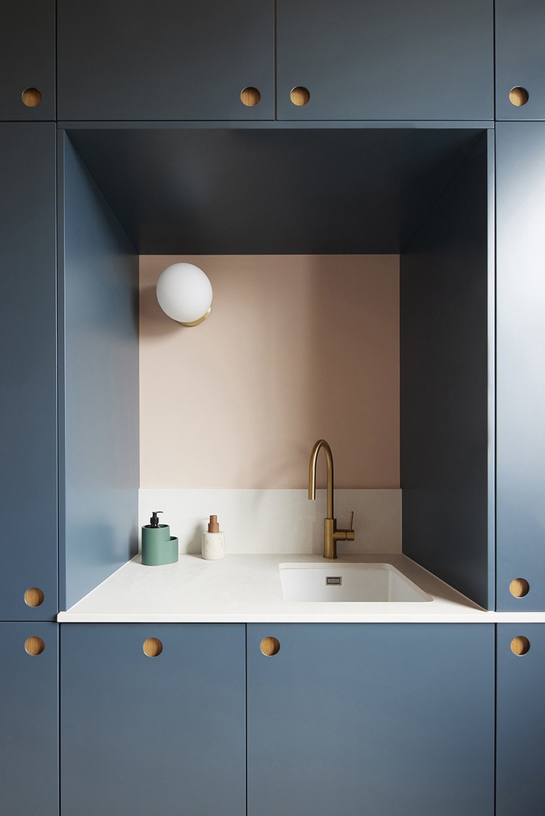
Piddock streamlined the kitchen by concealing the appliances behind the same Reform fronts as the IKEA cabinet bases. The Caesarstone countertop extends down onto the built-in seat and the light fixture is by Menu. "We wanted to harmonize each space and thought carefully about how rooms and materials within them link together throughout the flat," says Piddock. "For example, the Douglas fir floor was chosen to blend subtly with the plaster pink paint color of the kitchen/living room where there is a lot more going on in terms of furnishings."
The walls and cabinets were painted in Farrow & Ball's Setting Plaster and Hague Blue, respectively. "The kitchen suits all of our clients' needs and also doubles up as a flexible space for doing yoga, arts and crafts, etc," says Piddock. "The view from the door entering the room is a lovely thing to come home to."
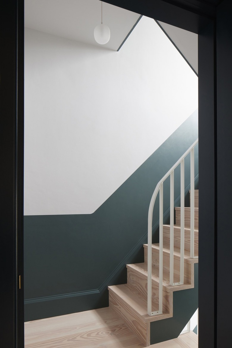
"In the stairs we used an off-white [paint] called Blackened to add a sense of calm as one ascends to the upper floors," explains the architect. "The lower color is Inchyra Blue, which creates a fresh forest-like feel, complemented by the Dinesen Douglas fir timber stairs."
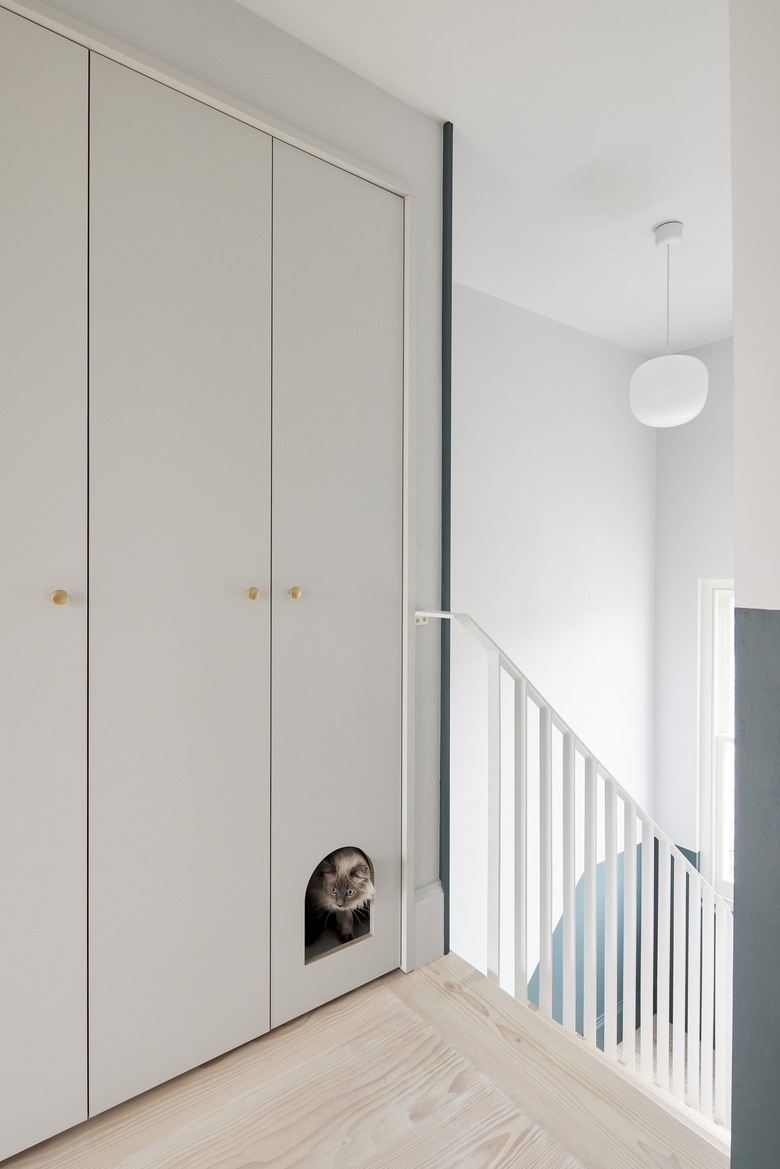
The architects added a wall of closets at the top of the stairs. "The integrated cat flap accessing the litter tray is the best thing since sliced bread," he says.
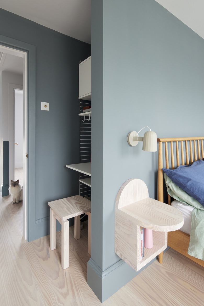
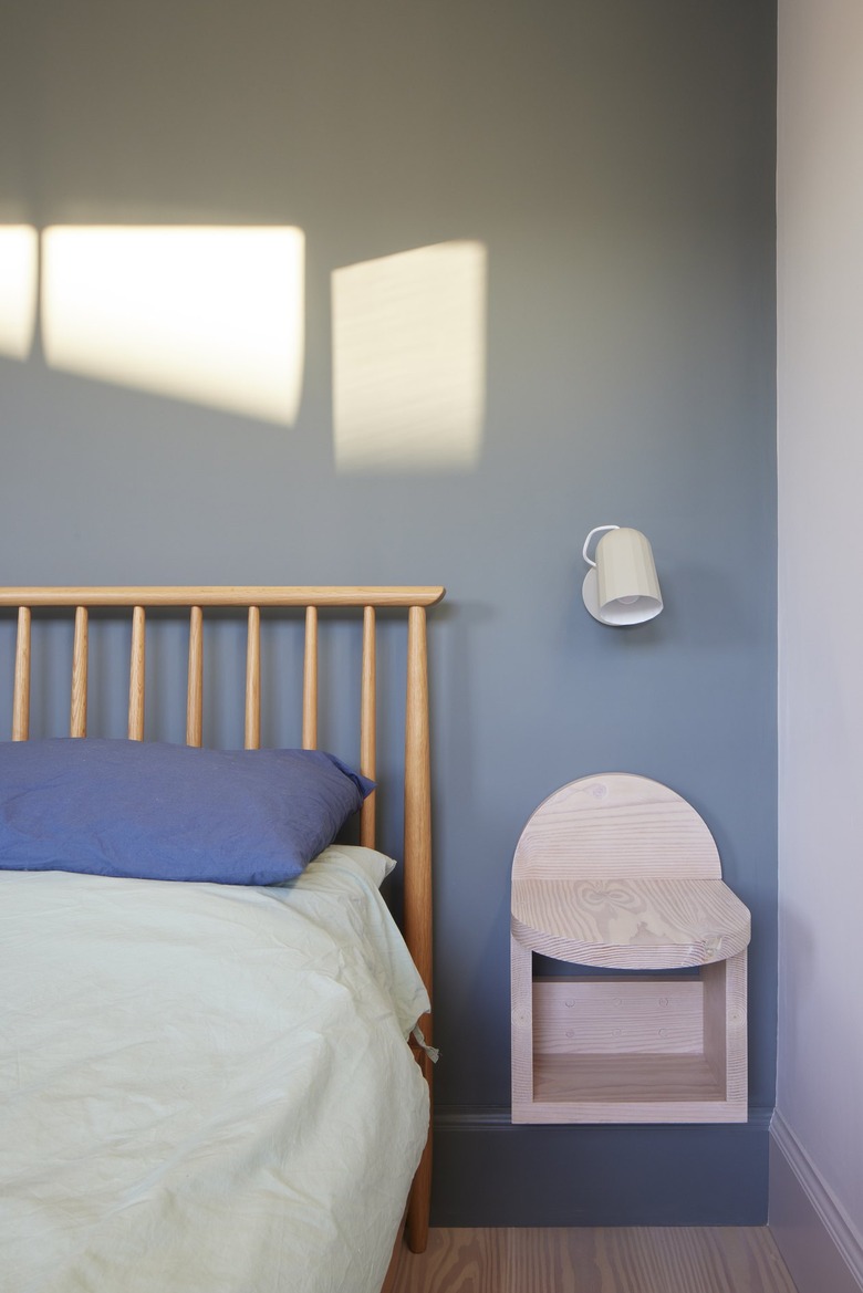
A small workstation with a Douglas Fir stool and String Furniture desk was tucked into the entrance of the bedroom. The space is outfitted with an Ercol bed, Studio Merlin bedside table, and a Hay wall light, and the walls are painted in Farrow & Ball's De Nimes.
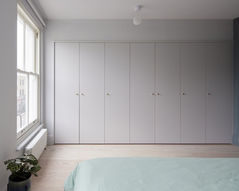
The upstairs was also reconfigured, taking space from the bedroom to create a larger bathroom. A wall of storage was painted in Farrow & Ball's Blackened.
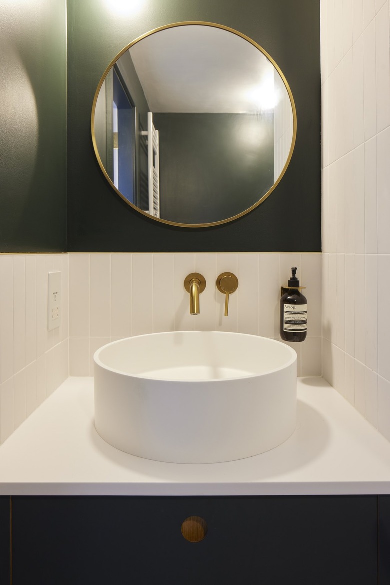
"The bathroom color palette was devised to be a mirror of the stairs, with a bright and well-composed tiled lower half contrasting a jungle-like deep green at high level to create a soothing environment in which to bathe," says the architect.
With clever storage and and a soothing but lively color palette, this Victorian home is now a well-organized retreat for its design-savvy owners.
