20 Small Nursery Ideas That Are Bursting With Charm
From adorable themes to neutral color palettes, the options are seemingly endless when decorating a nursery and that goes double when your space is limited. Whether you've already been down this road once before or this is your first time designing a space for your baby, a nursery should first and foremost be calm and relaxing. But before you begin the design process, it's important to carve out some space, whether that's in a corner of your own bedroom, a closet, or a small loft.
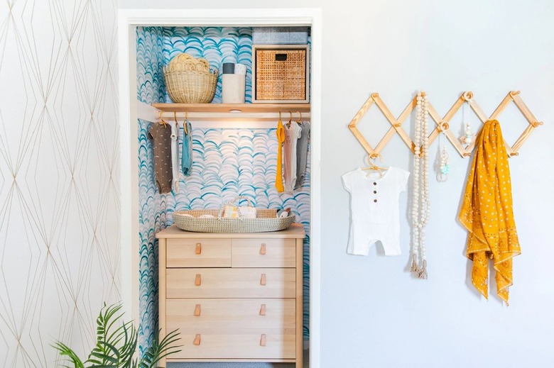
"My best tip for a small nursery is to use a dresser with drawer dividers and baskets in the drawers to organize all the baby gear," says HGTV's Jasmine Roth. "The dresser can go inside of the closet if that makes everything fit better." Use your child-like imagination to come up with innovative ideas in a small space. "In lieu of a changing table, I recommend buying a changing table topper, that sits on top of the dresser. That way, when the baby outgrows diapers, you pop the conversion tray off and you still have a functional piece of furniture," Roth states.
The important thing to remember is that with a little creative thinking and efficient space planning, you can make even the coziest of corners functional and cute as a button. Just in case you need a little bit of help, here are some helpful tips and tricks to make the most of your square footage.
20 Small Nursery Ideas
1. Opt for a small changing table instead of a large dresser.
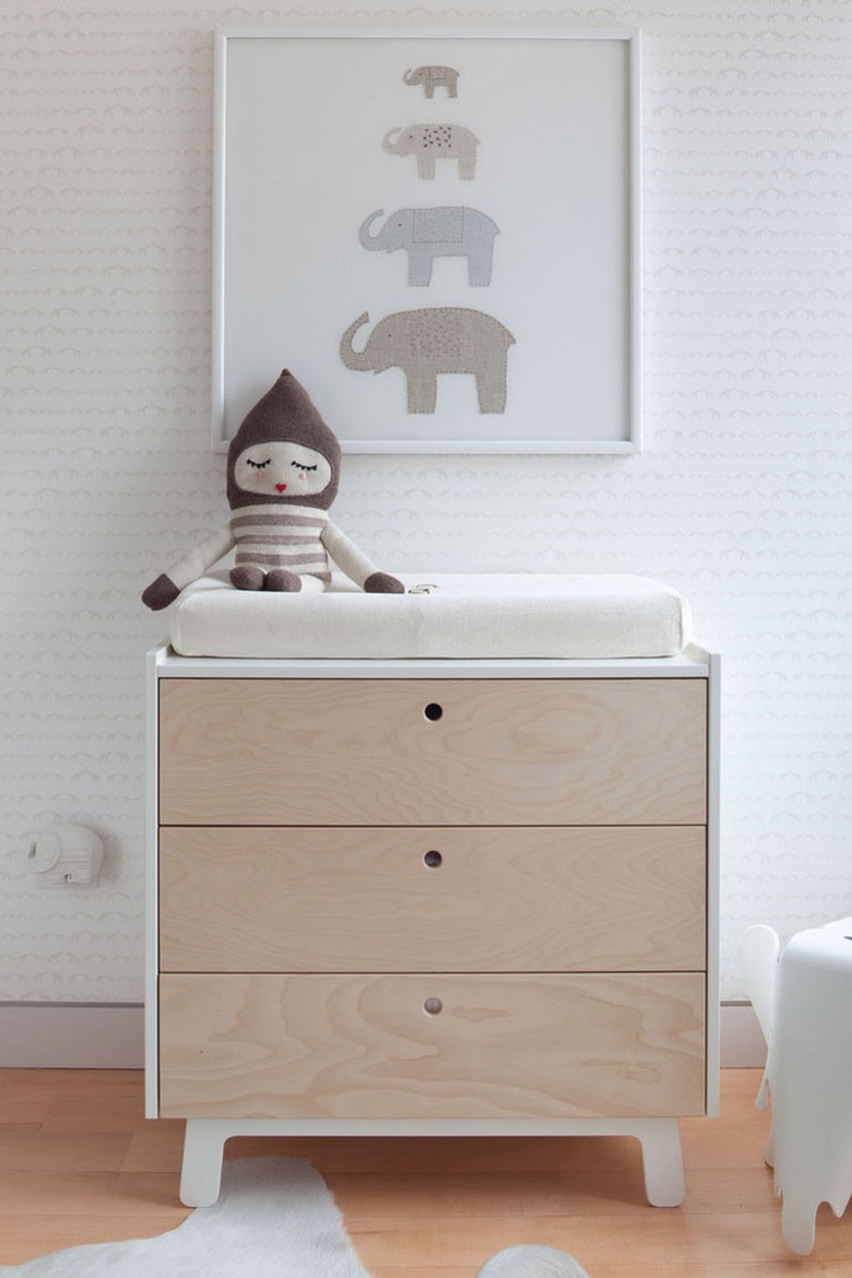
Forgo a large dresser that takes up an entire wall and opt for a smaller chest of drawers instead. The Scandi-chic piece that Sissy + Marley chose for this sweet nursery comes with three drawers for storage and is just wide enough for a changing pad. A petite design like this will free up some much-needed floor space and make the space feel a little less overcrowded.
2. Hang wall-mounted shelving to stash books and nursery decor.
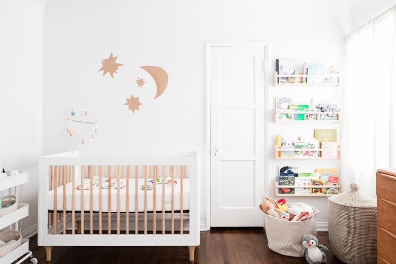
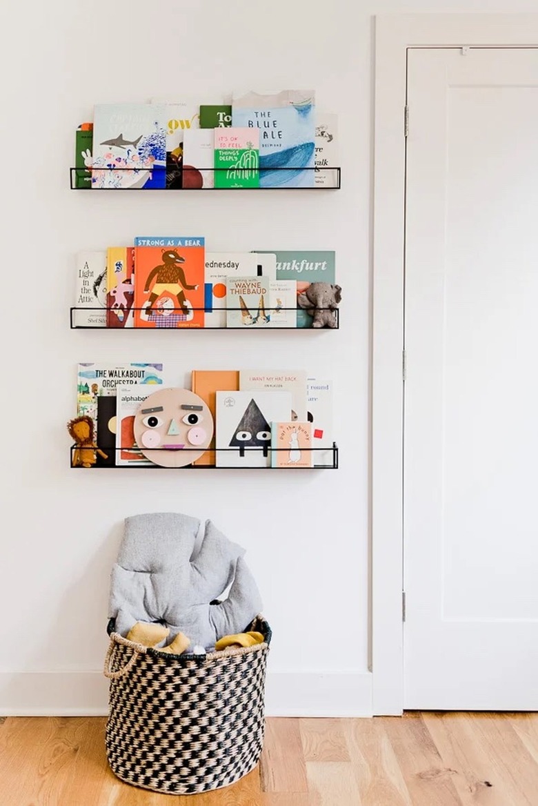
Large bookcases can take up a lot of floor space in any space. So skip the bulky nursery furniture and go with shelving instead. As demonstrated in this small room, they can be used to hold books, family pictures, toys, and more. Hang them from the floor to the ceiling to make good use of your wall space. And if you are feeling really crafty, you could even make your own shelves.
3. Use wallpaper to distract from a low ceiling.
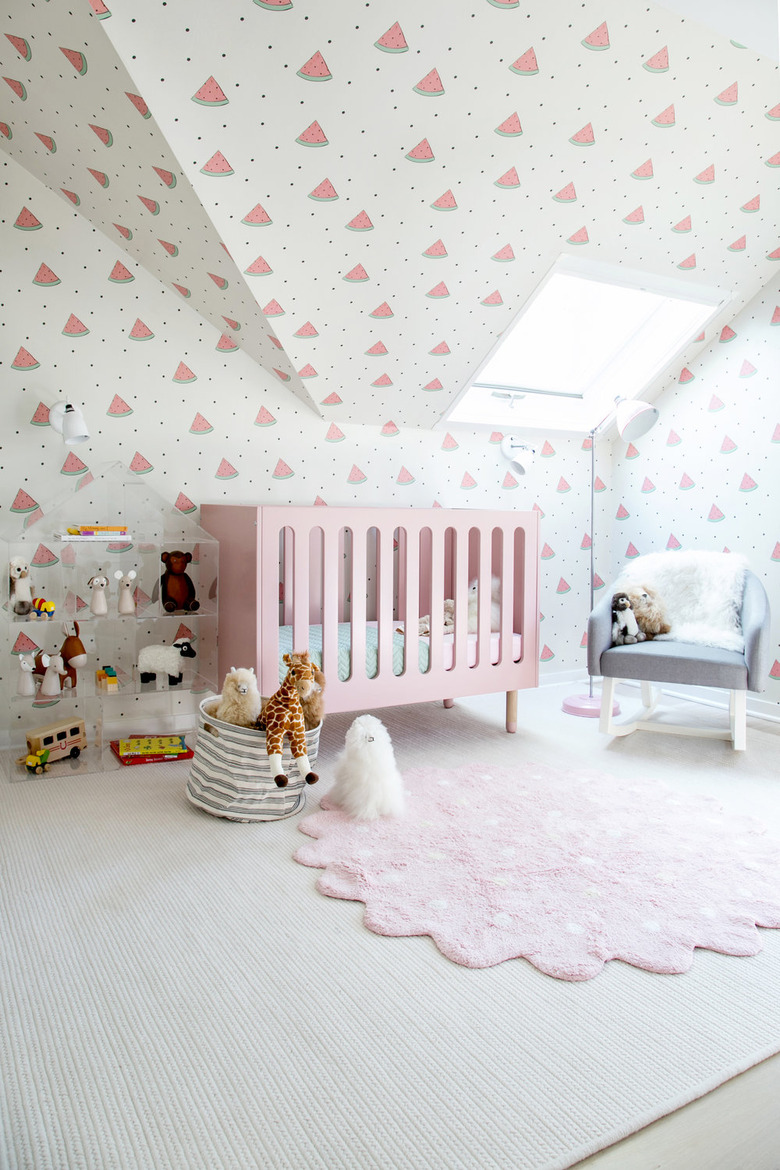
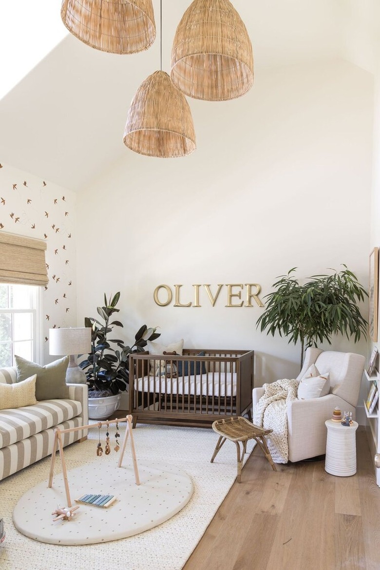
Follow the lead of Chango & Co. and draw attention away from the lack of square footage in your nursery with a whimsical wallpaper pattern. In this setup, the playful watermelon print continues onto the slanted ceiling, so you almost don't even notice the lack of space overhead. The natural light pouring in through the skylight and the cream-colored area rug keep the space feeling light and airy as opposed to dark and cramped.
4. Welcome a minimalist scheme.
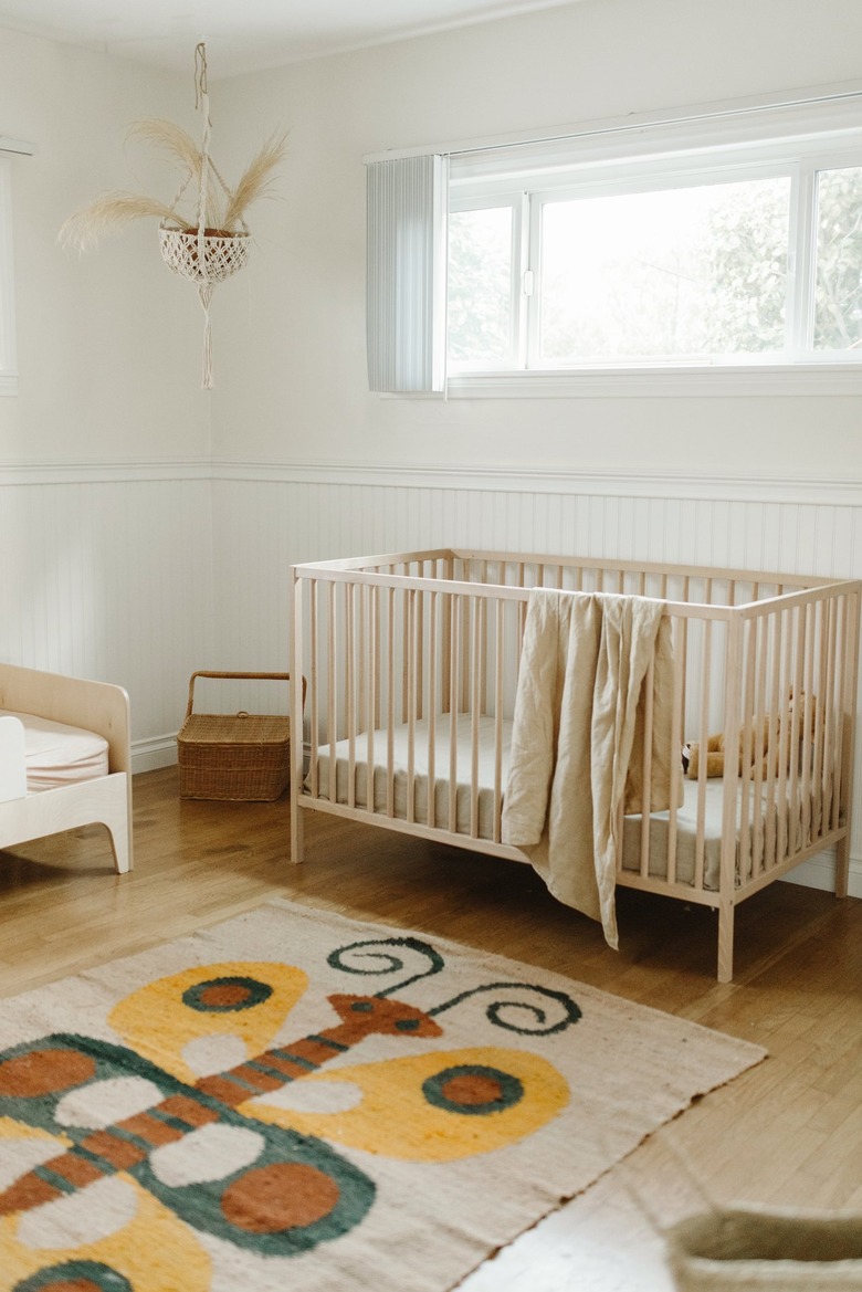
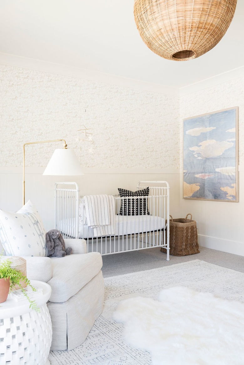
Nothing makes a small space feel even smaller than a lot of clutter. Embrace a minimalist scheme in your nursery, and only include the essentials and a few thoughtful pieces of decor. Use light neutral shades throughout the room, and throw in a cheerful rug or some artwork for a pop of color. Not only will this pared-back design work wonders in a small space, but it also happens to be a great gender-neutral nursery option.
5. Carve out space in your own bedroom.
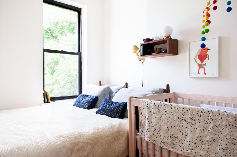
While incorporating the nursery in your own bedroom might not be ideal, sometimes it is the only option. And that's okay. Besides, it will be awfully convenient to have everything you and baby need close by for those midnight diaper changes and feedings. Take note of this shared space and keep it neutral — only adding in a few pops of color — to stay consistent with the rest of the decor in your room.
6. Save square footage with a mini crib or a bassinet.
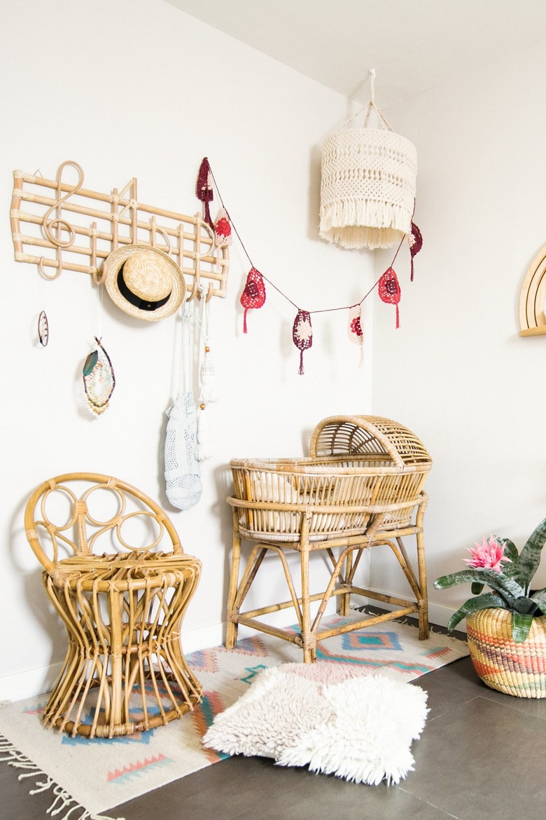
For a nursery that's located in a small bedroom, or in the corner of another room, use a petite bassinet instead of a bulky crib. Define the baby's space with the help of a rug, a light fixture, and some wall decor like a colorful garland.
7. Paint the ceiling to draw the eyes up.
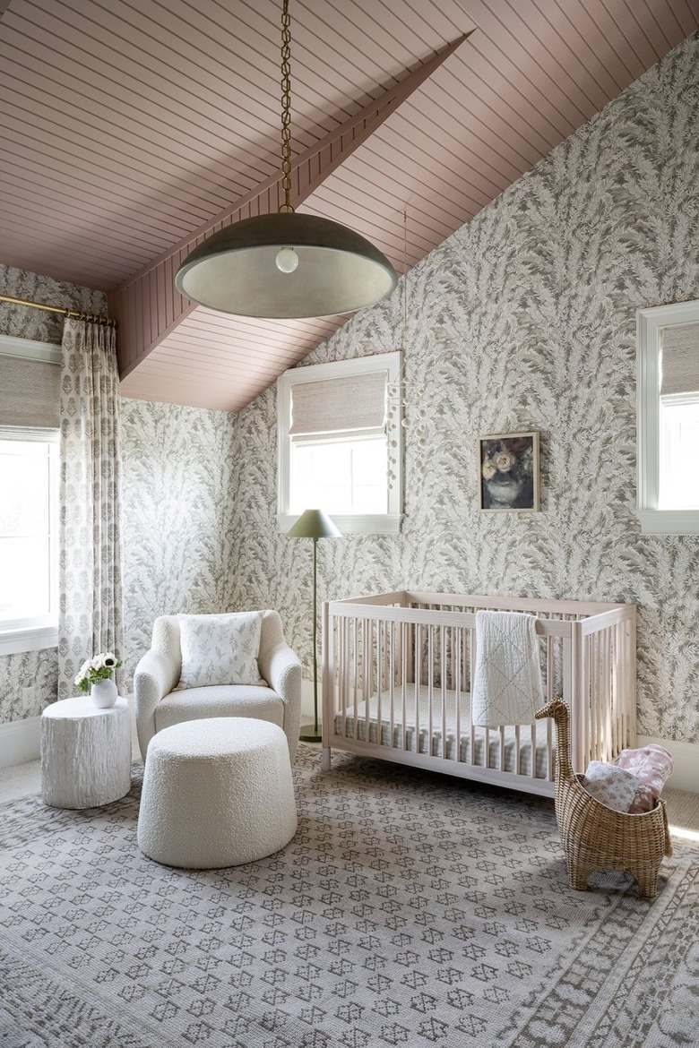
In addition to wallpaper, another clever way to distract from the size of a small nursery is to paint the ceiling. The pop of color immediately draws the eyes up and creates the illusion of a larger room, as proven by this quaint design from Studio McGee.
8. Make your space feel bigger with ample lighting.
Keep things bright and open by providing your nursery with adequate lighting. Use a floor lamp plus a ceiling fixture like this setup by Studio McGee. Depending on the ceiling height, you can go with a flush mount, semi-flush mount, or a pendant. You might also want to consider dimmer switches so you can control the level of light, especially at two in the morning.
9. Make use of oversize baskets.
There's no such thing as too many storage solutions when it comes to a small nursery. Use large, oversize baskets — like the checkerboard option that Brittni from Paper & Stitch used in this setup — for blankets, stuffies, toys, and more. They're functional, appealing to the eye, and all in all, they make it easy to keep things organized.
10. Maximize wall space.
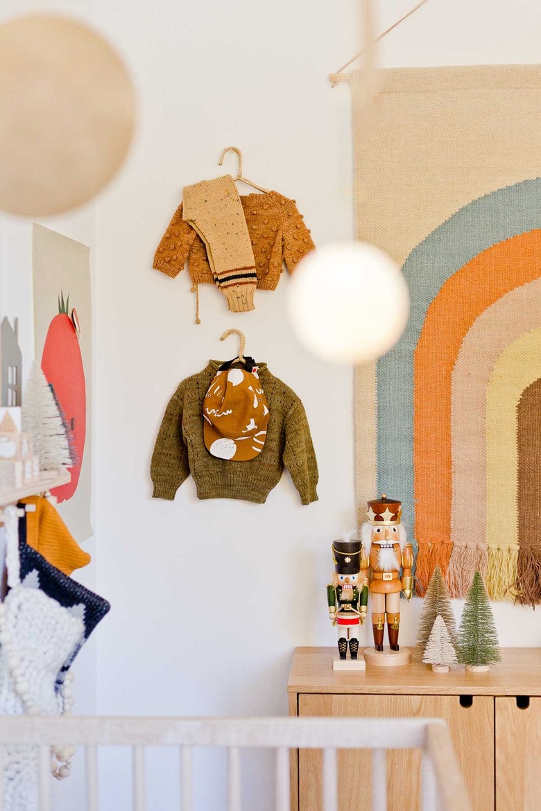
Get creative with the wall space in your little one's nursery by hanging everything from bookshelves to wall pegs or hooks to artwork. Brittni from Paper & Stitch did just that in this charming space, and the result is a visually interesting setup that offers a little extra room for baby's clothes.
11. Scale down the size of your rocking chair.
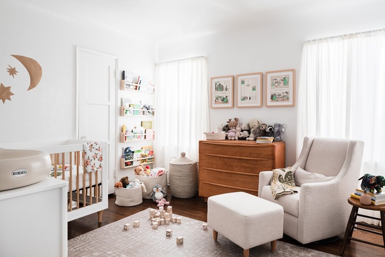
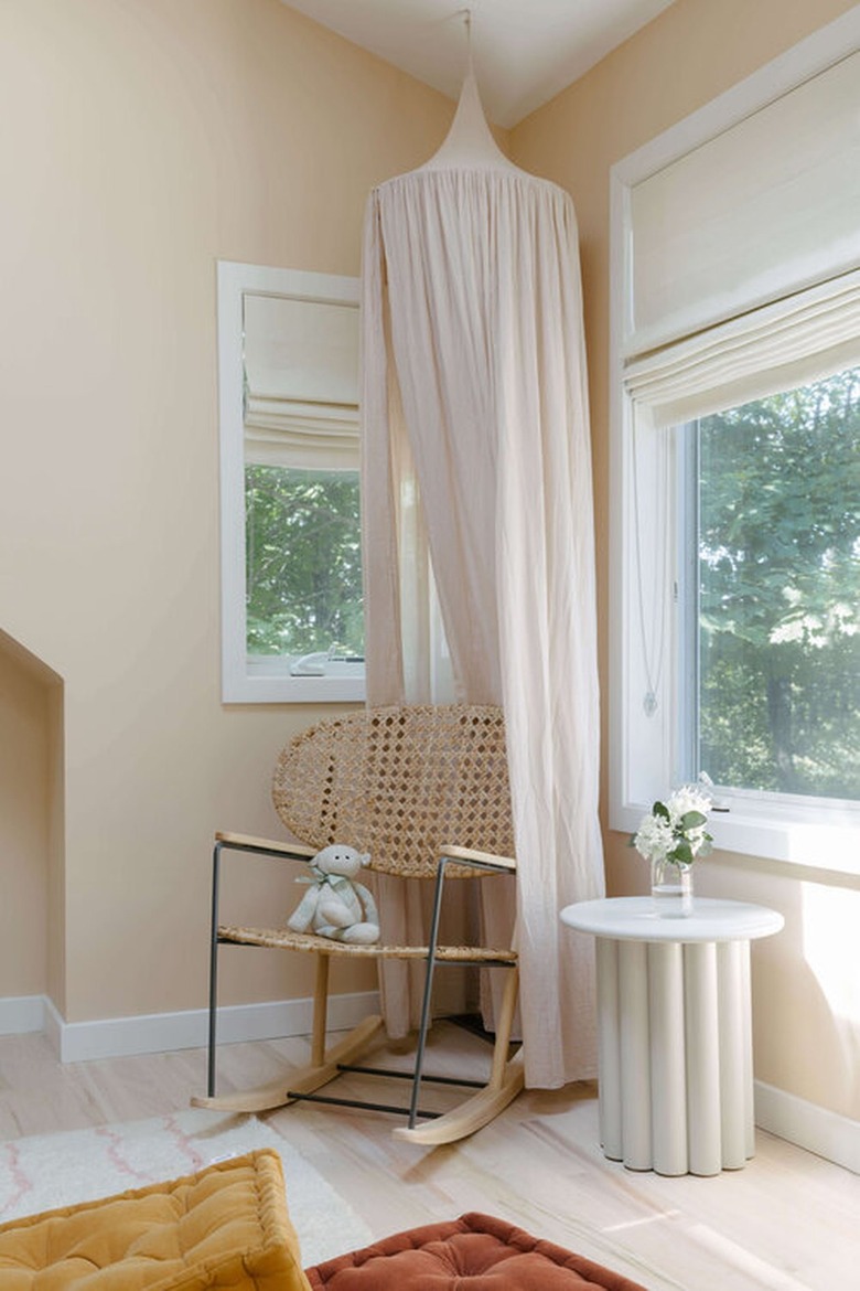
Instead of a large upholstered lounge chair rocker, go for a smaller alternative like the one used in this cozy corner by Tali Roth Designs. This way, you can still rock baby to sleep without using up so much floor space. Throw in a small ottoman and a soft throw blanket for added comfort.
12. Lose the closet doors.
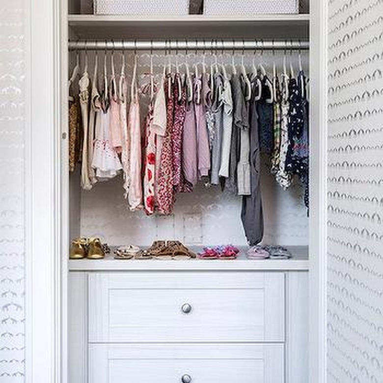
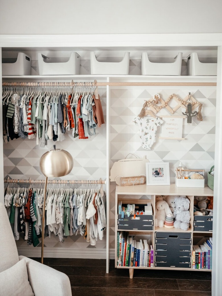
There's no getting around the fact that door swings take up valuable space. So why not remove them? Not only will the lack of doors free up square footage but it will also give you quick and easy access to everything you need. Just keep in mind that now everything in the closet is on display, so make it a design moment that's both functional and stylish like Sissy + Marley did. And bonus: If you can fit the dresser in there, that will free up even more space.
13. Incorporate fun wall hooks and pegs.
Whether you opt for a pegboard or wall hooks, they will definitely come in handy in a small nursery. There are a plethora of items that need hanging from headbands to bows to sweaters, oh my! Interior designer Jasmine Roth hung an accordion-style wall rack next to an adorable wallpapered closet.
"I love adding pattern and texture to a nursery. I recommend doing at least one wall, or maybe the ceiling, with an accent color or peel and stick wallpaper," Roth adds.
14. Transform a walk-in closet.
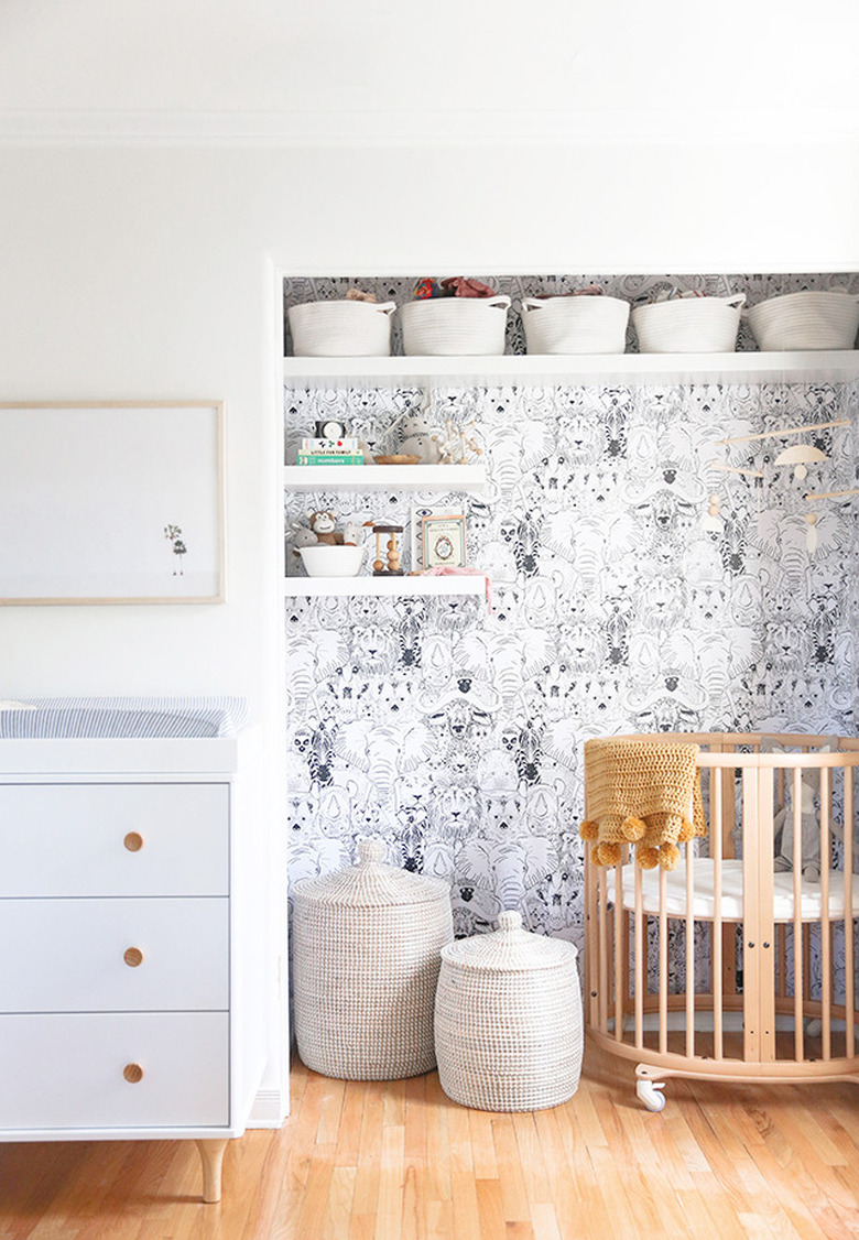
And speaking of wallpaper in a closet, interior designer Sarah Sherman Samuel did the exact same thing to transform this walk-in. The only difference? This charming space was big enough to incorporate the crib, a mobile, and some shelving for storage. The dresser-meets-changing table sits just outside of the closet.
16. Hang mirrors to create the illusion of more space.
Whether you prefer a floor mirror or a wall mirror, this one piece of decor can quickly and easily make any small space look a little bit bigger. For example, the round design on the wall of this nursery by Pennies for a Future adds loads of character and will bounce the light around the cozy space. And bonus: Now you'll be able to see when you have spit up (or something worse) on your shirt.
17. Embrace a light color scheme.
Create a tranquil and stress-free environment for you and for your baby by opting for a light palette like white, cream, or yellow in the nursery. Not only will this one design choice result in a more relaxing space, but it will also make the room feel bigger. Select a soft paint color and pair it with neutral window treatments and furniture. Enhance the airy scheme with adequate lighting à la this setup by Pure Salt Interiors.
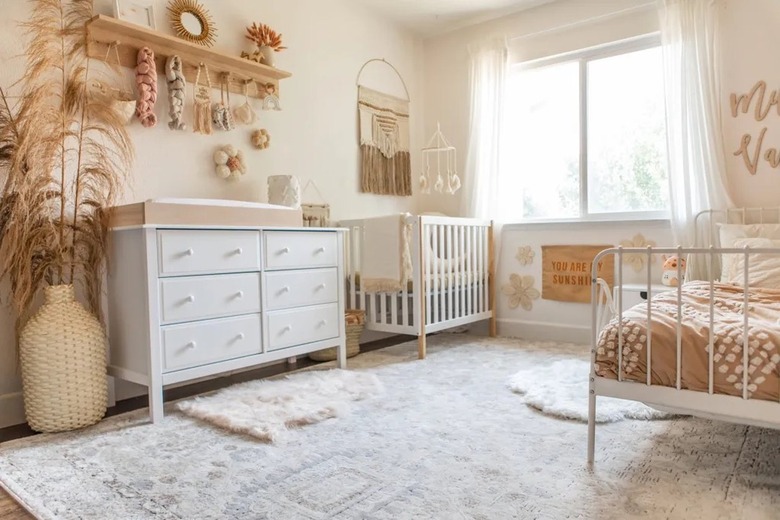
18. Put your little ones in the same room.
If you have a growing family, consider putting your kiddos in the same room. Divide the space in half with the baby's essentials on one side and your other little one's belongings on the other. Not only is this a space-saving solution, but it also allows more time for your children to bond and get used to sharing. Keep the overall design cohesive so the room doesn't feel like two completely different spaces. Before long, you'll be able to swap out the crib and toddler bed for grown-up bunks.
19. Maximize every square inch of closet space.
Since dressers and bookcases can take up a large amount of floor space, consider streamlining the closet to make room for more than just clothes. Create space to stash books, toys, and other baby necessities like Erin Elizabeth from Wink and a Twirl did. The well-thought-out space not only looks good but also stores so much more than ever before.
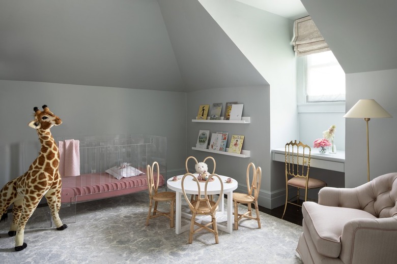
20. Consider a clear acrylic crib.
As you know, the crib is the largest piece of furniture in a baby's room and it takes up a big chunk of visual real estate. Unless, of course, you take a page out of Marea Clark Interior's design playbook and invest in a clear acrylic crib. In this lovely nursery, the crib almost blends right into the wall because you can see through it and the sightline remains uninterrupted.
