Prop Styling Ideas To Use On A Bookshelf, Coffee Table And Entryway Table
On the Being Home With Hunker podcast, expert prop stylist Robin Zachary revealed how she uses certain design principles from the photo world to teach others how to create visual interest when styling decor in their personal spaces.
Here, we share Robin's tips on how to style three specific areas of our home: bookshelves, coffee tables, and entryway tables. Plus, we've added in some of our favorite product picks to help you design the most gorgeous spaces and vignettes.
Listen to Robin Zachary on the Being Home With Hunker podcast for all her advice!
Listen to Robin Zachary on the Being Home With Hunker podcast for all her advice!
Bookshelf Styling Tips
Bookshelf Styling Tips
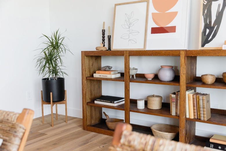
Zachary recommends using the entire space around the bookshelf for visual interest, including the wall. She likes to lean pretty platters up against the wall, or a favorite book, or framed artwork.
She also says that "there is a hierarchy to how you arrange things." She likes to use a stacking technique to create different levels and heights. To do this, she recommends using blocks, boxes, or pieces of wood. (Check out our DIY cube riser easy shelf styling.)
For decor, Zachary suggests adding a pretty bowl, some interesting figurines, glassware, and some books. She has a trick where she likes to use cloth-bound books: "I always look underneath the covers and take them off, and just use the pretty cloth covers." She goes on to say that "you can have them standing or you could put them stacked up on their sides." As she says, you can play around with this endlessly, building up different levels. "I think if you do put the books sideways, then you could put a little figurine on top, like a little ball or a little tiny bowl."
If you're going to add candlesticks or ceramics, Zachary suggests "using an odd number of things like threes and fives," to create an asymmetrical look. As she says, this makes the visual more interesting to the eye instead of having things lined up evenly.
Coffee Table Styling Tips
Coffee Table Styling Tips
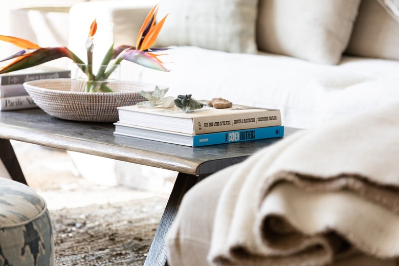
Zachary says that for coffee tables, art books and magazines with beautiful covers (such as a home decor or food magazine) are a given. You can top these with a bowl — she likes to use low wide bowls filled with dried flowers or pinecones.
She also likes a sectioning technique for coffee tables, such as adding a tray to segment an area. On the tray she suggests adding a carafe with glassware, a vase with dried or fresh flowers, and some coasters. She also recommends using pieces of marble slab, a disc, or a placement to create this sectioning effect.
Entryway Table Styling Tips
Entryway Table Styling Tips
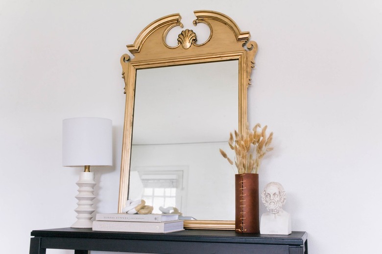
Zachary likes to use a mirror as a focal point to the entryway tables — and instead of mounting it on the wall, she suggests leaning it against the wall. She says, "you could also have some prints of family photos and things kind of overlapping and leaning as well. You don't have to have stand-up frames everywhere."
She also has the creative idea of using a clipboard with a pretty print or magazine picture clipped to it, and then leans that up against the wall as well.
Zachary also says, "you probably want to have a lamp there or a big branchy arrangement. [Also] I feel like every entryway needs like a bowl ... for everybody to throw their keys in."
To hear more from Robin Zachary, listen to her on the Being Home With Hunker podcast or visit her website at ThePropStylingExperience.com.


