13 Tudor House Exterior Paint Color Ideas Worth Copying
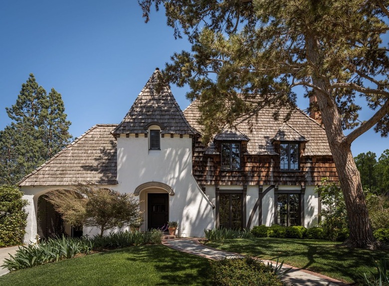
Tudor architecture originated in England in the late 15th century. The style is heavily influenced by the post-medieval period with a notable castle-like facade featuring a pitched roofline of varying heights and a combination of timber, stucco, stone and often brick. The style appeared in the United States nearly 400 hundred years later.
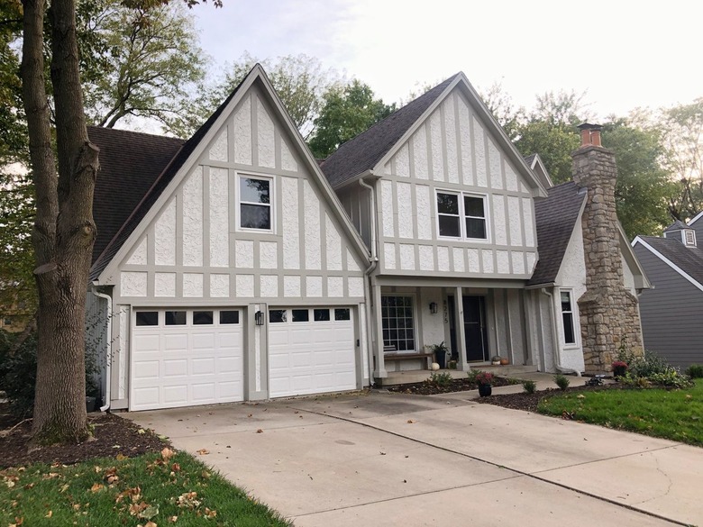
Traditional Tudor homes are easily identified by their steep-pitched roofs, gabled windows with leaded-glass mullions, half-timber and stucco detailing on the second story and stone or brick on the bottom. However, like many other architectural styles, authentic Tudor homes continue to morph and there are many modern Tudors that embrace the essential silhouette of the style while updating the materials used and today they can be all stone, all brick or all wood and even devoid of the gingerbread house-like details that make them so distinguishable.
The exteriors of Tudor homes are generally painted in earth tones such as brown, gray, greens and cream, that call to mind their original pastoral settings. Because the style combines so many different materials, selecting an exterior color palette for a Tudor home requires consideration to prevent it from looking busy and visually jarring.
"I prefer Tudor homes when a warm white, creamy background is used for the stucco and plaster walls between the decorative timbers. Something that has a subtle hint of buttery, green, brown or gray undertones is ideal because it provides contrast while playing up the inherent organic quality of the wood," says Beatriz Rose, owner and principal designer of byrdesign. "Always test your color on different facades of the home to see how the environment reflects on the lighter colors. You'll be surprised how much a neutral shade can alter. For example, if you have a pink building across the street that receives western sun, it will reflect a pink glow on your house or if your house is facing east and you have a large patch of grass, it may reflect a more green tint. So, choose your white to counterbalance the reflection."
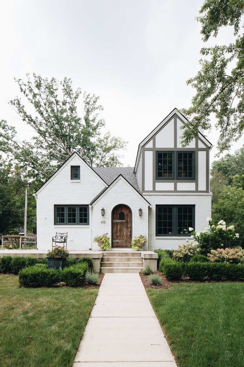
Some people opt to let the telltale decorative woodcut cross pieces stand out by using a high-contrast color palette (like dark brown and cream or black and white) that highlights the style's unique half-timbering and stucco detail. But you can also minimize the distinct detailing (which some may find overly ornate) by selecting a muted color palette with little contrast or by painting the timbers and stucco the same unifying color. Bolster curb appeal and inject personality to a Tudor home by painting the front door a vibrant color.
Here are modern examples of Tudor exterior paint colors.
13 Tudor House Exterior Paint Color Ideas
1. Cream
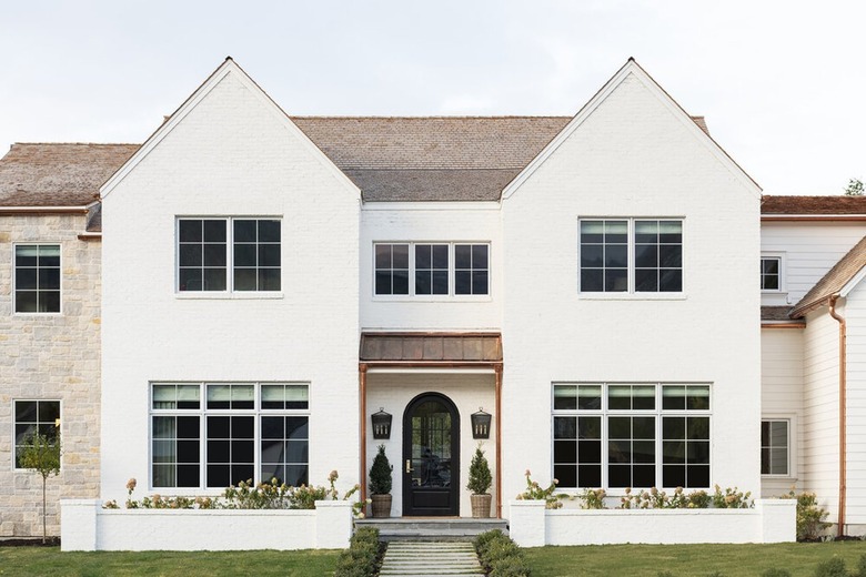
Typical Tudor-style facades are often dark and foreboding. Take inspiration from the home of Shea from Studio McGee and embrace a neutral color scheme instead. Despite the use of several different materials — brick and tumbled stone — the stately home maintains a unified appearance thanks to the all-white color scheme. Carefully placed greenery adds color and softens the angular architecture.
Get the look: Benjamin Moore Swiss Coffee
2. Dark Brown and White
Using dark brown and white on the timbers and stucco of a brick Tudor home is a classic exterior paint idea. The contrast lets the personality of the unique Tudor motif shine through and imparts an endearing fairytale vibe. With its plentiful narrow multi-paned windows, cantilevered second story and brickwork, this Airbnb home displays quintessential Tudor charm.
Get the look: Benjamin Moore Mink
3. Dark Green and White
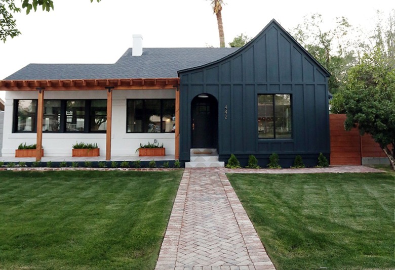
Opt for a high-contrast and timeless color scheme such as dark green and white. Jenny Komenda employed the dramatic duo to lend eye-catching curb appeal to her single story Tudor-inspired home, and then added wood details — a pergola and raised planter boxes — for warmth. A chevron patterned brick walkway adds pattern and references the material often seen on the exterior of Tudor homes.
Get the look: Sherwin-Williams Night Watch
4. Taupe and White
A pale purple-brown, mauve is a lovely exterior paint option that introduces a bit of color while still functioning as a neutral. This Tudor cottage (a scaled down Tudor home) spotted on @cilantrosue has strategically painted ivory accents to enhance its one-of-a-kind details for a look that's equal parts refined and approachable.
Get the look: Benjamin Moore Victorian Mauve
5. Gray and Beige
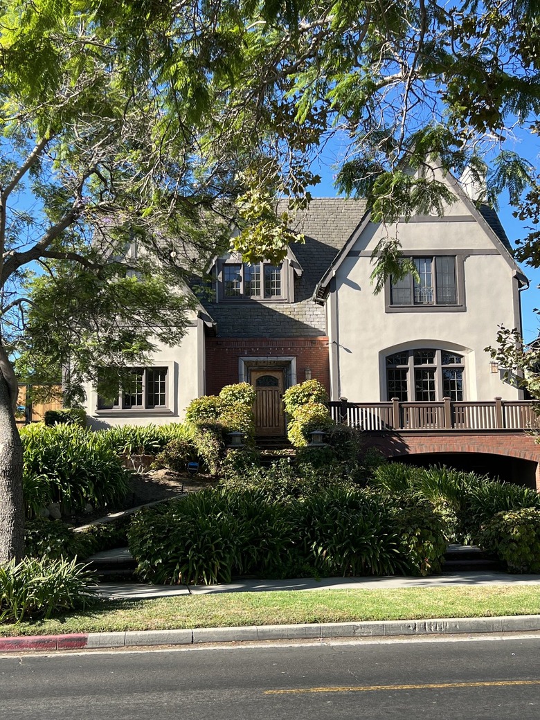
Keep the look subtle with a neutral combination. For this Tudor-style home in Los Angeles, a calming shades of gray and beige welcome guests. Accents in classic red brick offer a pop of color while complementing the charming architecture.
Get the look: Benjamin Moore Pale Oak
6. Gray and Brown
An earthy palette of browns, grays, and greens are typical hues used on Tudor-style exteriors. This home from color consultant Maria Killam flaunts organic shades of green-gray and brown which complement the various stone elements and blend into the natural environment.
Get the look: Farrow & Ball Treron
7. Green and Red Brick
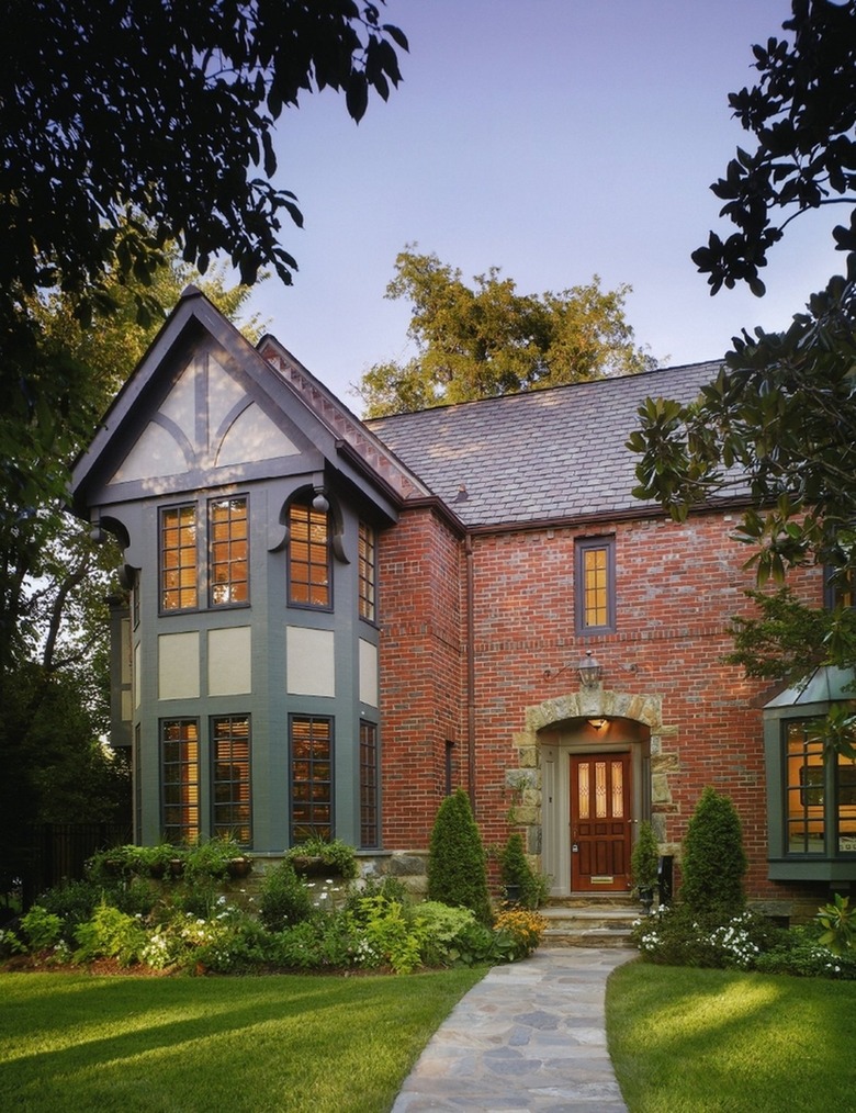
When selecting a color palette, take inspiration from your surroundings. This regal Tudor by Luther Paul Weber Architects flaunts green and beige on the timber and stucco portion of the home which blend into the verdant landscaping around it. A combination of brick and stone anchors the majority of the home for a look that's majestic and formal.
Get the look: Behr Royal Orchard
8. Charcoal Gray
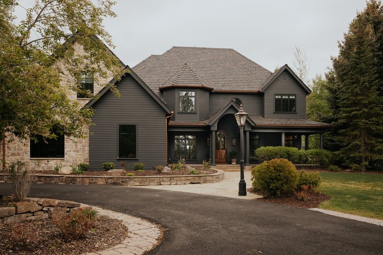
Create a moody tonal vibe by blanketing your Tudor home in a singular dark shade that veers toward black. This stunner from Chris Loves Julia is the perfect example of how a monochrome look can transform a Tudor-style home into a modern showstopper. The addition of warm-hued limestone introduces contrast and softens the imposing feeling of the expansive home.
Get the look: Benjamin Moore Graphite
9. White and Mint Green
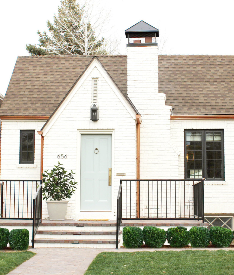
Cream and mint green is a timeless pairing that looks elegant on a variety of architectural styles from farmhouse to Spanish to colonial. Studio McGee selected the combo for this sophisticated Tudor remodel and added high-end touches like copper gutters, boxwood hedges and black accents for interest and visual weight.
Get the look: Clare Headspace
10. Brown and Blue
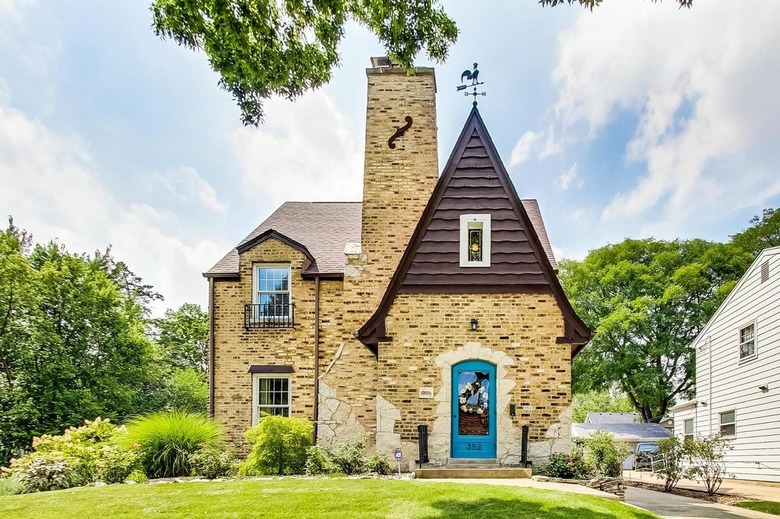
Complementary colors help take the guesswork out of color pairing. Shades of brown are derived from orange, and because orange and blue are located across from each other on the color wheel, they're a no-fail combo. The duo amps up the charm and curb appeal of this classic brick Tudor where chocolate brown adds drama to a pitched roof and a bright blue door adds whimsy to an entryway surrounded by stone tabs.
Get the look: Benjamin Moore Yosemite Blue
11. Off-White and Brown
If you have a home with wood shingles reminiscent of the original thatched roofs used on Tudor homes, accentuate their natural beauty with an exterior hue that doesn't compete. Jessica Helgerson refurbished this quaint home with a simple cream and brown color palette that doesn't detract from the intricate shingled roof and facade. Chocolate brown timbers on the lower half add architectural interest and depth.
Get the look: Benjamin Moore Swiss Coffee
12. Beige and Taupe
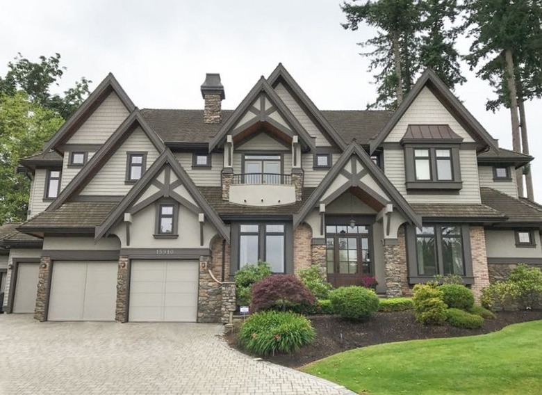
Downplay Tudor's characteristic timber and stucco detailing with a palette that minimizes contrast. Allie from The Adored Abode opted for a subtle color pairing of beige and taupe on her home to lessen the effect of the vertical and horizontal timber supports while letting the stone chimney remain a prominent architectural feature.
Get the look: Clare Windy City
13. Gray and White
An enduring color pairing on interiors and exteriors alike, gray and white will stand the test of time. Opt for the duo on a pared down wood shingled Tudor, like this one captured by @ny.victorians where crisp white trim and shutters punctuate dark gray walls. Arched doorways are a familiar Tudor feature.
Get the look: Farrow and Ball Selvedge
Best Colors for Tudor-Style Home Exterior
Best Colors for Tudor-Style Home Exterior
Although the aesthetic of Tudor-style homes calls to mind an English country manor, they're available in a range of sizes that include single story cottages. Tudor homes, regardless of their size, share common attributes that include a high-pitched roofline, half-timber detailing, narrow windows, an arched door frame and often the use of brick and/or stone.
Tudor's are typically painted in earth tones that mimic their historical landscape settings. These neutral shades allow the distinct character of the style to remain visible without being visually overwhelming. Minimize the appearance of the traditional woodcut cross pieces by selecting low contrast shades such as beige and gray or tan and cream. Alternately, the half-timber detail can be painted a singular shade that blends together. Inject life and a measured dose of color to your Tudor home by painting the front door an unexpected shade.

