This Spanish-Style Home Features A Psychedelic Powder Room And Vintage Pink Tile
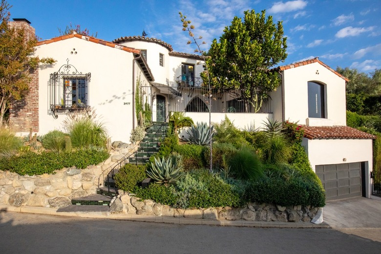
When a young composer bought a Spanish-style home in the Los Feliz neighborhood of Los Angeles, he had some unconventional ideas. But what he needed were some creative voices to reign in some of his wilder instincts and bring their own out-of-the-box ideas. Designer Lauren Montanari and architect Jamie Engelman were the perfect pair for the project, and together they modernized the home with vibrant colors and geometric shapes while honoring the architectural integrity of the house.
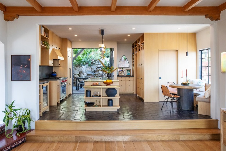
The owner wanted to use the house for entertaining, so Montanari and Engelman optimized the interior and exterior spaces so they could be used for everything from cocktails to pool parties. "That was one of the ideas behind opening up the kitchen," says Montanari. "I think everybody generally finds when they entertain that people congregate in the kitchen. So we wanted to make that a big focal point."
Removing a wall brought light into the previously closed-off space, and they used white oak for the cabinetry and shelving. Montanari added contrast with a brass countertop and dark floor tile from Clé. The designer collaborated with Isaac Resnikoff of Project Room on the custom stained-glass light fixture above the island. The team also made sure to include plenty of open shelving to display the owner's special objects and — since he had recently gotten into making fancy espresso drinks — a coffee bar.
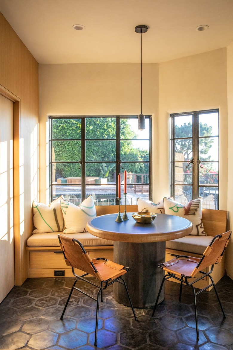
"The breakfast area is one of my favorite parts of the house," says Engelman. "I love that it's sitting there right by the beautiful backyard and can communicate [with] that space." Engelman and Montanari designed a custom table for the dining setup and surrounded it with a white oak banquette and vintage Charlotte Perriand chairs from Amsterdam Modern. "[The owner] said that the breakfast nook is actually where he does most of his work and where he hangs out the most," notes Montanari.
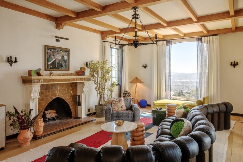
Engelman and Montanari wanted to use the original fixtures and maintain period details when possible and chose new accents that would feel at home in the Spanish-style house. In the living room, they kept the wall sconces and chandelier, and then stripped the beams down to the original Douglas fir. The client had always wanted a De Sede Sofa and Montanari was able to track one down in San Diego, which she perched on top of a colorful custom rug from Beni. She also added a vivid daybed from TRNK, pillows from Casa Ahorita, a swivel chair by Lawson-Fenning, and turned wood side tables by Dan John Anderson.
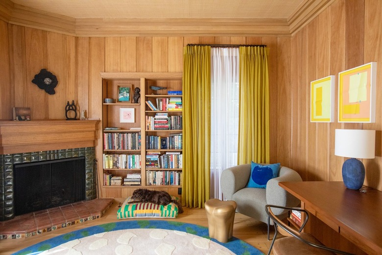
In the library, the walls were stripped to reveal the original extinct red mahogany, and the new moldings and mantel were stained to match. For the fireplace surround, Montanari went on a bit of a treasure hunt. "I realized that there was like a little strip of this Malibu tile," she says. "The company had gone out of business in the '30s, but I found somebody who had dead stock of all these tiles." The team also used vintage tiles throughout the interior and exterior, adding little "Easter eggs." The designer applied a custom Japanese seagrass wallpaper to the ceiling to add texture and soundproofing for the client's vintage piano. A Michael Felix chair with a Correll Correll pillow sits in the corner beside the Lawson-Fenning desk.
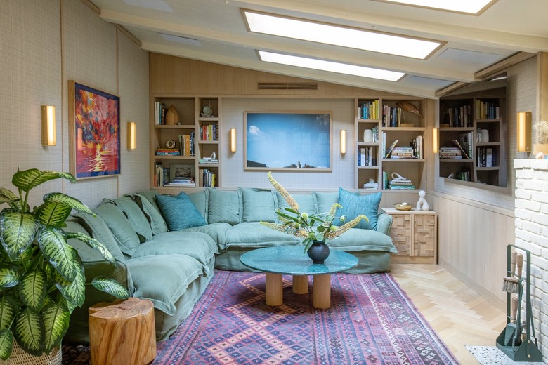
The media room had undergone a bad renovation and was dark and unusable. The design team brightened the space with soundproof walls, pale parquet floors, and skylights with custom detailing. "He wanted the most comfortable couch in the world," says the Montanari. "His inspiration was a toddler and a bunch of pillows." Enter the solution: a plush sofa from Maker & Son. She also added a vintage Berber rug, custom coffee and media tables, and wall lights by RBW.
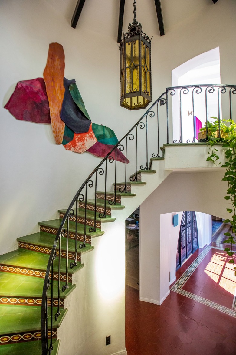
The client loved bright colors and wasn't afraid of bold combos. "I took the color palette from the preexisting stained glass windows, which was the same manufacturer who did the stained glass in the Mexican restaurant El Coyote and a lot of churches around Pasadena," says Montanari.
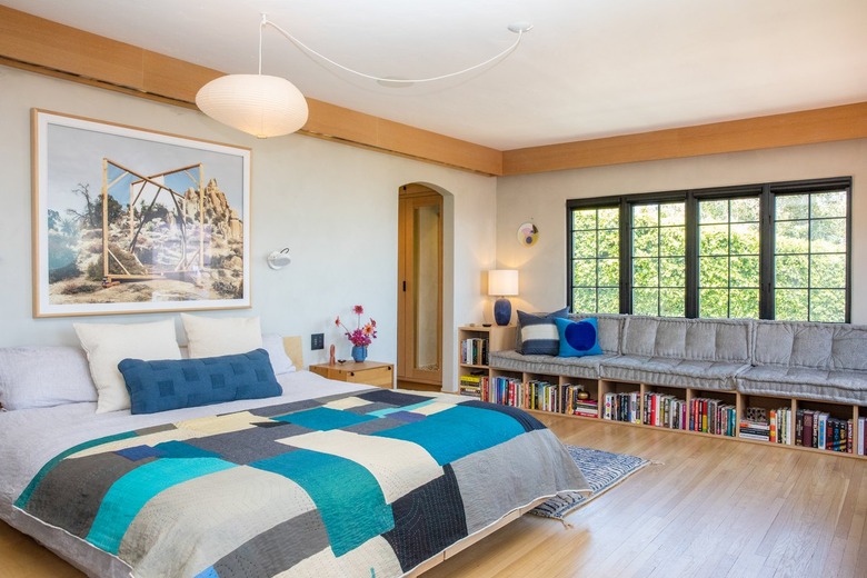
One of the client's ideas was to add a wraparound window in the primary bedroom, but Montanari and Engelman suggested a wall of windows and a round portal window that would give him a view of the mountains instead. They installed a custom daybed along the wall. "We wanted to design a daybed where you could nap and read because he primarily reads in that room," says the designer. A Noguchi lamp hangs over the bed, which is topped with a quilt by LOQ.
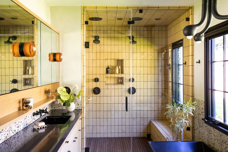
The client requested a shower that could fit two people comfortably and a six-foot bathtub in the primary bathroom. "It was a tall order for the space," says Montanari. They used custom terrazzo and Waterworks tile, as well as sconces from RBW and a chandelier by Entler.
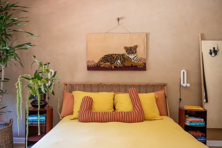
Like many of the spaces in the house, a guest bedroom features a Roman clay wall treatment. The bedside tables are by Hem, and the wall light is by Alex Reed for Commune.
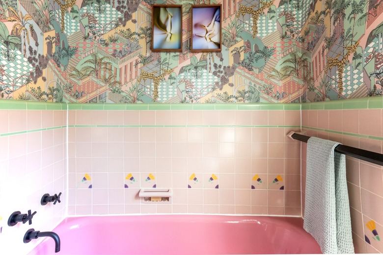
The guest bath had vintage pink tile, which the designer complemented with Cole & Son wallpaper.
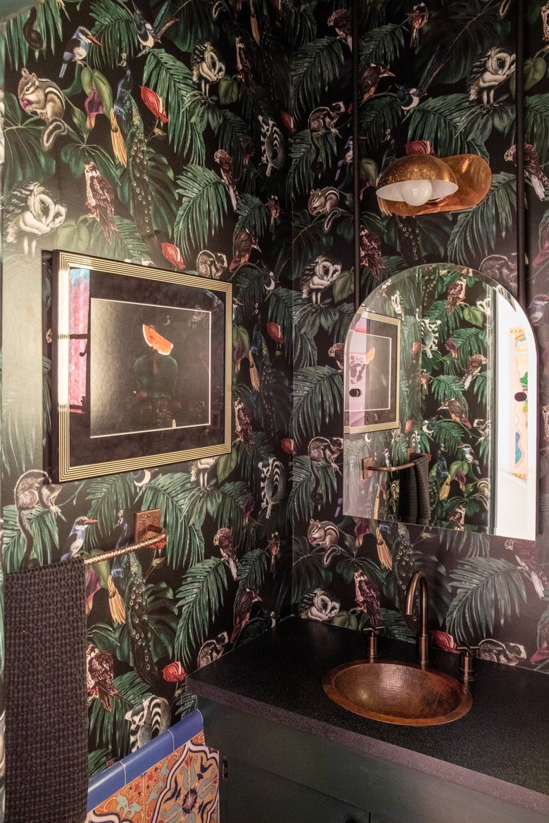
A powder room was lined in a Witch & Watchman wallpaper. "He wanted it to be like a psychedelic zoo in there," says the designer, who also installed a custom copper sink.
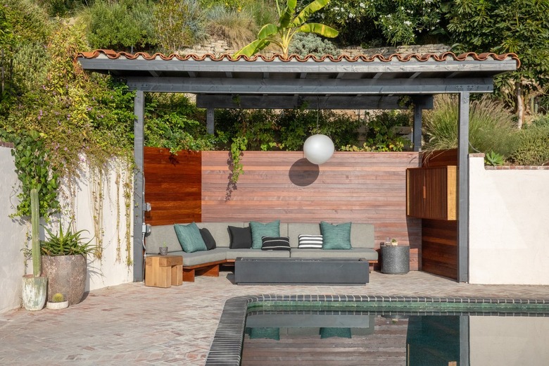
Engelman and Montanari took inspiration from Japanese design for the outdoor living area, where they created a custom sofa in the ipe wood-lined space. When it came to the pool, they went in an unconventional direction. "Jamie and I really wanted to do a black pool because it looks like a lagoon," says the designer. "Everyone thought we were crazy." They used dark Clé tile for the pool and love the end result. "When you're looking down from the primary bedroom, it's not bright, glaring turquoise like most California pools," she adds.
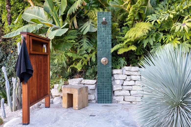
The team couldn't find an outdoor shower that the client liked, so they designed their own, taking inspiration from the metal "monolith" columns that appeared in the Utah desert in 2020 and using extra tile from the pool.
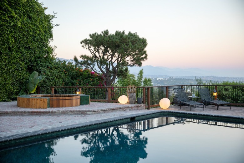
The spa patio offers spectacular views from the cedar hot tub. They also incorporated vintage brick into the hardscaping and then lime-washed them. "[The client] had some contemporary tastes that he wanted to integrate, and we were very careful to use materials that were going to patina and feel very natural, " says Engelman.
Together Montanari and Engelman were able to turn their client's bold instincts and love of color into a home that perfectly blends history and modernity.
