This Designer Turned A Drab L.A. Apartment Into A Stylish Home That Feels Authentically Him
Who: David Samuel Ko of Maison Ko
Where: Studio City, California
Style: California minimalism with pops of color
When David Samuel Ko, the interior designer behind the full-service Los Angeles-based design firm Maison Ko, first moved into his spacious 1,500-square foot Studio City two-bedroom, he resisted the urge to fill it immediately.
"As I've gotten older, I've started to take a more 'collector's' approach to sourcing," he says. "I realized that I don't need anything until it speaks to me. I would rather invest in something that has meaning, that resonates with me, that I feel connected to."
That measured ethos has resulted in an airy, livable space, rooted in California minimalism and punctuated with highly personal custom and vintage pieces, as well as pops of color.
And much of it is inspired by his first love, personally and professionally — fashion.
"My home feels like an outfit I would wear," says Ko. "I love nothing more than a vintage pair of Levi's, and a white tee, paired with a funky jacket and colorful shoes. That is exactly what my home is."
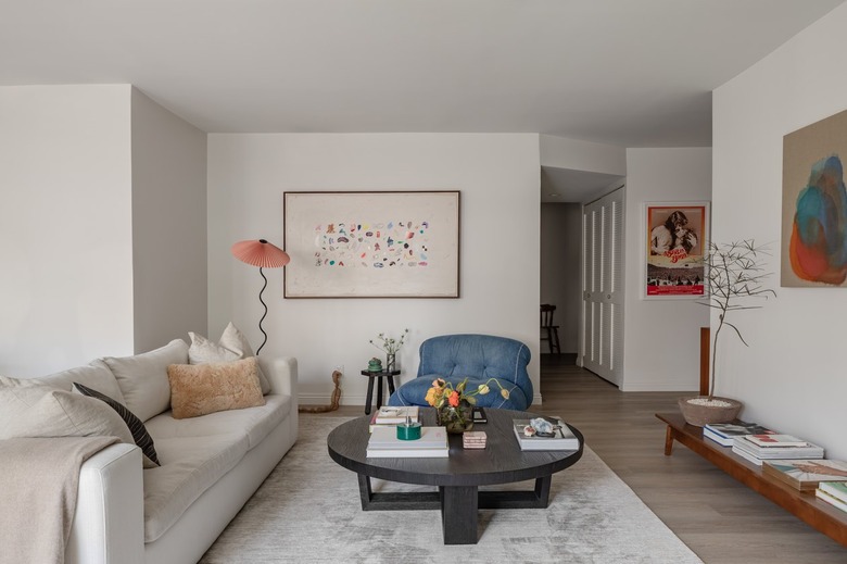
For Ko, the open plan living room is the heart of his entire space. "My living room is the only space that feels truly 'collected' right now as I was really intentional with what went here," he says.
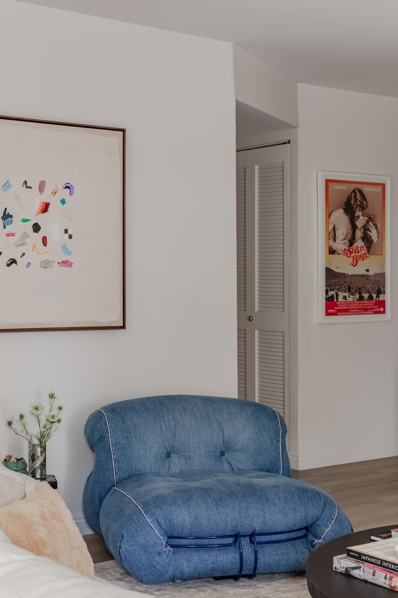
Ko's most prized collector's item is this limited-edition denim Soriana lounge chair, purchased at Cassina in Los Angeles.
"It's just so iconic," he says. "I live in jeans. I just love denim."
There are only 100 of each lounge chair — which, in addition to denim, comes in black and ecru. "It's made of [eco-friendly] materials. The stuffing bounces back. The material won't deteriorate and go flat," he adds. "It's a piece that will age over time."
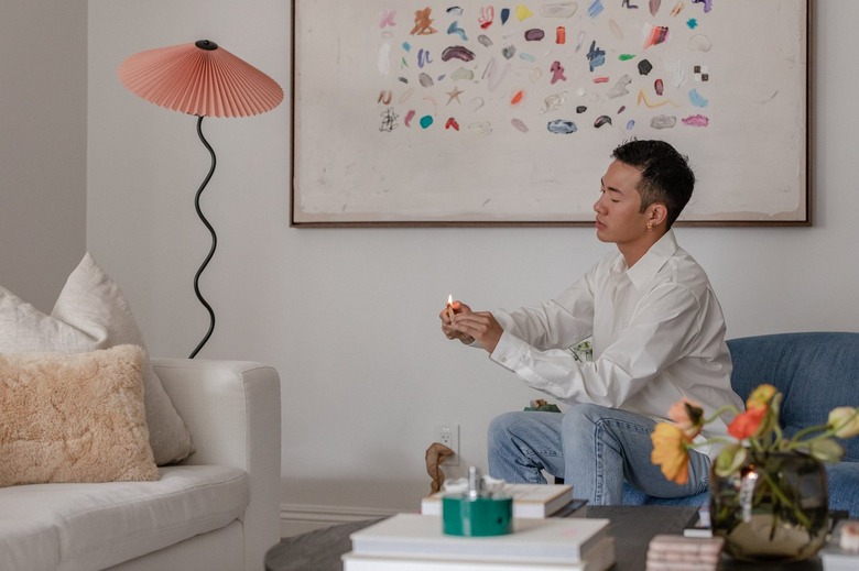
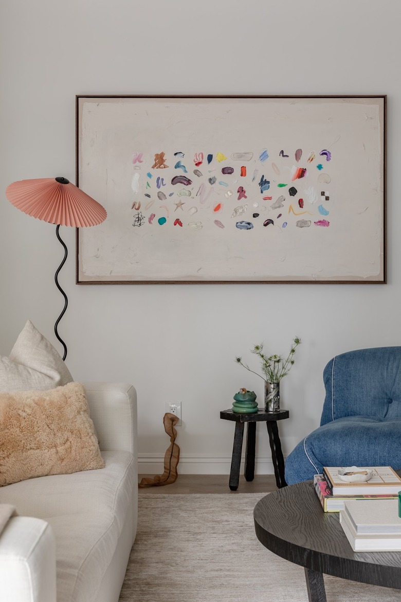
Hanging just above the Soriana lounge chair is a custom piece by Australian artist Tom O'Connor — a friend. "I love art by fellow queer artists, queer creatives," says Ko. "I just like giving those artists a voice in my home."
The mixed-media piece — which includes paint, pencil, and collagen — brings pops of color to the more neutral tones of the living room. "It tells a story, every time I look at it."
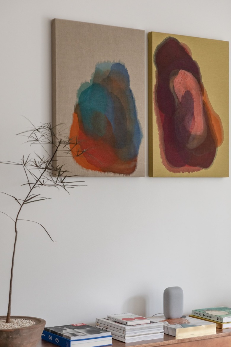
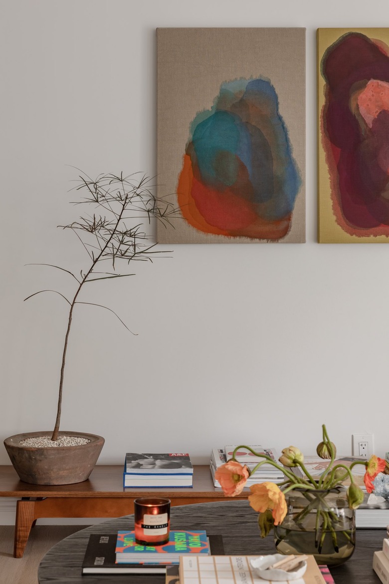
L.A.-based artist Tony DeVoney collaborated with Ko on these two custom paintings, which are acrylic ink on linen.
"When I moved and thought, I need a beautiful diptych above this bench," explains Ko. He and DeVoney poured through fabric stores in downtown Los Angeles looking for the exact-right shade of chartreuse linen. "Then I said, 'Here are the colors I like, run with it.' "
The result is a departure from DeVoney's typical style, and a piece that, Ko says, relates well with the O'Connor. "They play off each other, without playing off each other," he says.
The vintage bench below the diptych holds a highly intentional collection of books and other treasures. "When someone comes into my space, they can look at the books, read through them, and understand who I am," says Ko.
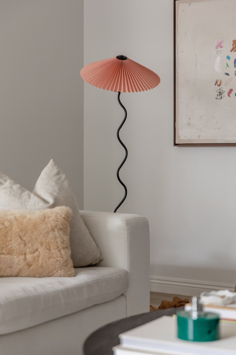
"Lamps are so tough," says Ko. "You get really expensive or really basic." He had almost given up when he found this pink Lampada Cappello by Oscar Piccolo. "I love the [pleated] shade and the pop of color," he says. "There was a time when I hated pink, millennial pink. But now I think it's campy and so cute."
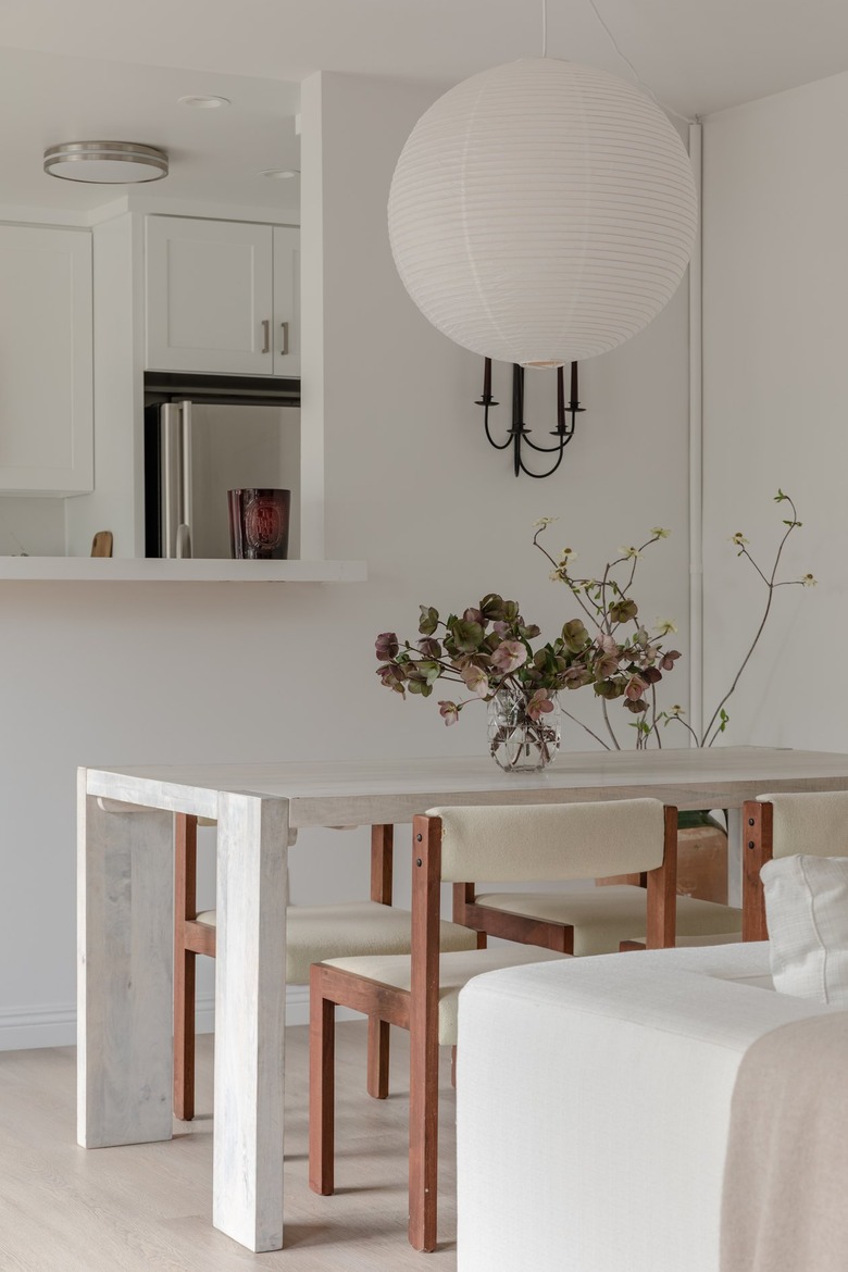
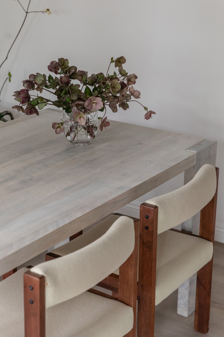
The best-selling HAY rice paper shade anchors the dining area, adjacent to the kitchen.
The dining chairs, which date back to the 1970s, have teak frames with upholstered seats and backs — which Ko plans to update in the future. "I see the chairs and the life they're going to have," he says. "[Those are pieces that will] evolve, with different iterations as time goes on."
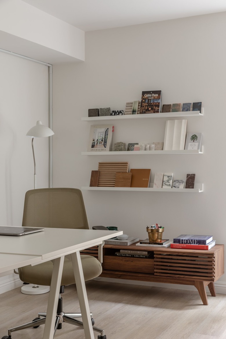
The second bedroom — which Ko uses as an office — has a similar color palette, but a different function. "This is not [a] permanent space; it is ever-evolving," says Ko. "This material wall changes all the time. It's what I'm loving at the moment."
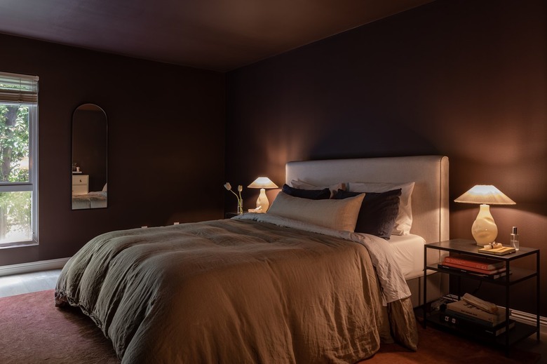
The true counterpoint to the clean California minimalism throughout the space, however, is Ko's dark, dramatic bedroom.
Ko chose the apartment in part because it was full of bright, natural light. But the bedroom was a different story. Even in the room's original state — painted white — it was dark, shadowy and drab.
"I am not a dark room person," says Ko. "But for this I had to embrace it." So, he went deep and dark with the paint color, and kept the decor spare.
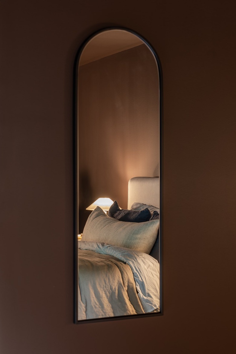
"The trick to that room is no overhead lighting," he says. "All of the illumination in the room is by choice."
The paint color is Incense Stick by Benjamin Moore — a rich chocolatey brown shade with violet undertones.
From the deliberate dark chocolate color of the bedroom walls to each little vignette throughout, Ko sees the story of how his home — and his aesthetic — has come together.
"I realized that I don't need anything until it speaks to me," says Ko. "I finally have a collection of items that I can look at and remember exactly where or why I have it. There really isn't anything in my home that doesn't have a piece of me attached to it."
