3 Outdated Paint Color Trends To Leave In The Past (& What To Replace Them With)
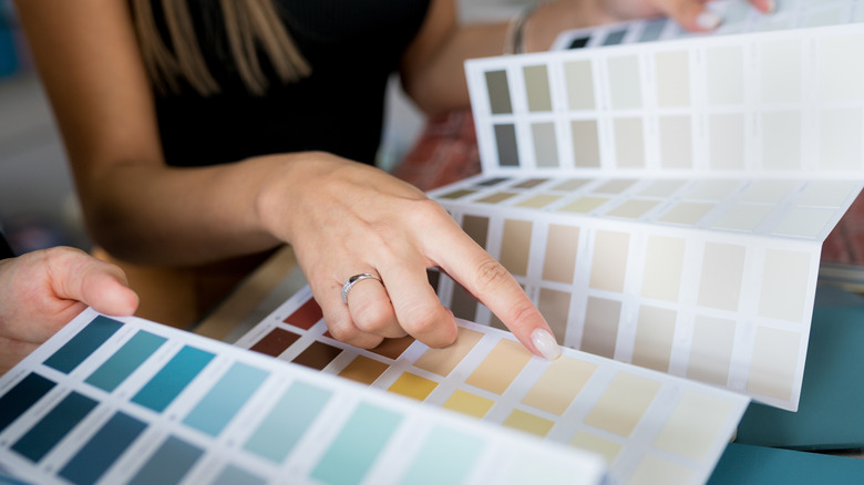
Paint trends are just that, trends: Popular hues that have their time in the sun, ways of showcasing color that keep the world of interior design moving forward. Social media has changed the game for forecasting trends, as it is now so easy to see the waves of popularity with a color coming and going, but the mistake many homeowners make is focusing on whether a particular color is going in and out of style. That's the wrong approach. Instead, it's more helpful to explore the types of color groups that homeowners are moving away from, in favor of new dynamic families of hues. With every shift comes a new way to think about and use color to achieve certain goals.
In that context, it becomes easy to see that the three major paint trends homeowners are outgrowing are stark soulless neutrals, bold saturated color tones, and entirely white trim. The downslide of these groupings, then, is what's paving the way for enigmatic hybrid neutrals with strong color undertones, refined muted mid-tones, and the dynamic use of trim paint colors to enhance your home's overall paint palette.
When it comes to choosing paint colors for your home, the only way to ensure staying power is to choose hues you really love. However, by understanding the direction paint trends are moving as a whole, you can choose the shade that speaks to you within these exciting paint concepts, and use it in design-forward ways.
It's time to swap out both stark and oversaturated paint colors
While years past have been all about clean, undertone-free neutrals like stark white or pure gray, as the great Bob Dylan once sang, "The times they are a-changin'." The interior design industry has been working hard to understand, manipulate, and master undertones since its inception, but the concept of undertones, or the way a color reads beneath the surface of the main hue due to the colors that are used to create it, is becoming a mainstream consideration. Rather than shying away from a gray that leans green or a beige that pulls pink, designers and homeowners everywhere are embracing these sneaky and dynamic paint colors to create elevated and interesting interiors, proving that even soft, subtle colors can pack a serious design punch.
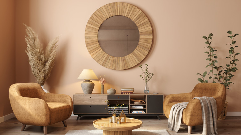
In addition to stark neutrals, bold unapologetic pops of saturated color expression are moving aside after years of popularity for the new queen of the paint world: the earthy mid-tone. Everywhere you look, in magazines and on social media, you will see muted paint colors near the middle of the light-to-dark spectrum. Embracing nature's colors such as sage green, regal medium blue, soft ochre, dusty pink, and muted terracotta, as well as middle-of-the-road neutrals like dark taupe or truffle, these popular mid-tone hues are serene, timeless, and versatile for many design styles. In addition, rather than a singular saturated accent wall of days past, the recent infatuation with mid-tones has taken to all four walls and beyond.
Nixing white trim in favor of dynamic painted trim colors
Lastly, gone are the days of all white trim. While many have been tiptoeing away from this stark trend for years, as the comfort level with using color at home has gained increasingly widespread enthusiasm, more homeowners are getting on board with including the trim in that process as well. Dark or black trim is a stunningly elegant touch, especially on baseboards, window casings, stairways, and wainscoting.
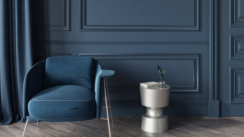
Alternatively, color drenching is a tried-and-true design approach where you paint the trim the same color as the walls, sometimes also including the ceiling. This effect envelopes you in color and blurs the lines of the room to make it feel simultaneously larger and cozier. Painting the trim and doors with the same calming and visually interesting shade as the walls makes for a show-stopping yet tranquil aesthetic.
Perhaps you have soft, creamy white walls that you adore -– try using a slightly darker taupe or mushroom on the trim for a gorgeous tone-on-tone look that boasts a ton of light and airy style. Creating a dynamic paint palette for your home doesn't necessarily mean embracing color, as unexpected uses of beautiful mid-tones or moody neutrals can have a similar design-forward effect. Regardless of which paint colors make your heart sing when choosing sophisticated mid-tones or neutrals with distinct undertones, using these elevated hues on both the walls and trim will ensure you stay ahead of the paint trend curve.