How To Mix Red And Yellow To Create A Royal Living Room
Imagine for a moment the sophisticated, complex, rich interiors of a regal English townhouse or chic London flat. With the widespread popularity of the modern traditional trend and design style and British-inspired vintage charm of cottagecore interiors, it is no surprise that many are looking across the pond for inspiration on creating warm, curated, high-end spaces. What makes these aesthetics so special are their elegant and dynamic color palettes that confidently showcase unexpected yet wonderful color combinations. One such color combination that seems so wrong yet looks so right is the mixing of red and yellow to create an upscale palette full of nobility and character.
Red and yellow are a classic color combination and go together like, well, ketchup and mustard — though I suppose that's not exactly the aesthetic I mean. Unless, of course, you are thinking of a rich, muted red-orange curry ketchup and dijon, in which case we might be back on track. (I digress.) There is a reason they paint school buses and taxis a classic bright yellow and also why the "unexpected red theory" of interior design works every time — both hues immediately grab your attention and make a seriously powerful statement. The trick to mixing red and yellow without having them compete is to find the right balance with less saturated versions of these vibrant hues to ensure they play nicely with each other. Achieving this harmony is what creates the luxurious and royal English townhouse-inspired color palette in your living area.
Can you really combine red and yellow in a sophisticated way?
As primary colors, there is some degree of red and yellow in every other color, so they truthfully look great with anything. However, the key to creating a balanced space that feels more like a rich, regal London flat and less of a Heinz and French's situation is to opt for muted, lighter, or darker tones of these two hues that are less likely to battle for your attention. Consider colors like burgundy, rust, red-orange, ochre, amber, dijon, gold, honey, and soft reds bordering on pink.
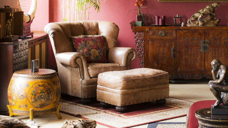
By using red and yellow's orange-based tertiary colors you'll be obsessed with, as well as a variety of lightness, darkness, and vibrancy within the actual hues themselves, you get a sophisticated palette fit for a royalty. Both red and yellow hues with a healthy amount of brown also help the space feel rich and grounded with earth-tone roots. If you would like to keep either red or yellow in their bold, saturated form, balance it out with a more muted counterpart.
Speaking of balance, once you have your red and yellow hues selected, the key to making everything work together is to find a nice harmony between the two attention-grabbing colors with more down-to-earth shades and natural wood tones. A foundation of earth tones and warm neutrals connect these statement hues with nature, bringing to mind freshly-pressed grapes dripping burgundy wine or fields of amber grasses in late summer. Red and yellow shades look gorgeous with terracotta, saddle, cognac, muted pinks, natural wood tones, and any hue nestled between them on the warm side of the color wheel.
Creating a regal harmony between red and yellow
Once you have the warm, nature-inspired base hues selected to complement and ground your red and yellow shades, it's time to add some final touches to round out the majestic, high-end color palette for the royal living room of your dreams. It is important to introduce some much-needed contrast to avoid having the space feel muddy or all the same color value. For lighter spaces, add in black and other deep shades, while you should plan to incorporate some white and other light colors to give some visual relief from a darker room. Playing with the contrast adds layers of sophistication and creates a dynamic interior.
In addition, adding in natural greenery juxtaposes the warmth with some organic tones towards the cool side of the color wheel, so houseplants go a long way to achieving a balanced palette. Lastly, inject a bit of sparkle in the form of warm brass and gold tones. Not only do these yellow-based metallic hues add some high-end opulence by acting as the jewelry of the room, but aged finishes also create a rich sense of history, making the space feel storied and curated. By playing around with combinations of sophisticated red and yellow shades, as well as balancing these bold hues with complimentary earth tones, greenery, and pops of gold, you can create the royal living room color palette of your dreams that looks nothing like the garish condiment table at your last barbecue.