Hue, Saturation, & Value: What To Know About Using Color Theory In Your Home
A massive part of interior design is understanding and showcasing the intricate and delicate nuances of color in a space. While artists and designers usually study color theory at length to become experts in manipulating color to create something beautiful, it dawned on me the other day that, while I like to throw around all sorts of color theory lingo while I talk about design, the concepts may not be widespread knowledge. You've heard the terms hue, saturation, and value, but what exactly do those all mean and how does any of that nerdy color chatter apply to decorating your home? Since color is the entire foundation of designing a space, let's learn color theory basics so you can apply the principles to your own aesthetic.
By far the simplest of the three terms to define is hue, which is often interchangeably used with the word color. If you know anything about color theory, you likely remember color wheel basics from art class. There are the three primary colors (red, yellow, and blue) and three secondary colors (orange, green, and purple) — as well as six tertiary colors you may have never heard of between each primary and secondary color (such as red-orange between red and orange). Any color on this wheel or made from mixing its colors is the hue. Technically, it's any color except black, white, and gray. However, interiors are not just made up of technicolor rainbow hues, so let's further explore how color is manipulated by adding white, black, or gray to alter a color's saturation and value, as well as how to apply that to your home's color palettes.
Saturation looks at color intensity and purity
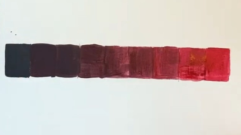
A term you have likely seen while editing photos on your phone, saturation measures a color's intensity. If you were to take a tube of red paint and squirt it directly on a canvas, the purest form of this hue is fully saturated and very vibrant. These are the hues you see on a basic color wheel, the purest, most saturated versions for simple comparison and demonstration. However, the saturation can be reduced by adding a form of gray to the hue.
Look at the image above and you will see a scale of how pure red paint (right) was changed as incremental amounts of a neutral medium gray was added as you move to the left. This process of adding gray to a vivid color reduces the saturation, creating a more muted version of that hue called a "tone." By pulling down the intensity of the hue, it opens up a huge range of colors with varying degrees of vibrancy within the one hue depending on the light or darkness of the gray you choose to mix. This is where we start crossing paths with a color's value.
Measuring lightness and darkness with color value
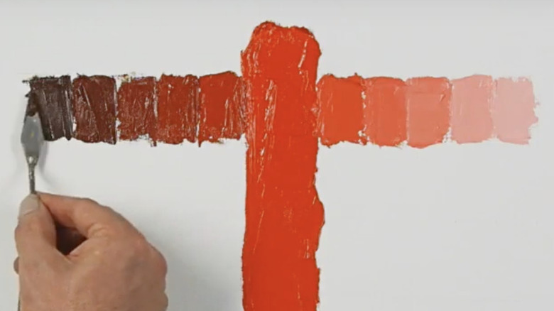
Color value measures the relative lightness or darkness of that hue. The easiest way to picture this concept is to think of a black-and-white photo. While there are no hues present in this scenario, there is a gradient of different levels of light to dark gray, called grayscale, that allows us to differentiate between the variety of grays in order to see the image. The same concept applies to a hue.
To manipulate a hue's value, add black or white to that color. Adding black darkens the color and is called a "shade" of that hue, while adding white lightens the color, creating a "tint." In the image above, you will see the range from darker shades to pure saturated red (large swatch in the middle) to lighter tints.
An easy way to test a color's value is to tightly squint your eyes, which roughly simulates applying a grayscale filter to what you're looking at, removing the hue and saturation as much as possible, and revealing the value. Conversely, the saturation scale looks almost like one long block of the same gray tone with very little value change (though these methods are not an exact science — we need computers for perfection). This is because the only way to manipulate a color's saturation without affecting its value is to add a medium gray that is the same value as the original hue. Anything lighter or darker will also begin to alter the value.
Manipulating value and saturation in interior design
Okay, so medium gray affects saturation but not value so much, and pure black or white strongly affects value as well, but what about everything in between? While adding black or white is the most extreme, straightforward way to manipulate value, there is a range of grayscale tones that can be added to the color to alter both its value and saturation. If you were to add a light gray to our red example, you would get a range of more muted tints in the pink family, while dark gray would produce muted burgundy shades. Playing with the value and amount of the gray tone will change how you can manipulate the hue and the range of colors you can achieve.
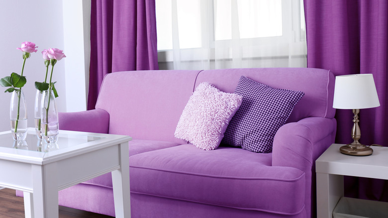
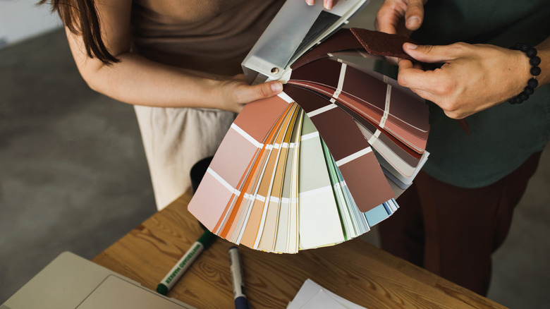
Using all of this color theory knowledge is important when choosing the finishes for your home, from textiles and furniture to permanent finishes like flooring and countertops. Be aware of the saturation level (paint color always looks more saturated on the wall than on the swatch), as well as how the natural light in your home affects the value. Bring samples into the space whenever possible to see how the color reads throughout the day in a particular room.
Vary the saturation and value throughout your design to create contrast and create a more interesting interior — even the color drenching paint trend needs a bit of value and saturation relief to make the space come together and not feel muddy. So the next time you are picking finishes for your home, use the color theory basics of hue, saturation, and value to level up your aesthetic and create a dynamic space full of contrast.