3 Bedroom Paint Colors That You'll Wish You Never Used
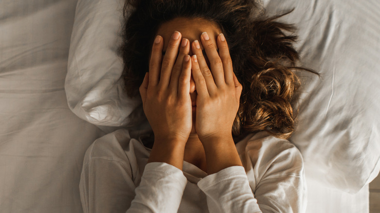
The goal of designing the perfect bedroom space is to have a beautiful, relaxing room that makes you feel happy, calm, and restful. Since the paint color on the walls is the largest pop of color in the space, the hue you choose is extremely important when it comes to setting the right sleepy mood. In fact, the wall color in a bedroom can actually affect your quality of sleep.
I'm an interior designer, and this is a big reason why understanding how different colors evoke different emotions, moods, and physical effects in our minds and bodies is crucial for picking the right bedroom paint color and closing the door on sleepless nights.
Since the goal of any bedroom color is to promote good sleep, tranquility, and peace in a bedroom, it is essential to avoid hues that are too energizing or have negative associations that prevent quality rest. The worst offenders are overly saturated, vibrant colors like bright red, bright purple, or yellow-green, thanks to their overstimulating, distracting qualities, as well as connections to feelings not well-suited for a relaxing bedroom. With that in mind, I'll go ahead and explain the problem with these colors, and help you steer away from these three saturated hues for your serene bedroom space. I'll also give you some ideas on which colors you should consider instead.
Avoid overly saturated shades when painting your bedroom
Knowing how much your selection on the color wheel affects the quality of your sleep, it is essential to choose the right paint shade for a restful bedroom, avoiding colors that are too energizing. While all three of these paint colors are certainly a no-go for the bedroom, the truth is that any overly saturated hue, especially on the warm or warm-adjacent side of the color wheel, is going to feel too energizing and bold for creating a restful bedroom space.
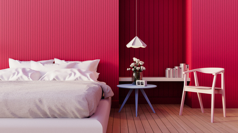
I'll start with the worst offender: Don't do a very saturated, bold red hue. While red does evoke passion, it's also the most intense, stimulating color. It actually raises your heart rate and blood pressure. It also brings up feelings of anger and aggression.
Now, our second color. Thanks to strong red undertones, it is also best to skip bright, saturated purple hues, as the vibrant versions of this color are far too stimulating to promote rest. Purple is associated with creativity and imagination, though lying in bed trying to sleep is not exactly when you want your brain hard at work. To allow your gears to slow their turning, walk away from red-adjacent bright purple colors designed to stimulate the brain.
For my third and final "don't do this" selection, I'm going to say that a neon yellow-based green such as lime or chartreuse is not a good pick for the bedroom, thanks to its lively yet artificial feeling. While softer shades of green are associated with rest and renewal, the overstimulating and vivid yellow-green counterparts are associated with sickness, decay, and envy – not exactly the vibe anyone is going for.
Which bedroom colors should you choose instead?
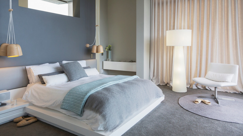
If saturated hues aren't the answer for painting your bedroom, which colors are best for promoting a restful atmosphere and good sleep? Thanks to its connection to nature and associations with tranquility, peace, and calm, it's said that muted or soft shades of blue are the most soothing color. Similarly, muted mid-tone or light shades of green promote similar nature-inspired feelings of happiness and comfort as blue hues. Lastly, unlike saturated reds, muted soft pinks are wonderful for promoting restful sleep, thanks to the optimistic, kind, hopeful vibes they evoke. Reminiscent of a beautiful sky at sunset, this optimistic hue promotes feelings of love and peace. All three of these extremely serene hues can actually lower your heart rate to promote rest and relaxation.
Light or mid-tone neutrals are also safe, non-energizing color options, though avoid any white that is too stark, as it can be too reflective for good sleep. Muted mid-tone hues are also a wonderful way to bring in a bit of color without becoming too overwhelming. Some argue that a dark bedroom can feel negative or depressing, but I personally disagree — gorgeous, muted, and yet moody shades of aubergine, forest, charcoal, or bronze have an incredible power to envelope you in the space, creating a cozy atmosphere. However, if these hues feel less moody and more gloomy to you, then skip them!
Paying attention to the emotions and energy level that your paint color choices evoke is essential for choosing the perfect restful shade for your bedroom, as well as avoiding those overstimulating hues that you'll definitely regret using.