Paint Colors That Are Making Your Dining Room Look Terribly Outdated
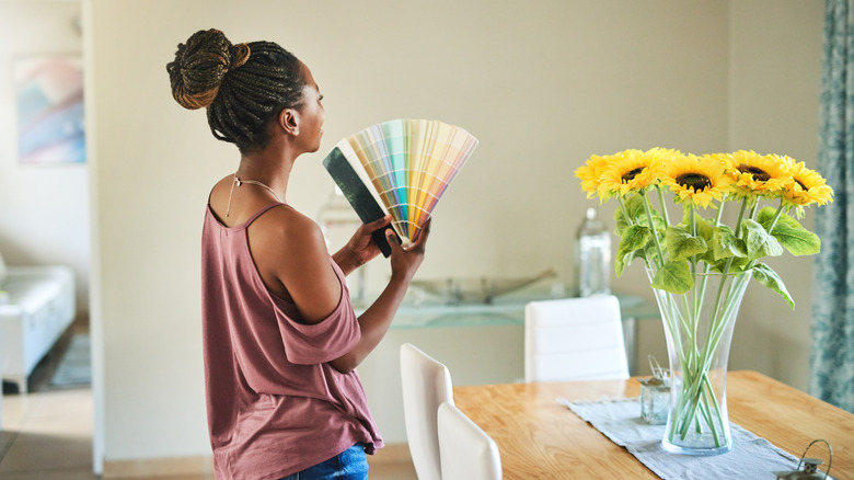
The location for dinner parties, family gatherings, and memorable holiday feasts, your dining room is truly the social entertainment hub of your home and works hard to create a welcoming, joyous atmosphere. When a dining room's design has a ton of coziness and wow-factor, guests will find the space unforgettable. But sometimes the aesthetic of your dining room has lost its luster, with an outdated vibe and uneventful personality. How do you know which past-their-prime wall colors putting a damper on your space?
As an interior designer, I'm here to share some good news: There are only a couple of tones that will truly date your dining room. I bet you think I'm about to hit you with proclaimed "outdated" hues like brown or red, but when done in the right way, even those colors can look like a million bucks in a contemporary dining room. And anyway — spoiler alert! — both of those shades are on their way trending back in, with a rich, soft medium brown, Mocha Mousse, named as Pantone's 2025 color of the year.
No, the outdated colors dragging down the aesthetic of your dining room have far less personality than brown. In fact, 2025's color trends are all about unique character, bold color choices, and unapologetic visual interest, so the drab, uninspiring presence of my choices is precisely why these two tones made the list: Cool-toned grays and stark white, which are both so sterile and charmless that they actually detract from the overall aesthetic rather than add to it. Let's break down why these once-popular neutrals have seen their day, and what you should use instead to create an inviting, memorable, and gorgeous dining room.
Cool, light gray tones ... make a dining room look like it's stuck in 2013
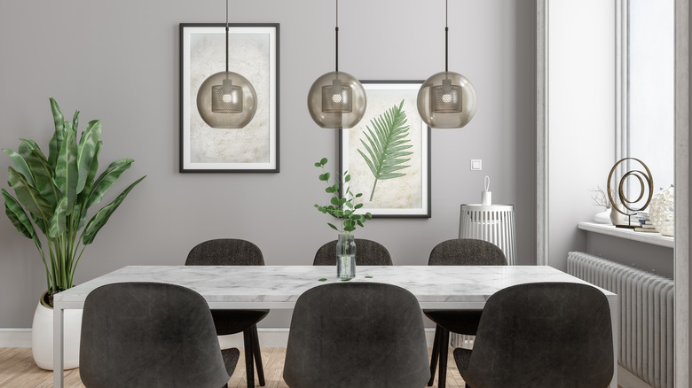
Light cool gray was the paint color of choice 10 or 15 years ago, when the world became a wash of "Millennial gray" as a reaction to all of the warm tones so beloved in years prior by the parents of said Millennials. However, as with many overdone design trends, the cool gray paint mania has waned in popularity these days, in favor of less dreary, lackluster shades. A soft cool gray dining room lacks the warmth to be inviting, or the personality to be memorable. Plus, its deep associations with the 2010s means guests will take one look at the wall color and think you haven't bothered to put any thought into it for over a decade. Not exactly the vibe you want to exude, am I right?
What should you consider instead? If you love a light neutral, opt for grays with warmer undertones — like taupe and greige dining room paint colors. These tones, while still scratching the gray itch, are exponentially more welcoming, cozy, and interesting. If you are willing to branch out a bit from your light gray comfort zone, consider a warm mid-tone taupe, deep truffle taupe, or even a warm undertone charcoal shade for a moodier, elegant aesthetic. Endlessly sophisticated and cozy, these darker tones pack a serious design punch that is somehow both serene and dramatic all at once.
And when in doubt? Color drench the space with these moodier hues, for even more wow-factor. This will leave your guests in awe of their luxurious and impactful surroundings. And you won't even have to fully abandon gray to do it.
Stark, uninspiring white dining room walls are a recipe for a lackluster dinner party
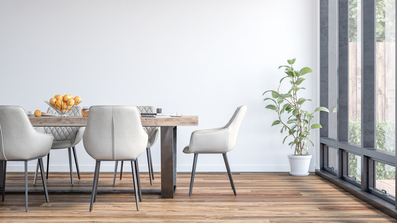
The second hue that is dating your dining room is a stark, soulless white. Again, the use of a bright white with neutral or cool undertones was all the rage in the 2010s, as a reaction to warmer hues that preceded it. However, perhaps even more so than the light cool gray fad, the sterile white trend is the easiest way to make a space (and your dinner party) feel drab and devoid of personality. Though all-white may not have quite as aggressively era-specific associations as cool gray, people have given up on designs that feel cold and standoffish in favor of those that feel more exciting and inviting. And while I am not opposed to white walls, there are a few tips I always use to avoid the boring, stale, whitewashed vibe.
If you love the clean, fresh aesthetic of a white wall, opt for a creamy white with warm undertones to help avoid the lifelessness of neutral or cool-toned whites. In addition, adding a texture or visual interest to the walls helps to provide more character and depth without introducing color, such as with elegant picture molding or a creamy white grasscloth wallpaper. Finally, introduce natural earth tones and contrast into the space with the furniture and decor, to bring the neutral look to life.
Long story short: When it comes to freshening up your insipid, outdated dining room color palette, paint the walls with either (1) color or (2) a neutral with warmer undertones. This will transform it into a more welcoming, guest-friendly entertaining space.