7 Colors Interior Design Experts Wouldn't Recommend Using In Your Kitchen
Choosing a color palette for your kitchen remodel is a big job, with seemingly a billion paint colors and finishes out there to choose from. Not only that, but the high cost of elements like cabinets, countertops, and other big-ticket finishes means a larger financial investment, and therefore a longer emotional commitment. The stakes and process can be overwhelming. Thankfully, there are a million resources out there to help you select the perfect kitchen color palette, but are there colors that should absolutely be avoided when it comes to planning your kitchen? As a design professional, I'm here to tell you that "avoid" is perhaps too strong of a word, but there are absolutely colors that I nearly always shy away from to achieve a sophisticated, time-tested look.
I have one huge caveat here, though. With just the right balance, dynamic color, and finish palette, great designers can make nearly any hue look amazing. And there are certainly some homeowners who have a higher threshold for incorporating bold, vibrant colors than others. My list today breaks down the toughest kitchen colors to pull off and why they present such a challenge for the kitchen. That being said, one quick Pinterest search will likely prove that there are incredible exceptions to each of these not-so-hard-and-fast design rules, so you do you, okay? Without further adieu, let's dive into colors like stark white, fire engine red, and bright yellow that may give you one heck of a run for your money on your quest towards creating an elevated kitchen aesthetic.
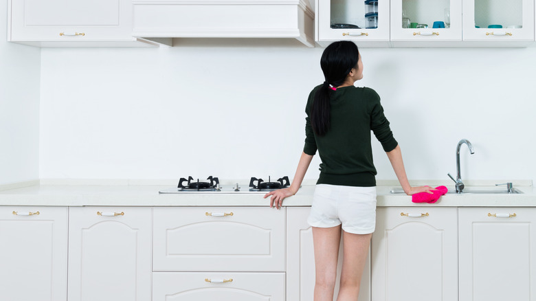
Stark bright white gives off sterile, clinical vibes
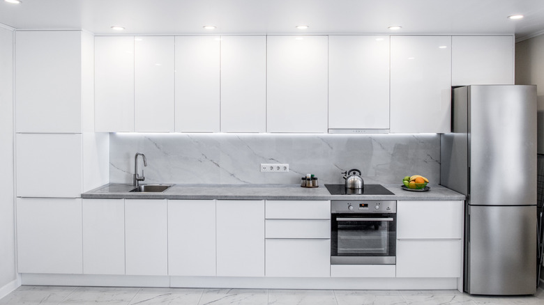
I've said it before, and I'll say it again: those 100% stark white kitchens are outdated. Incorporating white tones that are too bright or cool makes the space feel clinical, sterile, and downright unwelcoming. There is nothing less visually interesting than a generic, bright white space with no personality or warmth. If you love the light, airy vibe of white paint colors, opt for a selection that is more of a creamy white with warm undertones and compliment the off-white shade with other warm finishes to make it feel even more inviting.
Neon lime green is a no-go that casts a sickly glow
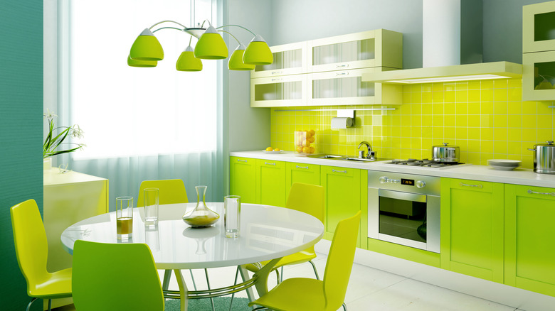
While the title of this paragraph says "lime green," you really could substitute any other neon color name (like orange, yellow, or pink), and the theory would hold. Neon colors can be off-putting and overpowering when used more than sparingly in a kitchen. An excess of an overly vibrant hue like lime green casts an unappetizing, sickly glow over your surfaces, food, and guests that can feel childish or unsophisticated. If you love neon hues, use in moderation for some fun accents rather than drenching the kitchen in it.
Saturated fire engine red is overwhelming and overpowering
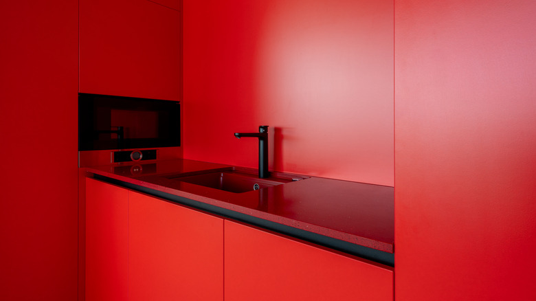
Red evokes the strongest emotions of any other color, like anger, danger, energy, and power, so pummeling your kitchen with the most saturated fire engine red is overpowering, overstimulating, and downright overwhelming. Bright red often packs too hard of a punch for the gathering hub of your home. If you love the warmth and energy of red tones, stick with accented pops of red (the hue is actually known to stimulate the appetite!) or opt for a gorgeous muted burgundy for a more historical, grounded, and sophisticated feel.
Cool gray is boring, bland, and unremarkable
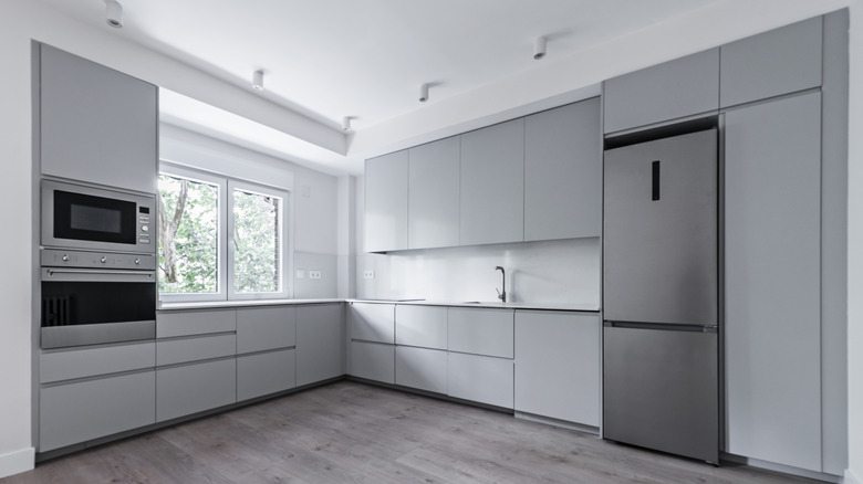
One of the most drab, uninspired colors you could choose for your kitchen is cool gray. I mean, what is this, 2013? Not only has the hue seen its day come and go, but the vibe it gives off is bland, uninviting, and utterly forgettable. If boring and cold is the ambiance you're going for, then have at it. But if you're looking to create a welcoming space that feels cozy and elevated, look for gray paint colors with warm undertones, such as taupe or greige.
Bright sunny yellows are harsh on the eyes and overly energetic
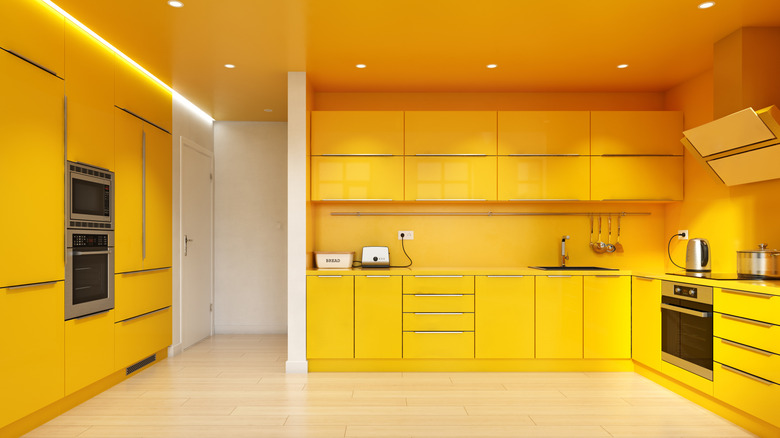
Listen, before you come at me, I fully realize that yellow has been a classic kitchen color for ages, but there's a fine line between a softer, muted butter or marigold color ... and a neon lemon or school bus yellow. While yellow kitchens in general bring a cheerful, happy, sunny vibe, anything too vibrant can actually cause eye fatigue because of the amount of light it reflects. Yellow is also an exceptionally energetic color, so super bright shades can be extremely overstimulating.
Saturated or pastel purples with cool undertones can be polarizing
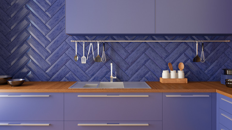
Purples with blue undertones, ranging from pastel lilacs to saturated vibrant purples, can be very challenging in a kitchen, as they don't play well with others. Definitely full of unapologetic personality, cool purple hues can be off-putting to many. Light variations may look childish or cutesy, while darker hues may feel overwhelming or confining. However, it wouldn't take much convincing for me to create a kitchen with cabinetry in a rich, warm, muted aubergine that tiptoes towards burgundy, so I say, "to each their own, and undertones matter!"
Saturated brown tones, especially in wood stains, can look painfully outdated
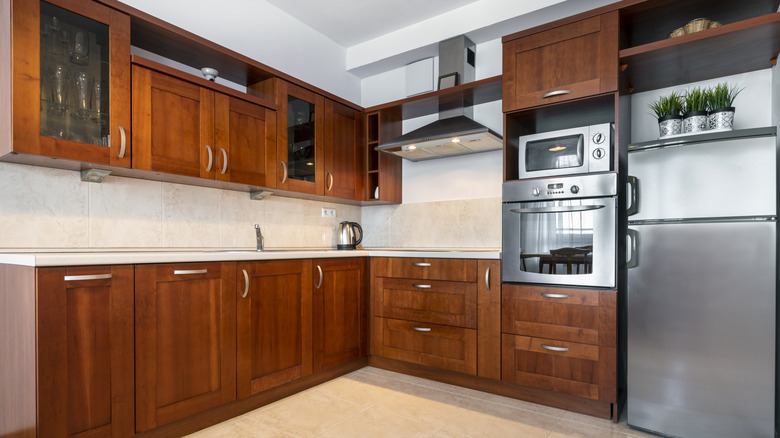
While rich, desaturated browns, like chocolate or mocha, are trending at the moment thanks to their warmth, depth, and sophistication, not every brown shade is a winner. Saturated browns, especially those with unsavory orange or yellow undertones, evoke bad memories of 1990s interiors, making your kitchen look instantly outdated. This applies to both paint color and wood stain tones, as honey oak cabinets do NOT need a resurgence, thank you very much.