A Couple Gives Their Sunny Venice Bungalow The Illusion Of More Space
A wife and husband in public relations and journalism weren't looking to change much about their beach bungalow in Venice, California. They liked its relatively small size and appreciated its laid-back exterior given their close proximity to the waves. But the pair did want to make some upgrades to the house's interior — after all, the dropped ceilings and cramped floor plan didn't fulfill their wishes to have more natural light and access to the outdoors. They asked Robert Sweet and his boutique studio, ras-a, inc., for an upgrade that was more detail-oriented than big picture: knock down walls, open up ceilings, and carve out larger windows without disrupting the site's square footage. "The existing framing, wood floors, footings, and roof were all maintained or refinished," Sweet said. He and his team replaced the smaller panes and doors with larger versions that showcase views of the backyard, and included skylights in vaulted ceilings to give an airy illusion of more space. Once sunshine became a defining feature of the property's open layout, Sweet then outfitted the rooms with colorful tiling to give their minimal aesthetic a colorful finish. The address may not have undergone a complete renovation, but it's the little things that make it feel brand new.
1. Front
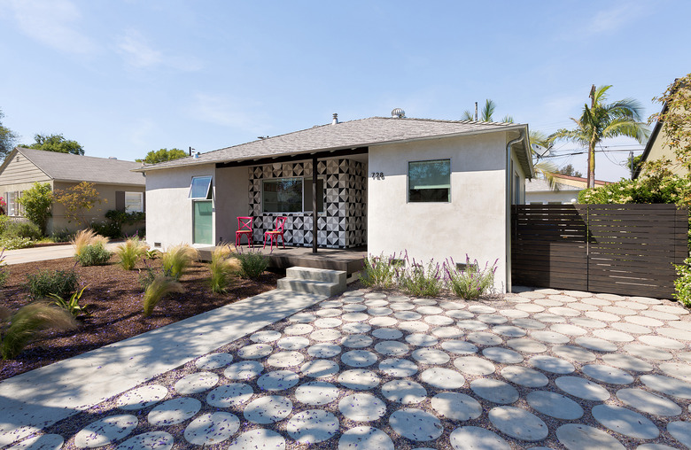
Sweet wanted the keep the front of the home uniform with the other single-story, ranch-style properties in the immediate neighborhood. "The previous slab driveway was replaced with small, poured-in-place concrete rounds to provide a permeable surface that doubles as a parking area and pathway," Sweet said.
2. Living Room
Original oak flooring was preserved throughout the house, but it was bleached and topped with a matte polyurethane to match the raw plywood ceiling overhead. A Cirrus Aluminum Ceiling Fan by Modern Fan Company keeps the living room cool, and NanaWall Bifold Doors stream light in from the backyard.
3. Entertainment Center
The firm custom built the bookcase that surrounds the television in the living room. Minimalistic bulbs from Tech Lighting illuminate the space at night.
4. Kitchen
Tech Lighting sockets continue into the kitchen, which features the same woodwork as the rest of the property. Spanish porcelain tiles provide a backsplash behind a Wolf range, which oppose Ikea cabinetry with custom fronts.
5. Hallway
The team "added operable skylights in multiple rooms to bring in daylight and allow the home to be cooled through cross-ventilation," Sweet said. The design also makes use of vaulted ceilings to give the illusion of a larger footprint.
6. Bathroom
The couple asked that their home have a "whimsical" look, and Clé tile mosaics laid throughout the home met this goal. In the small bathroom, a Darling Wall-Mounted toilet from Duravit sits above the tiles, and a Hansgrohe Croma Shower Pipe hangs on the opposite wall.
7. Master Bedroom
Modern Fan Company's Cirrus Aluminum Ceiling Fan — yes, the same piece in the living room — was also used in the master bedroom.
8. Master Bathroom
In the master bathroom, rows upon rows of Daltile's penny rounds create a floor-to-ceiling mosaic that works as an artistic and functional feature. A freestanding bathtub and a FS1 bath mixer by Vola sit next to the shower.
9. Master Bathroom
On the other side of the bathroom, DuPont® Corian® vanities sit under wall-mounted Axor faucets from Hansgrohe.
CORIAN® and DuPont® are registered trademarks of E. I. du Pont de Nemours and Company.


