A London Home's Transformation Features A Bright, Spacious Kitchen
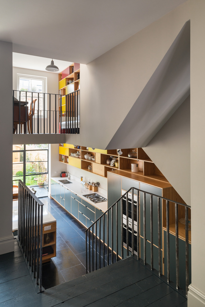
When a couple with two young children purchased a dilapidated house in London's Hampstead neighborhood, their main concern with their new address was its uneven structure — the entrance and garden level were separated by a half-story. Historic conservation laws hindered changes they could make to the exterior, but with the help of MW Architects, they figured out a solution that would maximize the challenging floor plan: open the existing framework and build down for more space. The design centralized the kitchen and opened it to light, created a joint dining room and study, and added a basement utility room for storage. But perhaps most importantly, the firm created a mezzanine-like landing between the entrance and garden level that provides order to the home's many layers. "Visually, it locks the spaces together," Matthew Wood, the owner of the firm, said. Now, sharp angles and square shadows can be found in each room, where a total of 18 different paint colors work to define every individual space. And although Wood jokingly admits that this wasn't "exactly a conservation project," the moody Victorian shades and the reuse of some original materials give credit to property's place in a historic neighborhood.
1. Kitchen
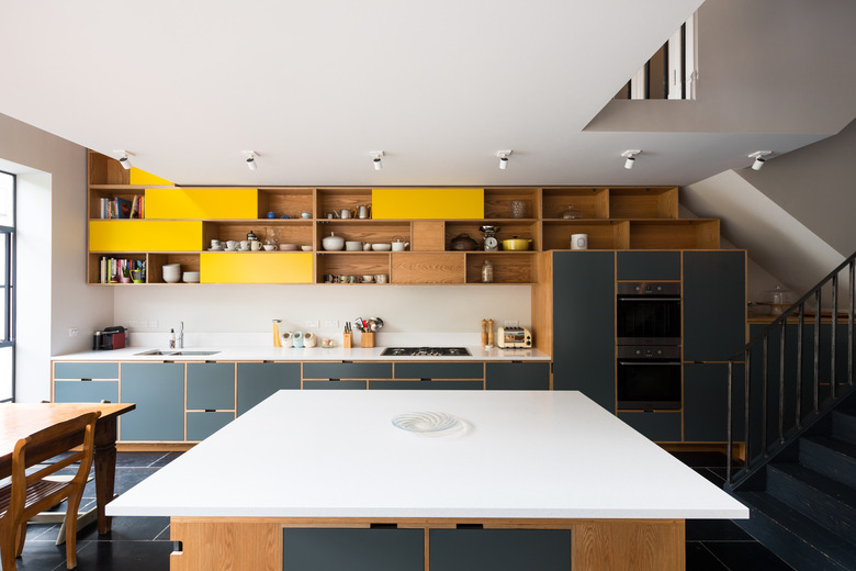
The owners had two goals for the kitchen: create more light from its dark past by knocking down walls, and then complement its newfound light with darker matte paints by Farrow & Ball. They enlisted a color consultant to make sure the shades were just right.
2. Kitchen
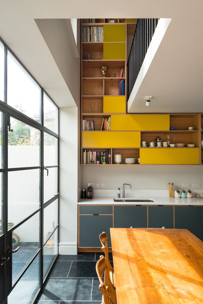
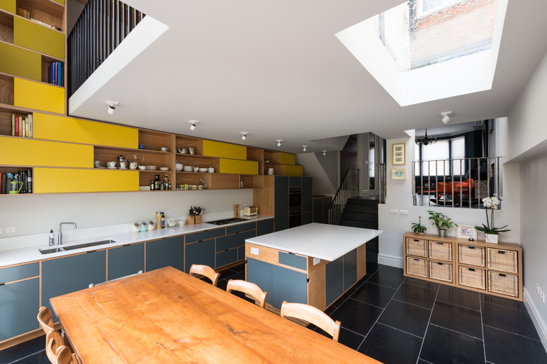
The blue and yellow plywood kitchen cabinetry from Uncommon Projects add pops of color to the kitchen. "The kitchen table actually came from the neighbor," Wood said. "It was passed over the garden fence."
3. Kitchen
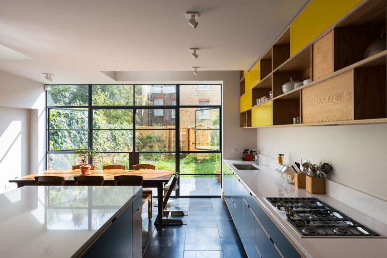
Quartz composite countertops by Planet Granite wrap around the kitchen, and steel-framed windows offer views of the garden.
4. Kitchen
Wood believes that storage on either end of a space can be overbearing. So, all cabinetry was confined to one side, which allows more light to filter through.
5. Staircase
"We cut a couple of voids in the upper level to [create] a stronger connection between the spaces," Wood said. A second dining room stands above the kitchen, and the lower staircase leads to a living room.
6. Bedroom
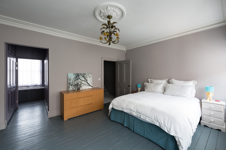
At the owners' request, the room kept the original floorboards with a fresh coat of paint from Farrow & Ball. "Each room has a different color floor, so it was a strategy of color matching," Wood said. He estimates that there are over 18 colors in the home.
7. Bathroom
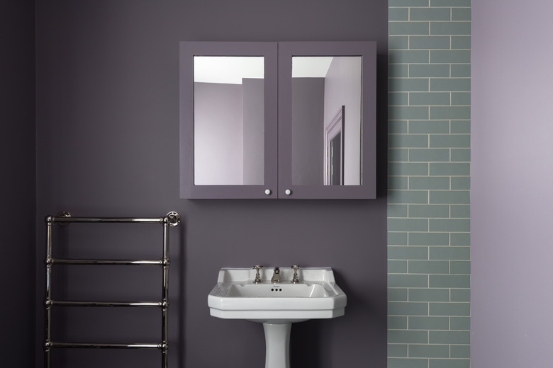
The owners wanted to pay respect to the home's Victorian past with rich paint colors, including Farrow & Ball's "Brassica."
8. Exterior
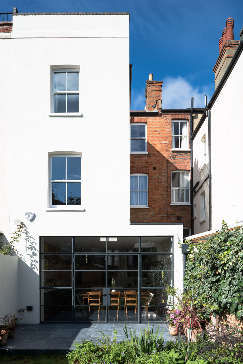
Most of the home's historic exterior remains intact, so now the home is an eye-catching balance of old and new.

